| Image |
Comment |
| 02/28/2005 09:21:41 AM |
The Axe Effectby SirBiggsALotComment: I made a similar comment to another Bokeh in this challenge - it is more fit for the magazine ads, does not fit the billboard signs. |
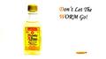
| 02/28/2005 09:19:05 AM |
Monte Alban Tequilaby cheekymunkyComment: I have the feeling that the text leans to the right just a little bit. The edges of the bottle got lost in level & brightness adjustments. For a billboard, you would have to have those edges visible I think. |
 Photographer found comment helpful. Photographer found comment helpful. |
| 02/28/2005 09:16:19 AM |
IRRESISTIBLEby vivienComment: I don't find Bokeh photos often on billboards. Great image, but perhaps for a magazine, not for the big boards. |
| Photographer found comment helpful. |
| 02/28/2005 09:13:11 AM |
Please don't drink and drive!!by orussellComment: I imagine you printed the sign w/text, laid it on the table, put the key in the glass and laid it down... maybe you should have had this validated to eliminate low scores from suspicious people that will think that you added text.
One suggestion - you should have made the letters heavier - using extra bold typeface perhaps. |
| Photographer found comment helpful. |
| 02/28/2005 09:09:22 AM |
Stressed? Need to be heard? We'll listen. CRISIS HELP CENTERSby IvoComment: For a billboard, I imagine that the text would be printed in the top 3rd. Therefore, this would have been better with the bottom cropper... wait, I just realized that the letters could be white (light) and fit in the bottom half. That would make it much better, bumping up. |
| Photographer found comment helpful. |
| 02/28/2005 03:41:19 AM |
Shooting Hoopsby debitiptonComment: Eyes... unnaturally white. Probably as a result of whitening the background. They just seem so unreal, that it bothers me when I look at this image. Otherwise, very good DoF, details are sharp both on the ball and on the left hand way behind. But eyes, I have to score it down some. |
| Photographer found comment helpful. |
| 02/26/2005 12:25:32 PM |
1970 BCEby kyeboshComment: One just gotta love this one. Thinking outside the box may and will hurt, though. However, I really like the lighting on this one, and it does meet the challenge, if taken literally. Good luck! (6) |
| Photographer found comment helpful. |
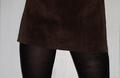
| 02/26/2005 12:22:45 PM |
Mini Madnessby dragonladyComment: I think that the choice of color is rather unfortunate here. I understand that you may not have clothing in arbitrary colors to pick from, but this photo is too dark for the '70s. You could have done a sillhouette effect, and darkened your legs and the skirt. Alternatively, a lighter stockings and skirt would have done it for me...I hope this helps.
Second pass, bumping up. |
| Photographer found comment helpful. |
| 02/23/2005 10:29:20 PM |
Pong !by Tom_RobbrechtComment: Very good. I'm not sure if you could have achieved better focus for the pong though. One of the ribbon candidates IMO. Bumping up to 8. |
| 02/23/2005 10:27:59 PM |
"Two Policies, One Nation"by Doug ScrogginsComment: How true for the 2000s as well as for the 1970s. This is very good image, technically speaking. I can see what you wanted to refer to with your title, but it is not exclusively '70s issue, so that brings the mark down to 6. |
Home -
Challenges -
Community -
League -
Photos -
Cameras -
Lenses -
Learn -
Help -
Terms of Use -
Privacy -
Top ^
DPChallenge, and website content and design, Copyright © 2001-2026 Challenging Technologies, LLC.
All digital photo copyrights belong to the photographers and may not be used without permission.
Current Server Time: 07/16/2026 09:50:40 PM EDT.