| Image |
Comment |
| 03/09/2005 07:45:22 AM |
Anyone for a "light" lunch?by lentilComment: Congratulations Lisa on your best placement so far. Keep up the good work, keep that shutter clicking and the improvement will happen.
-S. |
| 03/03/2005 12:11:37 AM |
Whole Foodsby utroComment: This is too dark for a billboard. Idea is good, and having the tomatoes more to the left (or right) to leave some negative space for the text, together with much brighter background would have been better IMO |
 Photographer found comment helpful. Photographer found comment helpful. |
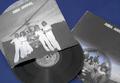
| 03/02/2005 11:28:10 PM |
33 1/3by srdanzComment: I was probably too tired when I was writing about what I did to the photo... I did not desat all colors but red (!?), but rather all colors but blue. If you did not notice already:-) |
| 03/01/2005 11:58:43 PM |
|
| Photographer found comment helpful. |
| 03/01/2005 02:51:17 PM |
Coke - The World Is Your Coolerby TranquilComment: People looking at this billboard would have a hard time distinguishing that there is a bottle at all, let alone getting the trademark. Also, centered composition is not the best one in this case. Since you had natural white background, you could have created space for the text on either side by placing your subject near the edge. |
| Photographer found comment helpful. |
| 03/01/2005 02:48:04 PM |
|
| Photographer found comment helpful. |
| 03/01/2005 02:03:54 PM |
Time lost to video gamesby afarlandComment: I'm not sure it if was the intention, but it is severely and selectively out of focus. If it was the intention, then I don't find it as an improvement to this photo. If lower part (the patr next to the darker background) were softer and the top (next to the bright area) sharper, then it would be nicer to the eye. |
| Photographer found comment helpful. |
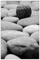
| 02/28/2005 01:40:38 PM |
Lazy Day Fishingby scalvertComment: Ooh, I've been wrong before when predicting blue ribbon winners, I realize that, but how can I go wrong here? 10, the only one so far. |
| Photographer found comment helpful. |
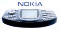
| 02/28/2005 01:19:54 PM |
Nokia N-Gageby KonadorComment: Almost perfect. I can readily imagine this one on the billboard. I assume that the quality of the letters is a result of taking a photo of them, whilch would make them even better if you could draw them afterwards. Points taken for soft focus - near buttons and front edge of the phone are softer than needed for the billboard. All in all, 8 |
| Photographer found comment helpful. |
| 02/28/2005 10:57:39 AM |
Wireless Skiesby zagmanComment: Resizing probably did a disservice to this otherwise splendid photo. I checked my monitor, and other photos w/ clouds look better. Pity. I'll ignore that, hoping that the original is better, since noone would use 640x320 for their ultimate image. |
Home -
Challenges -
Community -
League -
Photos -
Cameras -
Lenses -
Learn -
Help -
Terms of Use -
Privacy -
Top ^
DPChallenge, and website content and design, Copyright © 2001-2026 Challenging Technologies, LLC.
All digital photo copyrights belong to the photographers and may not be used without permission.
Current Server Time: 07/17/2026 02:43:56 PM EDT.