| Image |
Comment |
| 04/25/2005 05:24:41 PM |
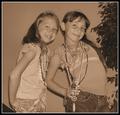
Girls can never have enough jewelry!!!by singsunshineComment: Nice photo, but it does not depict jewelry in the best light. I don't believe that desaturation is a good choice for representing something as colorful as jewelry. Selective desaturation is OK for jewelry, but would not work here either.
I think this image will get hurt because of the "does not meet the challenge". |
 Photographer found comment helpful. Photographer found comment helpful. |
| 04/25/2005 05:21:10 PM |
February by nico_blueComment: Beautiful reflections off the ring and nice lighting. Top 10 IMO. |
| Photographer found comment helpful. |
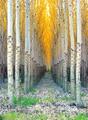
| 04/25/2005 12:08:03 PM |
Natural Cathedralby charliebakerComment: Comment on the photo: beautiful colors, looks like pure gold. 8.
Comment on the title (not affecting the score): this is not naturally occuring in nature - someone planted those trees... |
| Photographer found comment helpful. |
| 04/25/2005 12:04:08 PM |
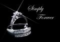
Simply Foreverby ebertdjComment: returning for comments:
beautiful image I really like the colors and the dark tone. bumping up. |
| Photographer found comment helpful. |
| 04/25/2005 02:27:34 AM |
Dali's Earringsby labudsComment: Not all shadows are bad - I would like to notice that this one stands out - double shadow precisely placed (the light sources were placed I know) to achieve the very nice total image. 8. |
| 04/25/2005 02:21:23 AM |
Pearls are imortalby NunoComment: Did you use packing styrofoam peanuts here? If you didn't, these sure look like ones... Not an image you want to see in an jewelry ad, I would think. |
| Photographer found comment helpful. |
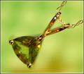
| 04/25/2005 02:18:59 AM |
August - Peridotby dartompkinsComment: We can see that you used the flash (by looking at the reflection in the pendant). Continuous, slightly diffused light from the direction of your choice would have been better in this case (IMO). |
| Photographer found comment helpful. |
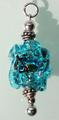
| 04/25/2005 02:17:37 AM |
Aqua lampwork beadby PaperfibeComment: you could have done this one without a shadow - it only takes away, adds nothing pretty to the otherwise good photo. |
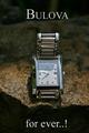
| 04/25/2005 02:16:51 AM |
Bulova for ever..!by joaquinComment: There should not have been a shadow over the face of the watch.
having the time set to 10:10 would have helped (as it is a de facto standard for watch ads but haven't impacted my score at all). |
| Photographer found comment helpful. |
| 04/25/2005 02:01:15 AM |
Beauty Jewel...by sfarrell23Comment: Did you check what kind of web site www.bj.com is? I like the joke (I had my suspicions... if you'd put www.beautyjewel.com I would not bother going there checking it out).
Technically, I wish for a different perspective. This is taken from a higher point I would prefer for a ring of this type - shooting from a slightly lower position would have given you better reflections, I think. 6. |
| Photographer found comment helpful. |
Home -
Challenges -
Community -
League -
Photos -
Cameras -
Lenses -
Learn -
Help -
Terms of Use -
Privacy -
Top ^
DPChallenge, and website content and design, Copyright © 2001-2026 Challenging Technologies, LLC.
All digital photo copyrights belong to the photographers and may not be used without permission.
Current Server Time: 07/17/2026 12:30:31 PM EDT.