| Image |
Comment |
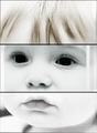
| 11/15/2005 02:46:04 AM |
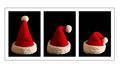
Multiplicity of moodby dimitriiComment: First, good things: I love the split, it is obvious that a lot of effort went into planning and executing post processing on this one. I like the tone change between frames #1 and #2, and I love the grain on #3. That is why I believe that you fell asleep at some point, and missed the separator between #2 and #3 by a couple of pixels. You have also left some processing artifact (vertical lines) in #2, and some in #1 on the right side.
I hope that I'm right, and that you did not put these on purpose. 5 is as high as I can vote with these errors.
Oh, and if you put these on purpose, you haven't helped your photo, it only subtracts from the experience, adds nothing pleasant. |
 Photographer found comment helpful. Photographer found comment helpful. |
| 11/15/2005 02:39:11 AM |
|
| Photographer found comment helpful. |
| 11/15/2005 02:35:30 AM |
Caught in the Middleby DrAchooComment: I think that I know exactly what you're trying to portray here. My boy is 5 1/2 and my girl is 2 1/2, and I often find myself in this situation.
Very nice fit in the challenge, nice choice of b&w, and the only thing I would have experimented with is perhaps the thickness of the frame. It seems too thin (the frame separators at least.) But I like it nevertheless. |
| Photographer found comment helpful. |
| 11/15/2005 02:32:36 AM |
Natureby aussieComment: I don't know why, but the first association when I saw this one was: Andy Warhol. Can't grasp why, but there is some artistic value in this one that just struck me when it popped up in front of me. I like it very much.
Good luck! |
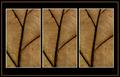
| 11/15/2005 02:28:55 AM |
Circle of friends by LalliSigComment: Unique! Love it, and although it may not win, this is the best of the challenge for me. Excellent posing, facial expressions, everything!
good luck!
|
| Photographer found comment helpful. |
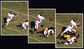
| 11/15/2005 02:24:30 AM |
The Snagby SkipComment: If only you resized frame #1 to align the yard line with the other frames... but excellent nevertheless. |
| Photographer found comment helpful. |
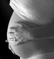
| 11/14/2005 03:46:36 PM |
DSC_0062-copy.jpgby dkubinComment: I think that the focus is too soft on the hand. You might have wanted it that way, but it comes across as an imperfection to me. same with the right hand - I guess the feeling of softness is exaggerated by the fact that there are no defining sharp lines on the belly to take over as the main focal point.
What were your parameters? (how far was the camera from the subject? What was the aperture? What was the focal distance used?)
Oh, and rotate the ring correctly. It looks careless... Message edited by author 2005-11-14 15:47:25. |
| 11/14/2005 02:00:09 PM |
Michelle's Husbandsby bobdaveantComment: Michelle got you to grow beard after the challenge got announced, made you shave twice as well! Very creadive, esp. with the order not being exact.
The head #2 is bigger than the other two, probably on purpose, but the message escapes me. Still I rank this one higher. |
| Photographer found comment helpful. |
| 11/14/2005 09:15:44 AM |
Library in Autumnby adamwebComment: I think you made a bad choice of that filler color for the frame, otherwise good composition and nice fall colors. |
| Photographer found comment helpful. |
| 11/14/2005 09:12:07 AM |
Spentby JRalstonComment: You could have made a better use of available space by not creating that one outer white frame. I don't think that it adds much in this case. Still, nice ligh on the cap, and a triptych that tells a story. Good luck! |
| Photographer found comment helpful. |
Home -
Challenges -
Community -
League -
Photos -
Cameras -
Lenses -
Learn -
Help -
Terms of Use -
Privacy -
Top ^
DPChallenge, and website content and design, Copyright © 2001-2026 Challenging Technologies, LLC.
All digital photo copyrights belong to the photographers and may not be used without permission.
Current Server Time: 07/19/2026 03:47:12 AM EDT.