| Image |
Comment |
| 01/18/2006 12:58:00 AM |
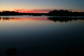
Boundary Waters Canoe Area Wildernessby bbmohrComment: Excellent photo but - what are those blotches doing in it? (lower left and lower middle)? You should have cropped them out, you would still have the horizon in the upper 3rd, and it would not spoil the image as it does now. Pity... |
 Photographer found comment helpful. Photographer found comment helpful. |
| 01/18/2006 12:26:35 AM |
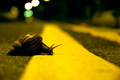
Double Parkedby scared_of_the_darkComment: Great DOF choice. Perfect theme for the challenge. The overall yellow tone bothers me a bit - not sure that it is the best choice for the photo.
I'm sure I'll be back to bump this one later. |
| Photographer found comment helpful. |
| 01/10/2006 11:23:20 PM |
Wooden Curlsby AlbireoComment: This one is similar to mine, only this one came out better IMO because of the light background. 8. |
| Photographer found comment helpful. |
| 01/05/2006 11:17:51 AM |
Classic Curvesby hughletherenComment: If you used some fishing line instead... (the transparent kind) it would have been more impressive. Very nice indeed. After the challenge, why don't you try cloning that rope out and show us all what it would look like then? |
| Photographer found comment helpful. |
| 01/05/2006 11:15:47 AM |
|
| Photographer found comment helpful. |
| 01/04/2006 01:55:53 PM |
|
| Photographer found comment helpful. |
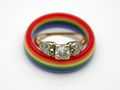
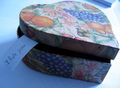
| 01/04/2006 12:11:23 PM |
Heart-shaped Boxby WawaaComment: The shadow cast in the front makes this look too snapshotty. A better lignting would have improved this image a lot. (E.g. having a sheet of white paper reflecting the natural light and illuminating the front of the box would have helped IMO). |
| Photographer found comment helpful. |
| 01/04/2006 11:40:53 AM |
Guitar Slideby thegrandwazooComment: Oohh, I like this one better than mine! (And I'm no troll!) I only wish it was bigger (I don't think that you utilized max 640 pixels and that may hurt you) |
| Photographer found comment helpful. |
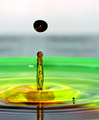
| 12/28/2005 10:48:20 AM |
Colorfull Dropby JasenkaComment: Prekrasno. Jedna od ljepsih fotografija - zanima me kakvo si osvjetljenje koristila. 50 ASA, f/8 i 1/1250 zahtijeva mnogo svjetla.
Wonderful! Given basic editing rules, I am surprised that it did not finish higher, but the 18th place is nothing to be ashamed of.
|
| 12/16/2005 11:12:42 PM |
Sensual Seductressby basssman7Comment: This image has great potential but it will fail to ribbon for the following reasons:
1) it has breasts (which are beautifully shaped, but controversial enough @ DPC)
2) the left hand is bent in the wrist in a funny way
3) the neck and the head do not appear to belong with the rest of the body.
Another suggestion for improvement: there is either a shadow or visible pants near the waist line. You could have cropped these, to leave more to imagination.
And whatever you do in the future, don't act on my suggestion #1. |
| Photographer found comment helpful. |
Home -
Challenges -
Community -
League -
Photos -
Cameras -
Lenses -
Learn -
Help -
Terms of Use -
Privacy -
Top ^
DPChallenge, and website content and design, Copyright © 2001-2026 Challenging Technologies, LLC.
All digital photo copyrights belong to the photographers and may not be used without permission.
Current Server Time: 07/18/2026 08:28:02 PM EDT.