| Image |
Comment |
| 01/19/2006 10:16:19 PM |
Thoughts elsewhere ...by kari1Comment: Maybe a better choice would have been to have focused on the girl in red shirt... your singled-out subject has too much of her face covered for effective presentation. |
 Photographer found comment helpful. Photographer found comment helpful. |
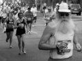
| 01/19/2006 10:14:50 PM |
Houston Marathon Runnerby CamComment: Billy Gibbons running the marathon in his hometown? Nah... but still very pretty capture. Not sure about the b/w choice, you could have bumped the contrast a bit to make the image stand out some more... |
| Photographer found comment helpful. |
| 01/19/2006 10:09:45 PM |
|
| Photographer found comment helpful. |
| 01/19/2006 10:01:16 PM |
The Futureby lcfourstarComment: I am not against post-processing blurring, but if it is done in such way to make the shot unreal, it takes away from it. E.g. the sand shore behind the kid is relatively sharp and in focus, while the lady next to the kid is out of focus. Should have blurred some of that shore to the left of the kid's head. 5 for trying. |
| Photographer found comment helpful. |
| 01/19/2006 09:45:57 PM |
Good Old Day'sby DianaComment: I thought that it is impossible in this type of challenge, but here is one that does not meet the challenge! It clearly stated 2005 in the description, and this is obviously taken in the 1920s. And don't tell me that you had a digital camera then! 1 from me.
Nice choice for b&w, almost would have been better if you've chosen perhaps sepia or even added some grain to the image to make it appear older than it is. Another thing to try is to perhaps leave more space on the top, to move the main subject away from the middle. Good luck in the challenge - 7. |
| Photographer found comment helpful. |
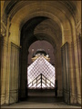
| 01/19/2006 09:37:29 PM |
Old and Newby GabrielComment: Deja vu! This looks like itsimring's red ribbon from a year ago... and I must say that it matches the quality, if not even compositionally stronger and with better lighting conditions.
I normally do not compare photographs, but this is so close to the other one that it just begs to be compared.
Expect high placement with this one. |
| Photographer found comment helpful. |
| 01/19/2006 03:54:21 AM |
End Of The Roadby geoffreyskuntzComment: Not a big fan of selective desat, but it works fine in this case. Nice and refreshing (not because it's a grave, but because it is different from others) photo in this challenge. Good luck! |
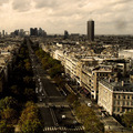
| 01/19/2006 03:51:12 AM |
Endless Roadby SannelComment: Aaah, Champs Elysées - Is this taken from l'arc de triomphe?
One of the most beautiful roads I've seen in my life.
This photo invoked nice memories, I stayed with it more than 4 minutes admiring it. Strictly subjective I know, but that's what the art is all about. You've found your audience in me. 10. |
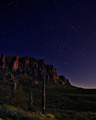
| 01/19/2006 03:35:04 AM |
Moonlight Sonataby kirbicComment: Wow! Really nicely done! I appreciate the technical superiority of this photography - and hope that other voters will realize how difficult it is to create such a shot. Good luck! |
| Photographer found comment helpful. |
| 01/19/2006 03:27:23 AM |
Self Portraitby PhotoTessComment: Interesting choice - the veil - beautiful face, well exposed and well lighted. One bothersome detail is the necklace that is IMO overblown and distracts - draws attention from the eyes and the face, and then dissapoints when I finally look at it as it is soft, and without any detail.
It is almost to the point of being better without it. (or if you had pearls, they would not reflect as much light as metallic jewelry.)
7. |
| Photographer found comment helpful. |
Home -
Challenges -
Community -
League -
Photos -
Cameras -
Lenses -
Learn -
Help -
Terms of Use -
Privacy -
Top ^
DPChallenge, and website content and design, Copyright © 2001-2026 Challenging Technologies, LLC.
All digital photo copyrights belong to the photographers and may not be used without permission.
Current Server Time: 07/19/2026 02:27:13 AM EDT.