| Image |
Comment |
| 02/05/2006 02:58:23 AM |
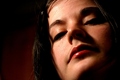
Darknessby toffleComment: Can't see the eyes, that's a major setback for me. Looks VERY strange this way, spooky. |
 Photographer found comment helpful. Photographer found comment helpful. |
| 02/04/2006 03:26:15 AM |
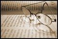
Fairytale comes to lifeby marvinComment: Greetings from the Critique Club :)
This is a good example of a photo that provokes the observer to establish a link to the challenge. One thing that is easily overlooked when making such images is the ability of the photographer to put him/herself outside the box of their own thoughts and look at the produced photo with the eyes of someone that does not know about the intent. For example, you know that the book is about the snowwhite, i.e. a fairy tale. For the careful observers that know Icelandic (and you've left very little text in focus) it may be obvious that the fairy tale is the link to fantasy. For me, it could have been a political science or a economy book, where little is left to fantasize about. Once the viewer recognizes the topic, then they can start appreciating the obvious link between reading and fantasizing.
Technicals: You've chosen a shallow DOF, and that left only a narrow portion of the glasses and the text in focus. For the Fantasy challenge, I would have preferred to convey fantasizing perhaps slightly differently: instead of having a shallow DOF, I would have gone with uniformly, yet tactfully softened image. That way the viewer could get the feeling of wandering off in the fantasy world while e.g. imagining themselves amidst the events they are reading about.
Choice of monochromatic image works well as it is universally accepted that we imagine/dream in monochrome.
Border: I haven't noticed it until I really looked hard at the image. This means that the border is tastefully applied and does not take away from the image.
-Serge
edit: separated paragraphs for easier reading Message edited by author 2006-02-04 03:27:29. |
| Photographer found comment helpful. |
| 02/03/2006 01:31:06 AM |
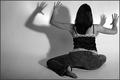
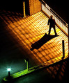
Confrontationby idnicComment: Nice take on the challenge. Perfect choice for b&w, as shadows are usually gray, and to try to make them stand out you have to eliminate the color from the rest of the image. The only negative is the pose - looks terribly uncomfortable and in my opinion is not in a perfect harmony with your title.
Still love it, bumping up to 8.
Good luck, Cindi! |
| Photographer found comment helpful. |
| 02/03/2006 12:41:35 AM |
|
| Photographer found comment helpful. |
| 02/03/2006 12:35:50 AM |
|
| Photographer found comment helpful. |
| 02/03/2006 12:34:22 AM |
Coffee Breakby GlouComment: This would have been better if you've had only a single light source from above, eliminating the cup shadows leaving only the shadow from a hand...5. |
| 02/02/2006 12:58:36 AM |
|
| Photographer found comment helpful. |
| 02/01/2006 05:56:24 PM |
Hollyby nsbca7Comment: Nice high-key photo, one of better high-key ones I've seen on this site. Love the shallow DOF, and careful choice of matching wardrobe (matches her eyes wonderfully.)
And yeah, Martin, you "way too overexposed" again :-) maybe you should check your MkII metering, LOL |
| 02/01/2006 02:15:14 PM |
The Sourceby jbsmithanaComment: Beautiful photo! (Gave it a 9). Could you change the date on it please - to be more realistic:-) (I'm not sure how did the system let you manage to submit the image outside the challenge dates anyway)
|
| Photographer found comment helpful. |
| 02/01/2006 02:38:39 AM |
|
| Photographer found comment helpful. |
Home -
Challenges -
Community -
League -
Photos -
Cameras -
Lenses -
Learn -
Help -
Terms of Use -
Privacy -
Top ^
DPChallenge, and website content and design, Copyright © 2001-2026 Challenging Technologies, LLC.
All digital photo copyrights belong to the photographers and may not be used without permission.
Current Server Time: 07/18/2026 10:21:54 PM EDT.