| Image |
Comment |
| 02/03/2007 03:08:58 AM |
The Dipperby CutterComment: very nice idea, almost wish to have a tighter crop here. The way the light reflects off of the water surface provided the perfect lighting - you should have made a better use of it. |
 Photographer found comment helpful. Photographer found comment helpful. |
| 02/03/2007 03:07:30 AM |
Mabelby InDotsComment: A clear path to face and her right shoulder behind the glass would have been better IMO, as I tend to look into subject's eyes and faces (even with nudes).
This distorts her face unjustly so if I may add.
Good luck! |
| Photographer found comment helpful. |
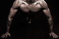
| 02/03/2007 03:05:27 AM |
Black & White by DrJOnesComment: Some more light on the backdrop could have worked better. (I double-checked my monitor before commenting :)
The whole photo goes on the dark side a bit, and the black body could stand out some more if e.g. a spotlight was aimed to the backdrop right behind him, in order to provide some kind of aura around him.
Not trying to teach you how to shoot (you obviously know your photography) just trying to explain what I would have liked better. Only a 9 for this. |
| Photographer found comment helpful. |
| 02/03/2007 03:01:11 AM |
Lady in Redby GiorgioComment: This one stands out - I'm not sure why, but I spent more time on it than on the majority of other shots. I think that it is the hat, and the appearance that the head is missing. An extra point for this intriguing shot. |
| Photographer found comment helpful. |
| 02/03/2007 02:58:44 AM |
|
| 02/03/2007 02:58:23 AM |
Pear of Legsby Rae-AnnComment: The rectangular shadow on the right side is distracting. This would have been much much better with plain background. |
| Photographer found comment helpful. |
| 01/31/2007 12:40:35 AM |
Unwelcome by UrfaKComment: Fantastic!!! you just raised the bar on yourself now. Congratulations on your well deserved ribbon. It will make the front page of DPC more beautiful and more enjoyable for the whole week. |
| Photographer found comment helpful. |
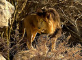
| 01/22/2007 01:45:24 AM |
He Dreamt of Lionsby anthonytuckComment: The old man and the sea?
Why so centered? Also, could have cropped it somewhat tighter, the surrounding is too distracting and you could have done without it. |
| 01/22/2007 01:41:14 AM |
Predatorby jeroweComment: Very nice colors - however the border serves more like an unnecessary distraction than an enhancement to this otherwise beautiful shot. |
| Photographer found comment helpful. |
| 01/22/2007 01:35:27 AM |
|
| Photographer found comment helpful. |
Home -
Challenges -
Community -
League -
Photos -
Cameras -
Lenses -
Learn -
Help -
Terms of Use -
Privacy -
Top ^
DPChallenge, and website content and design, Copyright © 2001-2026 Challenging Technologies, LLC.
All digital photo copyrights belong to the photographers and may not be used without permission.
Current Server Time: 07/17/2026 03:51:15 PM EDT.