|
|
|
Showing 121 - 130 of ~1004 |
| Image |
Comment |
| 08/30/2007 06:20:34 PM | Start of the Eclipseby noth1021Comment: I am assuming that you have only resized the image. You have a plenty of MPix in that Canon that you should be able to crop it decently before resizing it.
Photoshop (or other photo editing software) should become your friend...
Welcome! |  Photographer found comment helpful. Photographer found comment helpful. |
| 08/28/2007 10:51:12 PM | A Dreamy Afternoonby dseablomComment: Greetings from Critique Club!
.. and welcome to DPC. Well, you did not come in dead last, but it was somewhat of the below-average showing.
My first impression (when I first saw this image, I did not look at the challenge topic nor I have seen your score) was that the image is lacking technical quality to achieve the above 5.5 rating at DPC. The colors are hazy, either because of the sloppy post-processing, or, more likely, by slightly overexposed shot. The second impression was that there isn't a readily identifiable subject in this photo, (by now I've seen the challenge topic), and while it does not necessarily fail to meet the challenge description, it fails to wow the viewer with unique attractive scenery.
Therefore, you ended up with a relatively uninteresting shot of the woods, which is less than perfect technically.
I would recommend for the future avoiding ISO400 for the daytime photos. It only increases the noise and does not contribute to the image. Since you were going for a dreamy look, f/8 was probably not necessary, too.
It'd be interesting to see you get better - follow the forums (individual photo discussion is exceptional) and ask questions on your own photos. However, this is a small part of the photo world - make sure you always remember that DPC and the opinions of DPC members does not necessarily represent the true value of your photography; it just gives you an insight into what one category of people think about it.
So, keep shooting and keep submitting to challenges and participate in forums. Giving someone else a critique may get you to look at your own photos with different eyes.
I hope this helps!
best of luck,
-Serge | | Photographer found comment helpful. |
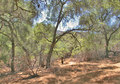
| 08/24/2007 02:53:47 AM | Tree on Hillby chaddybonesComment: Greetings from the Critique Club!
I'll try to give you my first reaction on the photo, so here we go:
- I like the choice of monochromatic representation for the image.
- normally, I do not like when people overdo the vignetting, but this photo is an exception, and only because of the already crooked trunk of the tree. Combined with the vignette, it makes the whole image appear warped and sucks the viewer right into it
- the lightness range/balance between the center of the sky and the dark edges is a little bit too much for me. I would have preferred to find the range elsewhere, this way the sky in the center appears blown out.
For the free study challenge, I think that this image landed right where it was supposed to, given the fact that free studies on DPC typically attract more appealing images than a lonely tree landscapes. Nothing wrong with your image, I'm just saying that in this challenge, it fell right where I would have expected it to fall - upper 20% but not an award contender.
I hope this helps - and best of luck in future challenges.
-Serge |
| 08/24/2007 02:46:01 AM | My Big Fishby protein_man2Comment: Greetings from the critique club!
I'd like to concentrate on a couple of things that you could have done differently and perhaps entice more positive response to your image.
First, composition. The fish filled the frame completely. This is not forbidden technique in general, but you really have to have something either less busy, more uniformly colored and shaped than the fish to have it fully in-your-face like this. It feels.... compressed. In general, and it might have helped here, it is usually a good idea to leave some empty space in front of the subject, in a general direction of where the subject is heading.
Second, lighting. Although you say that you did not use flash, the light source that came from right/behind you was pretty harsh and was falling unevenly on the side of the fish. The right side of the fish looks overexposed, while the left side looks like it has been metalized.
Aesthetically, this falls right in the middle of the pool. Challenge-wise, this was a free study, normally a challenge that attracts higher-quality images than a regular challenge, just because people concentrate on making the image looking perfect without having to worry about meeting the challenge. Had your score not suffered from the composition and lighting issues mentioned above, it would still have suffered from the perceived simplicity and snapshot-like choice for your subject.
This is only my opinion, which is a combination of what the image meant to me and what I think the explanation is for the 4.x score you've received. I hope you find it helpful.
-Serge |
| 08/22/2007 12:02:48 AM | | | Photographer found comment helpful. |
| 08/15/2007 12:40:50 AM | Look Mum, one hand!! by JudiComment: Wonderful shot, congrats on the well deserved yellow ribbon.
Congratulations to Kita as well, for putting up with mum's crazy photo ideas. | | Photographer found comment helpful. |
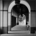
| 08/06/2007 12:23:51 AM | The Blanton Archesby nadiaCComment: An OK finish, should have ended higher up than this. I assume that you got hurt partially by the 'not a street' gang. Very nice presentation of the rain we've had tons of.
| | Photographer found comment helpful. |
| 08/05/2007 09:01:33 PM | DWT_0559.gifby dwterryComment: Cool! How many frames is this?
ETA: nevermind, I read the thread... 18 Message edited by author 2007-08-05 21:03:18. | | Photographer found comment helpful. |
| 08/05/2007 02:26:15 AM | Stay behind me!by srdanzComment: Originally posted by Chucker:
Beautiful shot...I love the textures of the deer & grasses. Less DOF would be nice, but if this had to be taken quickly, you may not have had time to adjust settings. |
I shot this at f/2.8, the widest my lens would do... I could have added some blur to the background in PP. Maybe I should do that. |
| 08/04/2007 06:58:55 PM | Hula Hoopby annigComment: Blur is OK here, as it it obviously a motion shot. However, some fill flash would make all the difference between the snapshot and a good photo.
ps. Don't name your portfolio folders "I suck at photography..." - or maybe do - it is a good advertising! | | Photographer found comment helpful. |
|
Showing 121 - 130 of ~1004 |
Home -
Challenges -
Community -
League -
Photos -
Cameras -
Lenses -
Learn -
Help -
Terms of Use -
Privacy -
Top ^
DPChallenge, and website content and design, Copyright © 2001-2026 Challenging Technologies, LLC.
All digital photo copyrights belong to the photographers and may not be used without permission.
Current Server Time: 07/16/2026 08:21:00 PM EDT.
|