Greetings from the critique club!
I'd like to concentrate on a couple of things that you could have done differently and perhaps entice more positive response to your image.
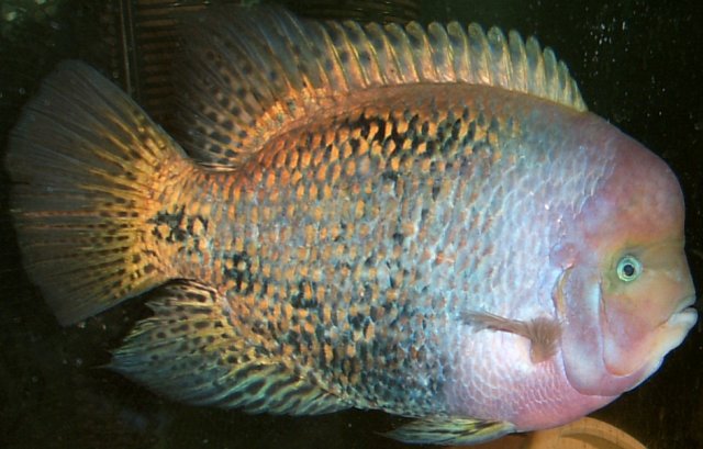
First, composition. The fish filled the frame completely. This is not forbidden technique in general, but you really have to have something either less busy, more uniformly colored and shaped than the fish to have it fully in-your-face like this. It feels.... compressed. In general, and it might have helped here, it is usually a good idea to leave some empty space in front of the subject, in a general direction of where the subject is heading.
Second, lighting. Although you say that you did not use flash, the light source that came from right/behind you was pretty harsh and was falling unevenly on the side of the fish. The right side of the fish looks overexposed, while the left side looks like it has been metalized.
Aesthetically, this falls right in the middle of the pool. Challenge-wise, this was a free study, normally a challenge that attracts higher-quality images than a regular challenge, just because people concentrate on making the image looking perfect without having to worry about meeting the challenge. Had your score not suffered from the composition and lighting issues mentioned above, it would still have suffered from the perceived simplicity and snapshot-like choice for your subject.
This is only my opinion, which is a combination of what the image meant to me and what I think the explanation is for the 4.x score you've received. I hope you find it helpful.
-Serge |