| Image |
Comment |
| 01/29/2005 11:39:46 AM |
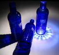
Three Bottlesby BShawnComment: The light on right and left bottles are very nice, but third one feels out of place. |
 Photographer found comment helpful. Photographer found comment helpful. |
| 01/29/2005 11:39:01 AM |
I Am A Three Year Survivorby rubyrednailsComment: Perhaps this is a cultural thing, because I don't have any idea what you've survived. But good for you! Image has quite warm feeling, but I'd like the white closer to the white. |
| 01/29/2005 11:37:01 AM |
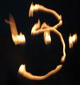
Three Flamesby JimBoSSComment: Quite original idea, but feels like it could be reworked to maintain even a bit of sharpness. |
| Photographer found comment helpful. |
| 01/29/2005 11:35:48 AM |
|
| Photographer found comment helpful. |
| 01/29/2005 11:34:59 AM |
Whyby kennytComment: My girlfriend liked the idea, the simplicity but I hate the tones and don't get almost anything at all from the image. |
| Photographer found comment helpful. |
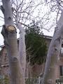
| 01/29/2005 11:34:12 AM |
THREE BRANCHESby hauntingimagezComment: This is perhaps the worst image on the challenge. The light is awful and it has pushed the tones very unsatisfying. The only good color contrast shines in cut branch and that makes me wonder what exactly are the three branches as the trees are full of branches and there's even more branches on the background. The house on the background is falling backwards. The composition doesn't really highlight what's the photographers point here. I'm sure you had good intentions, but I'd say there's lot of potential for you to develop your senses by retaking this image. Choose better lighting, experiment with dozens of different compositions and arrangements with this exactly same subject, work on the image when it's on the computer by chaning it levels, diminishing the unneeded background etc. Then compare to this take, and I'm sure you'll get some "hmm...Hmmm..." -moments! |
| Photographer found comment helpful. |
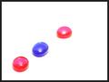
| 01/29/2005 11:28:43 AM |
Beadsby shavenwalrusComment: Depth of field is blurring and separating the third one. Colors are quite saturated, feel like oversaturated, but exposure has been nice on the background. |
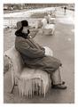
| 01/29/2005 11:27:45 AM |
3 guys 3 zingby jjbeguinComment: The guy and the chair are marvellous and perfect for a subject on their own, but the background doesn't add up meaningfully. The other people are quite a bit of stretch so the image doesn't fit too well on this theme. I'd like to give you much higher number, but can't in this category. And you'll make the image better by reconsidering the tones on the ice (and border). |
| Photographer found comment helpful. |
| 01/29/2005 11:24:35 AM |
flytrapby grahampComment: Almost feels like these are animals on their own :). |
| Photographer found comment helpful. |
| 01/29/2005 11:24:17 AM |
-3-by mbardeenComment: This is extremely nice. Composition works, and the idea is great. If only the bottommost spike wouldn't shine that much nor the leave glow that much on the bottom part (the top part is great)! |
| Photographer found comment helpful. |
Home -
Challenges -
Community -
League -
Photos -
Cameras -
Lenses -
Learn -
Help -
Terms of Use -
Privacy -
Top ^
DPChallenge, and website content and design, Copyright © 2001-2026 Challenging Technologies, LLC.
All digital photo copyrights belong to the photographers and may not be used without permission.
Current Server Time: 04/01/2026 04:37:36 PM EDT.