| Image |
Comment |
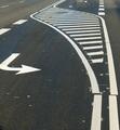
| 11/22/2004 07:23:22 AM |
black and whiteby visaksenComment: Nice idea, but the image isn't BW. You could also work on execution, as the topmost pointer is too far on the edge to work well together witht the lower one. |
 Photographer found comment helpful. Photographer found comment helpful. |
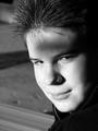
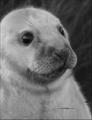
| 11/22/2004 07:22:20 AM |
Deep in Thoughtby bjc0001Comment: Hair is very sharp, but skin seems blurred. Both have nice tones. Name doesn't match the image as it is. |
| Photographer found comment helpful. |
| 11/22/2004 07:21:21 AM |
Pebblesby SteveJComment: Highlighted stone, with interesting form, is a bit blown, and shadows don't show too much detail. |
| Photographer found comment helpful. |
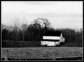
| 11/22/2004 07:20:19 AM |
Old Barnby JeileenComment: Killing contrast might work better if the roof would be distinguishable from the woods. If this wasn't shot on film, try to find contrast from different channels (I guess green would display some difference on roof and woods). Otherwise I like the contrast, as the detail is still present. Composition is a bit odd on bottom, and there's feeling the image is not straight even though it might be. |
| Photographer found comment helpful. |
| 11/22/2004 07:18:18 AM |
Lookin' Westby hillbilly_jeeperComment: This image is seriously missing shades. Composition is very original, the wires wouldn't bother too much but extra diagonal component on right is probably too much. The sun is partially blocked which is weird. Can't say I don't like the idea, but this execution isn't succesful to my eyes. |
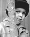
| 11/22/2004 07:16:21 AM |
Tree Huggerby riotspyneComment: I wouldn't guess the tree is the main subject like it seems hinted by the focus. Look is touching even though tones at eye seem to be pretty blocked. So the contrast is not where it should be. |
| Photographer found comment helpful. |
| 11/22/2004 07:14:45 AM |
|
| 11/22/2004 07:13:24 AM |
|
| 11/22/2004 07:12:23 AM |
BUCHE (Korean fan)by docpjvComment: Form is nice, and light seems to do it's job. Cropping is odd, regarding repeating form on the bottom, and partly cropped marks on left. |
| Photographer found comment helpful. |
| 11/22/2004 07:11:01 AM |
Trainwheelsby scottaubComment: Subject is clear, form mentioned in assigment is present in multiple variations. I'm not sure the triangle at top adds anything useful. Main areas are quite contrasty, so maybe softer light would have been better. |
| Photographer found comment helpful. |
Home -
Challenges -
Community -
League -
Photos -
Cameras -
Lenses -
Learn -
Help -
Terms of Use -
Privacy -
Top ^
DPChallenge, and website content and design, Copyright © 2001-2026 Challenging Technologies, LLC.
All digital photo copyrights belong to the photographers and may not be used without permission.
Current Server Time: 04/02/2026 01:30:26 AM EDT.