| Image |
Comment |
| 01/29/2005 03:57:28 AM |
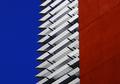
Apple´s sellerby joaquinComment: There's strong feeling in this one, coming from bright color contrasts and perhaps surprisingly disproportional objects. I feel the composition is too tight for the red apples and too right sided for the seller. You've managed to make the backround static enough. |
 Photographer found comment helpful. Photographer found comment helpful. |
| 01/04/2005 06:29:49 AM |
|
| Photographer found comment helpful. |
| 01/04/2005 06:26:32 AM |
Mechanical Graveyardby jessieComment: There's too much of everything. Too much of gray and way too much colors (feels oversaturated), too much of flurry and hussle. It very hard to say what's the point of the image apart of "mechanical things attract others to the limit of chaos". Still, there's lot to see here, so even if my eyes would have liked to skip I maintained my position over this for a moment. |
| Photographer found comment helpful. |
| 01/04/2005 06:23:28 AM |
A fine deviceby jjbeguinComment: Great image if it was like this. Now it feels way overly saturated and contrasted. On the other hand, many people like candy colors. In any case the composition is nice, giving room for the background in balanced way. |
| Photographer found comment helpful. |
| 01/04/2005 06:21:29 AM |
The Pratice Issueby graphicfunkComment: The image is quite gray (or was before toning). Nice idea. I would have liked the metronome positioned closer to center, now it's falling away. Highlight at after the rightmost hand could be good, but feels like it's also too close to the border to be good now. |
| Photographer found comment helpful. |
| 01/04/2005 06:19:16 AM |
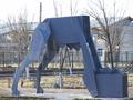
Papagalu de betonby piticuComment: Cold tones fit, but light doesn't seem good elsewhere than on leftmost leg. Background is horrible, but that you probably knew already. |
| Photographer found comment helpful. |
| 01/04/2005 06:17:30 AM |
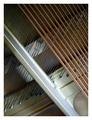
Piano Studyby nicolepComment: Feels like there's something to work on with the white balance. Nice composition though. |
| 01/04/2005 06:16:31 AM |
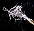
Happy 2005! Peace, Love, Health and Ribbon! by LuxvichComment: Very nice touch. Light is perfect and you've managed to get even some sparkle in some brilliant droplets. It feels so done, but still is elusive as it's natural enough. Can't say yet if that's ribbon, but it's good anyway. |
| Photographer found comment helpful. |
| 01/04/2005 06:12:35 AM |
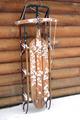
Sydney's Sledby bbower1956Comment: Doesn't feel too sharp. Your subject is nice, but I'm sure you could have got much more out of it. In addition putting the sled into some other position, to some other background, you might like to do it in some other part of day so that light would favor you a bit. |
| 01/04/2005 06:10:03 AM |
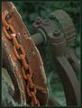
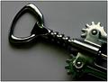
Screwedby MikeOComment: They do these electronically too these days, but I simply cannot see why. Odd feeling when the light or environment haev some blue and green parts. Shadow makes the bottom wheel look like it barely fits into the frame. |
| Photographer found comment helpful. |
Home -
Challenges -
Community -
League -
Photos -
Cameras -
Lenses -
Learn -
Help -
Terms of Use -
Privacy -
Top ^
DPChallenge, and website content and design, Copyright © 2001-2026 Challenging Technologies, LLC.
All digital photo copyrights belong to the photographers and may not be used without permission.
Current Server Time: 04/02/2026 07:41:49 AM EDT.