| Image |
Comment |
| 05/02/2007 08:48:54 PM |
whakatopaby rinacComment: This does look quite nice. Only suggestion would be to touchup the Cyans to make it look like more a blue sky color, and add a touch of Saturation. If you're using photoshop, then that Hue/Saturation dialog is all you need. I tried it and it looked great. |
 Photographer found comment helpful. Photographer found comment helpful. |
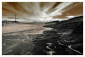
| 05/02/2007 08:43:07 PM |
Riding The Waveby yakatmeComment: Gotta love this. Excellent leading lines here. Though the colors are somewhat oversatured for my taste. |
| Photographer found comment helpful. |
| 05/02/2007 08:42:13 PM |
Nautical Directionsby SomeamateurComment: A very nicely capture beach scene. Though the stake looks unnaturely pasted in and out of place. The idea is very interesting, just wondering if there was some other way to implement it in the image. |
| Photographer found comment helpful. |
| 05/02/2007 08:39:13 PM |
Pilgrimsby BrinComment: A stunning vista! but I must say it looks oversharpened to me and the image quality could have been a little better. If you need help with PP work leave me a note at the end of the challenge :) |
| Photographer found comment helpful. |
| 05/02/2007 07:34:11 PM |
daffodilby CapeSailComment: No comments yet! This is one good macro :)
The point of focus is perfect. What I like most is the unique composition and the backlighting glow.
Always a pleasure to see a different viewpoint on subjects that we've seen before. |
| Photographer found comment helpful. |
| 05/02/2007 07:30:50 PM |
|
| Photographer found comment helpful. |
| 05/02/2007 07:26:46 PM |
KatieIMGcd_0707.jpgby dsternerComment: A pretty portrait. Has a charming playfulness to it.
Nicely posed and composed :) Just a few suggestions, the eyes are a little OOF, perhaps some sharpening can rescue that and maybe darken the light reflection on the aqua colored card. Message edited by author 2007-05-02 19:28:39. |
| Photographer found comment helpful. |
| 05/02/2007 07:22:53 PM |
crisisby boysetsfireComment: An excellent image. Nice concept! Really like the composition, and background is way awesome. The tones and contrast are perfect. I only find those little bright bits of white spots somewhat distracting seeing the rest of the image is fairly dark, and them being so hot. |
| Photographer found comment helpful. |
| 05/02/2007 04:10:59 PM |
|
| Photographer found comment helpful. |
| 05/01/2007 08:01:56 PM |
morningby vikasComment: That's one scene I wouldn't mind seeing in the morning. Looks warm and inviting. |
| Photographer found comment helpful. |
Home -
Challenges -
Community -
League -
Photos -
Cameras -
Lenses -
Learn -
Help -
Terms of Use -
Privacy -
Top ^
DPChallenge, and website content and design, Copyright © 2001-2026 Challenging Technologies, LLC.
All digital photo copyrights belong to the photographers and may not be used without permission.
Current Server Time: 06/21/2026 08:47:12 AM EDT.