| Author | Thread |
|
|
05/02/2007 07:26:46 PM |
A pretty portrait. Has a charming playfulness to it.
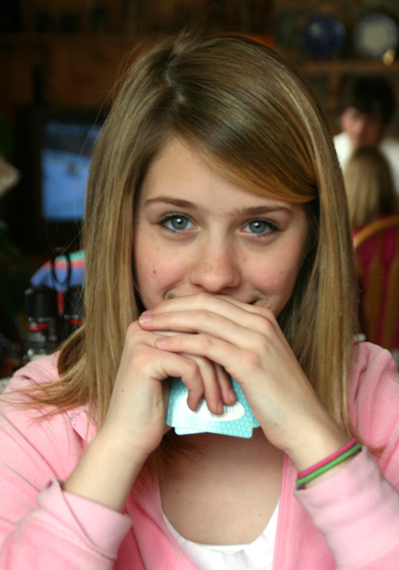
Nicely posed and composed :) Just a few suggestions, the eyes are a little OOF, perhaps some sharpening can rescue that and maybe darken the light reflection on the aqua colored card.
Message edited by author 2007-05-02 19:28:39. |
|
 Photographer found comment helpful. Photographer found comment helpful. |
|
|
04/15/2007 08:52:15 AM |
|
Sorry I'm late :( Your focus is muuuuuch better!! :) She does have lovely eyes and the pink looks great on her. |
|
| Photographer found comment helpful. |
|
|
04/12/2007 10:48:56 AM |
|
What a lovely niece you have Deb! She has beautiful eyes. With your background that you do have, the center crop works very nice here. |
|
| Photographer found comment helpful. |
|
|
04/12/2007 08:25:47 AM |
|
What a pretty girl! I do wish there were a bit better focus on her eyes here. Definitely try to get her to pose again for you in other shots! |
|
| Photographer found comment helpful. |
|
|
04/12/2007 08:11:35 AM |
|
She's pretty and the background doesn't interfere too much. I don't think you can dodge and burn (or clone or any other destructive action) on adjustment layers on cs2 - I think that's one of the new features of cs3 - but you can copy the background layer and d&b on that and add a mask if needed. If this turns out to be bad information then I apologise in advance. |
|
| Photographer found comment helpful. |
|
|
04/12/2007 07:40:30 AM |
You did great. I think this looks good. Of course. . .she's beautiful, so it would be hard for a picture of her to look bad, but with her dressed in pastel pink -- the already dark background doesn't look bad tome. Yeah. . .sometimes when you take too much out of the background -- it looks really fake and overdone right around the subject. I would leave the background in on this one.
|
|
| Photographer found comment helpful. |
Home -
Challenges -
Community -
League -
Photos -
Cameras -
Lenses -
Learn -
Help -
Terms of Use -
Privacy -
Top ^
DPChallenge, and website content and design, Copyright © 2001-2026 Challenging Technologies, LLC.
All digital photo copyrights belong to the photographers and may not be used without permission.
Current Server Time: 07/17/2026 10:14:41 PM EDT.