| Image |
Comment |
| 04/11/2005 12:45:46 AM |
Donovanby ShannonComment: Needs some kind of different lighting to show the cat's facial features a little better. Hard to make out. Hope that's helpful. |
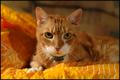
| 04/11/2005 12:43:00 AM |
Pinkby pawdrixComment: I'm not a cat fan, but I thought this was decent, but the orange blanket kinda competes with the subject. Mighta looked better against black or even better if it was a dog. ;-) |
 Photographer found comment helpful. Photographer found comment helpful. |
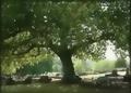
| 04/10/2005 03:03:05 AM |
graveyard.JPGby trainComment: I'm not too fond of it. It does look kind of 'dreamy' though. Stuff in the far background just looks too washed out / blurry / blobby to me. Fun stuff to do, though! :) |
| 04/09/2005 01:00:00 PM |
|
| Photographer found comment helpful. |
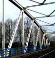
| 04/09/2005 12:57:19 PM |
winkby messerschmittComment: Neat! Although I don't see the K - I do see more of a G to make it "WING" - I like the colors except for the sky is a little washed out. Good eye for detail though! |
| Photographer found comment helpful. |
| 04/08/2005 09:30:20 PM |
George by Rando D300Comment: Awesome lighting. Very nice job - this is in my top 5 |
| Photographer found comment helpful. |
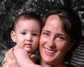
| 04/08/2005 08:22:49 PM |
Mother & Daughterby BudComment: Very nice protrait - might be better if it was portrait-oriented and see a little more of the subjects. The baby's expression is a little strange also. I'm no child photographer, but I think you're supposed to squeeze a squeeky toy at thenm and make goofy faces. ;-) |
| Photographer found comment helpful. |
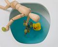
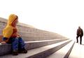
| 04/08/2005 08:15:35 PM |
troppum.jpgby asijComment: Originally posted by rex07734:
I like it. I think you could make it a lot better with some cropping. I would crop about half of the photo out. Half of the right I should say. The background is just too bright for me. The pov on the kid is excellent though. Try to crop it like I suggested then look at it. If you don't like it then fine. I think it would make a marvelous print if you done that. It would give a sense of lonliness. You have a good eye and frame your subject well. |
Not sure if I agree with Rex - to me there are 2 subjects and sounds like he is saying to crop one out. Overall I like the shot. Without a title it is hard to caption it though. Maybe some statement about a father walking away from his responibilities? What is the intended conveyance? |
| Photographer found comment helpful. |
| 04/06/2005 02:33:17 AM |
//\\//\\by totaldisComment: Clever title! Extra point for that. Most would have tried explaining the photo in the title - I hate that. The photo is a bit busy, but good job overall. |
| Photographer found comment helpful. |
| 04/06/2005 02:30:07 AM |
|
| Photographer found comment helpful. |
Home -
Challenges -
Community -
League -
Photos -
Cameras -
Lenses -
Learn -
Help -
Terms of Use -
Privacy -
Top ^
DPChallenge, and website content and design, Copyright © 2001-2026 Challenging Technologies, LLC.
All digital photo copyrights belong to the photographers and may not be used without permission.
Current Server Time: 04/10/2026 09:52:18 PM EDT.