DPChallenge: A Digital Photography Contest You are not logged in. (log in or register
 
Browse Settings
Currently viewing:
Registered Usereschelar

Show comments:

Per page:

Order:

Comments:


Comments Made by eschelar
Pages:   ... [51] [52] [53] [54] ... [159]
Showing 501 - 510 of ~1589
Image Comment
Nature's Opulent Power
05/20/2008 08:57:31 PM
Nature's Opulent Power1st Place
by SJCarter

Comment:
Really, really nicely done. Perfect bolt. The timing is just part of the battle really. Compo is often tricky and this one played for you very nicely.
Photographer found comment helpful.
MAID
04/09/2008 11:04:10 AM
MAID
by DrJOnes

Comment:
I love your Nikon 70-200 f/2.8...
Ye Old Stompin' Ground
04/09/2008 10:41:22 AM
Ye Old Stompin' Ground
by cynthiann

Comment:
critique as requested in the forums.

Issues:
#1 subject of the photo = building. It can work for you. It can also fail to work for you. Personally, I think you did OK with what you had to work with, but there is no real sense of dramatics with this image. Nothing interesting about the POV. It's just a building from standing height eye level. There is nothing else in the picture to give context or compare to anything else in the pic. The human interest aspect is a bit lacking.

#2 Processing. A number of issues here, but not all bad. I like the processing on the building as related to the general look of it. Some problems that are commonly penalized here on DPC such as an 'overprocessed' look (although that one's a bit pot luck on how it's received IMHO - some people manage OK with an overprocessed look for certain reasons), blown highlights and not-smooth color transitions. I am guessing from your comment 'a different approach for me' that much of this you are aware of and at least some of it was intentional.

Specifically:
- The whites in the clouds are blown. This could be avoided by bringing the midtones up using curves (or levels if you want the slightly more complicated route) instead of brightness and contrast. It appears that your pushed the brightness of the building since it seems quite bright.
- The blues in the sky are too strong and not natural looking. Again, this may be intentional, but it's just a bit over the top I think... The sky is not a major element of the picture, so there's no real reason that it should be emphasized so strongly. This could be a result of pushing the saturation too hard, or something else, but a possible solution (and legal in basic) is to use saturation on a specific channel and tone it back a bit. Selective color can also help here if needed.

#3 Lines. Honestly, I'm not feeling anything from any of the lines in the picture. None of them are specifically pushing my eyes in any particular direction. For a picture full of lines, none of them seem to have much purpose. It could be worse.

Bottom line, I think the subject of the picture just isn't that DPC friendly. If it were for a newspaper article about a record store called the family dog or something, it would be fine. It's a decent presentation of the side of a building.

I think it would have been helped a lot by a skinny kid in running shoes with no socks bouncing a basketball though. or something...
Photographer found comment helpful.
Every Picture Tells a Story
04/07/2008 05:36:58 AM
Every Picture Tells a Story3rd Place
by SandyP

Comment:
killer shot. Love the ring.

This would look fantastic as an anti-smoking poster with a caption: Happy 25th Birthday from your friends at Marlboro.

hee hee. :)
Photographer found comment helpful.
Silenced
04/07/2008 05:24:30 AM
Silenced3rd Place
by lovethelight

Comment:
ekkkssepshunnel!

I like it so much, I'm going to put this in a test for my kids english class. woo. You are going to be famous with a small group of kids on the other side of the world! :)
d i S c O n n E c T
04/07/2008 05:18:03 AM
d i S c O n n E c T1st Place
by timfythetoo

Comment:
I'm sorry that I had to add another favorite to this one. it's just so damned striking, I couldn't help it.
:)
Photographer found comment helpful.
1
03/16/2008 08:58:18 PM
1
by whiterook

Comment:
;) I guess the point is that you never really know what is intentional in a whiterook masterpiece. Always something going on that builds the mystery! *big smirk*
Photographer found comment helpful.
d i S c O n n E c T
02/20/2008 07:33:59 AM
d i S c O n n E c T1st Place
by timfythetoo

Comment:
A real standout on the front page. Nicely done and congrats on the 0 1's. Woo!
Photographer found comment helpful.
Muriphobia - Waking up with Rats
01/09/2008 07:53:00 AM
Muriphobia - Waking up with Rats
by BigDaddy

Comment:
hey guy, I was doing a school project and was browsing pics of rats. I saw this one and thought I might have a bit of a quick go at it.

Incidentally, virtually none of this is legal in basic... that doesn't really matter since the pic has been entered and pulled a vote.

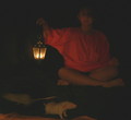
#1 - composition... I used the crop tool to slice out the top part of the face (for mood) and bring the eye's attention away from the face to the eye to the hand and lantern. Note that the lantern is using the rule of thirds, but the hand is not. It is secondary to the lantern and serves to move the eye left rather than being a specific subject. I also pushed the pic a bit wider which gave me nasty black edges that did nothing for the picture other than change the ratios a bit... I could have tried to match the grey of the shadows, but I went a different way by using a separate layer and filling it with my brush, using a mask to erase it. My purpose there was to amplify the mood generated by the lantern... If I were following basic editing rules, I'd probably have thrown a fairly thick black border maybe with a thin highlight border to accent the rat's eye. I would have used a minor rotate to bring the edge of the yellow blanket in line with the bottom and crop it off.

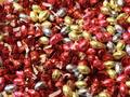
#2 - the pic already has virtually no other tones than red and yellow and precious little of those colors too, so the result is going to be both grainy and rather lopsided for colors. I took this as an advantage and chose to work specifically on the red and yellow colors. I could have made it look a bit better by mucking about with some tricks of hue-shifting and other labor intensive stuff, but I wasn't interested...

I desaturated everything in two layers via hue/saturation, one layer for reds, one layer for yellows (legal in basic) and masked the heck out of it. I could have gotten close by using the curves on specific color channels and selective colors as well.

I then added a hue/saturation layer for hue shifting to warm up the quality of the heavily deflated reds and tweak the yellows a bit.

Since the photo is so dark in most areas, it's a bit fiddly to work with the contrast, so it's virtually pointless to go at this with brightness/contrast. I used two curves layers. You could do something pretty similar with levels, but you'd probably need to do more than just adjust your black point. Either way, this all amplifies the noise and grain too.

Since the pic was themed for fear/phobia, I made some choices that I might not have made for a different theme, but what I came up with was this.

Hope it helps. It's not a quality edit, just a little something I fiddled with for a couple of minutes so I could use it in my spanish test for two seconds. But I thought I would share the process so you could see how the tools affect an image.

Message edited by author 2008-01-09 07:57:27.
Billy Bob Teeth
01/03/2008 02:26:40 AM
Billy Bob Teeth
by robst

Comment:
man, isn't it ironic that the bottom rung shot is probably the coolest gift of them all.
Photographer found comment helpful.
Pages:   ... [51] [52] [53] [54] ... [159]
Showing 501 - 510 of ~1589


Home - Challenges - Community - League - Photos - Cameras - Lenses - Learn - Help - Terms of Use - Privacy - Top ^
DPChallenge, and website content and design, Copyright © 2001-2025 Challenging Technologies, LLC.
All digital photo copyrights belong to the photographers and may not be used without permission.
Current Server Time: 09/07/2025 03:11:46 PM EDT.