| Image |
Comment |
| 01/17/2005 04:41:51 PM |
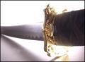
The sound of musicby lebowskiComment: The duotone looks strange, too aggressive. A more decent brownish yellow or sepia would have been better and more fitting for the theme of the 'old technology'. 4. |
| 01/17/2005 04:40:21 PM |
|
| 01/17/2005 04:38:43 PM |
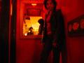
The Last Samuraiby KeysComment: Too many blown out highlights, motion blur. Nice composition, although a hand on the grip wpuld have done well. 3. |
 Photographer found comment helpful. Photographer found comment helpful. |
| 01/17/2005 04:37:56 PM |
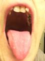
DEEP THROATby hauntingimagezComment: Unsharp. I don't see the throat, but the mouth. Also (sorry for attacking your model/yourself) the black teeth aren't very nice to look at. 2. |
| 01/17/2005 04:36:34 PM |
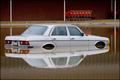
Pulp Fictionby mpalitangComment: I don't like the composition, it's too static even with the diagonal lines. Also, it doesn't look as if you had put too much effort into this shot. The title fits well, but you had to use the common diactionary method. Also, you've got some bad jpg artifacts in there! 5. |
| Photographer found comment helpful. |
| 01/17/2005 04:34:45 PM |
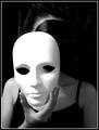
The Maskby mesmerajComment: Cool. Good idea to paint the face black, looks like the mask was the real face. I don't like the lighting though, it's not very interesting. A bit too dark overall, although the mask's blown out already. 6. |
| Photographer found comment helpful. |
| 01/17/2005 04:32:58 PM |
Splash!by panoramixComment: Ouch... The title doesn't fit that well, there is no splash. Maybe you'd have found something more fitting for your picture. 4. |
| 01/17/2005 04:31:53 PM |
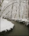
The Passion of the Christby GSRsedanComment: Wow. Looks like ice burning downwards. Two oxymorons with one element. Great colour, I like the cold blue and the range of the bright and dark areas. I don't like the other...stuff around it, it's distracting (mainly on the left). Otherwise, and with a tighter crop on the right, this would have one more point. 9. |
| Photographer found comment helpful. |
| 01/17/2005 04:29:15 PM |
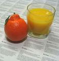
Mystic Pizzaby TooCoolComment: Judging from the LotR figurines, this could be one of Joey Lawrence's pictures, but it's a different style. The pizza could be floating a bit more above the ground, and some neon light undernath it would have been intersting (UFO ;) 5. |
| Photographer found comment helpful. |
| 01/17/2005 04:27:23 PM |
|
| Photographer found comment helpful. |
Home -
Challenges -
Community -
League -
Photos -
Cameras -
Lenses -
Learn -
Help -
Terms of Use -
Privacy -
Top ^
DPChallenge, and website content and design, Copyright © 2001-2026 Challenging Technologies, LLC.
All digital photo copyrights belong to the photographers and may not be used without permission.
Current Server Time: 07/22/2026 03:44:48 AM EDT.