| Image |
Comment |
| 01/28/2005 04:56:22 PM |
Bloom 'n Oldby ZippyComment: You might have desaturated or saturated the green channel. Now it's somthing in between which doesn't look too well. 5. |
 Photographer found comment helpful. Photographer found comment helpful. |
| 01/28/2005 04:54:36 PM |
Deep in prayersby zerocusaComment: Good composition. I like the tilt. Good DOF. The grain is interesting and adds to the image's character. 10. |
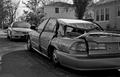
| 01/28/2005 04:51:03 PM |
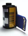
Old CD to New iPODby krazyivanComment: Your CD is out of focus. Use a smaller aperture (or was it bigger?... check the tutorials if you want to be sure, I'm not anymore ;) to get a wider DOF. Flipping the image would have been good, to make the iPod display readable. 4. |
| Photographer found comment helpful. |
| 01/28/2005 04:49:30 PM |
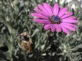
Very Close to be Old&Newby ridvanerkanComment: I guess your title is to suggest that your picture meets the challenge even though it's not obvious. Well, the only thing I can imagine for this shot to fit the challenge is that in the center of the plant new leaves start to grow. Is that what you're referring to? Nice bokeh. A bit grainy, some NeatImage would have been good. 5. |
| Photographer found comment helpful. |
| 01/28/2005 04:47:31 PM |
|
| Photographer found comment helpful. |
| 01/28/2005 04:46:45 PM |
Literature Bridges Timeby MarkComment: Too rigid. How about a big pile of books? That would bring in more dynamic. You have too many vertical lines. Also, chose another light source next time to avoid the gkares on the books' backs. 4. |
| Photographer found comment helpful. |
| 01/28/2005 04:45:16 PM |
Mother And Daughterby tchilyanComment: Over-exposed. Bad JPEG artifacts. And they both look quite young. Did you want to tell the mother she's old? Watch out! 3. |
| 01/28/2005 04:44:03 PM |
Listenby H R VerryComment: Intersting perspective. Looks cool, I especially like the noise. The only distracting thing is the text in the background. 8. |
| Photographer found comment helpful. |
| 01/28/2005 04:43:16 PM |
|
| 01/28/2005 04:42:18 PM |
|
| Photographer found comment helpful. |
Home -
Challenges -
Community -
League -
Photos -
Cameras -
Lenses -
Learn -
Help -
Terms of Use -
Privacy -
Top ^
DPChallenge, and website content and design, Copyright © 2001-2026 Challenging Technologies, LLC.
All digital photo copyrights belong to the photographers and may not be used without permission.
Current Server Time: 07/22/2026 03:35:04 AM EDT.