| Image |
Comment |
| 04/18/2005 09:22:59 AM |
Whoaby peeteComment: Excellent outtake. I think you were very lucky that the guy on the left was too fast, it adds a lot of interest. |
 Photographer found comment helpful. Photographer found comment helpful. |
| 04/14/2005 12:40:59 PM |
Kby paynekjComment: Originally posted by legalbeagle:
Why is it 550 high, and not 640 high??? |
So that it fits exactly onto my screen in Firefox :)
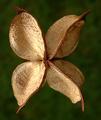
A great picture, I was surprised when I read it's a seed, I thought it was a flower! Well, a brown flower... Anyway, it's well executed and very creative. Congrats on your 8th finish. |
| 04/14/2005 10:40:11 AM |
yby glodaComment: Thanks for all your kind comments. I've never ranked that high. Nonetheless I must amdit I opted for a 7 :)
Here's my source of inspiration:
 Message edited by author 2005-04-14 10:40:45. Message edited by author 2005-04-14 10:40:45. |
| 04/13/2005 09:40:09 AM |
The Alpha and the Omegaby rblantonComment: I gave it a seven. The problem is that the letters are not that obvious, they are not the picture's main point of interest. |
| Photographer found comment helpful. |
| 04/11/2005 02:59:35 PM |
"V"by TallblokeComment: Needs sharpening. B/W would be nice. 6. |
| 04/11/2005 02:59:11 PM |
Zby AlbireoComment: Nice textures and colours. 8. |
| Photographer found comment helpful. |
| 04/11/2005 02:58:14 PM |
|
| Photographer found comment helpful. |
| 04/11/2005 02:34:19 PM |
|
| Photographer found comment helpful. |
| 04/11/2005 02:32:46 PM |
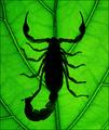
Find the 'A'by MihaiCiobanuComment: Didn't find it, sorry. It's not too good for this challenge to hide the object of main interest. 2. |
| 04/11/2005 02:30:45 PM |
|
Home -
Challenges -
Community -
League -
Photos -
Cameras -
Lenses -
Learn -
Help -
Terms of Use -
Privacy -
Top ^
DPChallenge, and website content and design, Copyright © 2001-2026 Challenging Technologies, LLC.
All digital photo copyrights belong to the photographers and may not be used without permission.
Current Server Time: 07/22/2026 06:19:26 AM EDT.