| Image |
Comment |
| 01/18/2006 01:14:39 PM |
Headless Horseman Bridgeby JMSComment: Oooh, Sleepy Hollow! Too bad the image mood doesn't fit the title :) Good use of long exposure. The composition is fine, colours too. 7. |
| 01/18/2006 01:13:39 PM |
The Calm Before the Stormby buckwheatComment: Is that you Zoomdak? :) I don't like the subdued colours here. You should either have pushed them or converted them to B/W. 6. |
 Photographer found comment helpful. Photographer found comment helpful. |
| 01/18/2006 01:12:47 PM |
911 Tributeby bjallenComment: The main subject is overexposed. The composition is not very interesting. The background is distracting. 3. |
| 01/18/2006 01:11:33 PM |
|
| Photographer found comment helpful. |
| 01/18/2006 01:10:14 PM |
|
| Photographer found comment helpful. |
| 01/18/2006 01:06:47 PM |
|
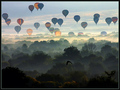
| 01/18/2006 01:05:35 PM |
Flight by jemisonComment: This seems familiar. I like this one better than the (assumed) one in my memory. The layers of distance are great, the dimensions are emphasized by the bird which other might find destracting. I also like the pale colours of the balloons. 10. Adding to favs. |
| Photographer found comment helpful. |
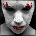
| 01/18/2006 01:03:29 PM |
Twistedby hannekeComment: Good image, very disturbing. The post-processing is good, not excessive. You just lost some detail on the nose. Maybe the expression is too passive, the face - even though the model looks at you from below - looks too relaxed. 7. |
| Photographer found comment helpful. |
| 01/18/2006 01:01:24 PM |
Tranquillityby ArnarHComment: The colours are not so great, you might have converted this to B/W. Also, your horizon seems tilted. 5. |
| Photographer found comment helpful. |
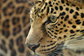
| 01/18/2006 01:00:26 PM |
On the prowl.by dickelComment: Good use of a shallow DOF. Unfortunately, the composition is poor. It would be good if all of the head was visible. Either you zoomed in to far, or you cropped the image too tightly.
Also, the image seems washed-out on the left. You can try to play around with curves to fix that. 6. |
| Photographer found comment helpful. |
Home -
Challenges -
Community -
League -
Photos -
Cameras -
Lenses -
Learn -
Help -
Terms of Use -
Privacy -
Top ^
DPChallenge, and website content and design, Copyright © 2001-2026 Challenging Technologies, LLC.
All digital photo copyrights belong to the photographers and may not be used without permission.
Current Server Time: 07/17/2026 10:35:46 AM EDT.