| Image |
Comment |
| 01/29/2006 06:19:01 AM |
The Sensual Nature of Emeraldby JunieMoonComment: If you had cropped the image a bit tighter on the left and right, you would have emphasized the image's abstract quality: it would have taken away all hints to determine where the leaf ends, thus creating much more impact. 8. |
| 01/29/2006 06:17:34 AM |
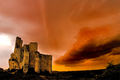
The Fortressby DamianComment: Lovely sky. I like how the smooth clouds clash with the detoriated stone ruins of the castle. The plant on the far right is slightly distracting though. Good timing for the right light conditions! 10. |
 Photographer found comment helpful. Photographer found comment helpful. |
| 01/29/2006 06:14:54 AM |
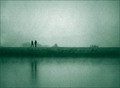
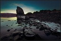
wintry walkby xtineComment: This is a very interesting image. I like the distorting effect of the mirroring water surface.
I'm also inerested in the noise in your image. It looks really good, I'd love to know how you created it. 10. |
| Photographer found comment helpful. |
| 01/29/2006 06:09:36 AM |
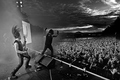
Satyriconby terjeComment: Wow, that's one of the best concert shots I've seen in quite a long time! I like how you managed to have both the action on stage and the audience's reaction in the same image. What's more, even the sky seems to think that this band rocks. The B/W conversion works well too. Excellent work. 10. Adding to favs. |
| Photographer found comment helpful. |
| 01/29/2006 06:05:59 AM |
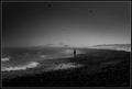
by andriComment: The perpsective you chose, along with the monotone conversion, give your shot an abstract quality. I like how you focused on shapes an lightness tones. 9. |
| Photographer found comment helpful. |
| 01/29/2006 06:04:43 AM |
All at Seaby babylonComment: I like the dark mood here. The sky is really opressing. 9. |
| Photographer found comment helpful. |
| 01/29/2006 06:04:14 AM |
Miss Understoodby roadrunnerComment: Cool surreal colours! The shoes are a bit too bright compared to the face. It seems to me you used a lot of dodge- and burning, so you might have lighted up tha face a bit. 9. |
| Photographer found comment helpful. |
| 01/29/2006 04:20:22 AM |
Golden Smileby PhilosComment: Excellent lighing, but you lost some focus on the lower half of the face, it seems. It's good the eyes are spot on focus though. I like how the background matches her eyes. 9. |
| Photographer found comment helpful. |
| 01/29/2006 04:17:23 AM |
A Rose...by sfarrell23Comment: Too much NeatImage. Also, the rose cannot set itself off enough from the background. 5. |
| 01/29/2006 04:15:36 AM |
Morning Gloryby arngrimurComment: This seems very Icelandic :) I like the effect of the wide angle and of the backlighting. 8. |
| Photographer found comment helpful. |
Home -
Challenges -
Community -
League -
Photos -
Cameras -
Lenses -
Learn -
Help -
Terms of Use -
Privacy -
Top ^
DPChallenge, and website content and design, Copyright © 2001-2026 Challenging Technologies, LLC.
All digital photo copyrights belong to the photographers and may not be used without permission.
Current Server Time: 07/18/2026 02:43:47 AM EDT.