| Image |
Comment |
| 04/29/2006 05:05:33 AM |
Top Shelfby livitupComment: The framing and the POC view of this image are well chosen. You might have included all of the orange glass though, or cropped out some more. This creates a 'chopped off' impression. Also, your background is too busy because the text on the bottles is still readable. You would either have needed a far narrower DOF, or bottles with less prominent labels. |
 Photographer found comment helpful. Photographer found comment helpful. |
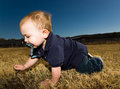
| 04/29/2006 05:02:55 AM |
At Dominik's Levelby livitupComment: You did well in choosing a low point of view for this photograph. Taking chilren's pictures from an adult's perspective usually makes the look too small and may even distort them when you use too wide an angle.
I find your use of the flash quite interesting. I would usually not have used fill flash in such a situation (partly because it seems you were quite close), but I enjoy the final effect. It sets the child off from the background.
You are right about the face though, you might want to darken it a bit in post processing. |
| Photographer found comment helpful. |
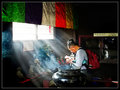
| 04/29/2006 04:58:46 AM |
DEVOTIONby RikkiComment: I enjoy the strength of the different areas of colour in this image. They really stick out quite well against their dark surrounding without taking away too much attention from the praying men(?). The smoke from the cattle and the way it gives the sunrays this atmospherical aspect makes the shot perfect. |
| Photographer found comment helpful. |
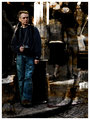
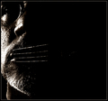
| 04/29/2006 04:55:53 AM |
Waitingby RikkiComment: Wow, this is really some amazing post processing you did here! I've never come across an image which actually seemd to be rusting. Usually you'd connect photography with paper, so you managed to go beyond a certain conception of our passion with this image. I like the shapes and the clash between colour and B/W (which you didn't manage to reconcile only at the top of DrAchoo's hair, for the rest it's well balanced). |
| Photographer found comment helpful. |
| 04/29/2006 04:51:37 AM |
Aqua Puraby TejComment: This is quite an amazing display of setup knowledge. I do not recall having seen a glass/water image which got the idea of movement inside the glass across as well as this one. It is as if you were looking at the surface of a pool, since ripples at the side of glass seem to be a physical impossiblity. Your use of ice is witty!
And the slight touch of amber really makes this shot for me for what concerns colours. |
| Photographer found comment helpful. |
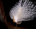
| 04/29/2006 04:48:07 AM |
White Peacockby TejComment: This is clearly one of my favourite images of those you display in your portfolio. I like the way in which the peacock seems to glow and spread a natural light. Your image has an evanescent quality: it seems as if this being coulod not possibly have come from that dark gloomy background, but must have been sent from "a better place". In fact, the white-black dichotomy suggests the image of an angel walking the earth. All in all, having seen the original, I must admit that you took this image to a completely new level with your masterful postprocessing, namely by dodging and burning. |
| Photographer found comment helpful. |
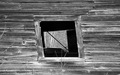
| 04/29/2006 04:44:16 AM |
Old Windowsby shanelighterComment: Shane, you found a good subject for this challenge. Old barns very often have quite interesting textures, be it rusty iron elements or, as in your picture, wood which is disintegrating as the teeth of time gnaw on it. With this window, you found a dynamic element for your picture, which suggests that nothing is ever stable and that things keep changing no matter what. I feel though that you might have emphasized this concept with a slightly different composition. First, the centred composition suggests stability and thus counteracts the oblique lines of the window. You might have tried to out the window to either side instead of centering it. Another thing I'd like to see is a tilted image - tilted in such a way that the now oblique lines become perfect verticals, so that the horizontal lines then seem crooked. It would have given the whole barn a much less secure and stable look. |
| 04/29/2006 04:38:35 AM |
Speak No Evilby JutildaComment: You portray quite an impressive use of light and shadow in this photograph. To me the large black area feels very oppressing, as if it were the force which makes the model silent - while at the same time being completely abstract, remote, empty. It is but negative space, but the positioning of the face suggests that this emptyness, the silence is actually pushing the model out of the frame. |
| Photographer found comment helpful. |
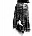
| 04/29/2006 04:34:51 AM |
Reachby JutildaComment: This image as been in my favourites for a few months now and I still like coming back to it at enjoy the way it portrays an everyday action. Not only did you take a pleasently different approach by cutting off the image just above the hips, thus leaving the action of reaching which one usually associates with stretched arms, out of the frame. You also managed to give it a very charming quality with your high contrast post processing. What really did it for me, I guess, is your use of vertical noise to echo the upward movement of the model. |
| Photographer found comment helpful. |
| 04/17/2006 07:57:47 AM |
300' Downby espy2Comment: Funny photographer's comments, I stilldon't know what you actually photographed though :) |
| Photographer found comment helpful. |
Home -
Challenges -
Community -
League -
Photos -
Cameras -
Lenses -
Learn -
Help -
Terms of Use -
Privacy -
Top ^
DPChallenge, and website content and design, Copyright © 2001-2026 Challenging Technologies, LLC.
All digital photo copyrights belong to the photographers and may not be used without permission.
Current Server Time: 07/16/2026 06:03:25 PM EDT.