| Image |
Comment |
| 01/05/2005 04:29:48 PM |
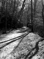
Long and Winding Roadby TranquilComment: I like the leading lines and the perspective. The vanishing point might be a bit father off. You might have crouched, and taken the shot from further below.
The shadows which come in from the right enhance the path a bit, which is a bit overexposed. It's hard to get this right in a wood, curves in post processing might have helped here.
By the way, there was only one person supposed to be in the shot. 8, nonetheless :) |
 Photographer found comment helpful. Photographer found comment helpful. |
| 01/05/2005 04:27:00 PM |
|
| Photographer found comment helpful. |
| 01/05/2005 04:26:24 PM |
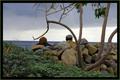
Hidden By Natureby photomayhemComment: Nice composition. The border is too big though. The green and black would have done well if the black one would have been thinner.
You slightly missed the challenge. There was only one person supposed to be in the picture. 6. |
| Photographer found comment helpful. |
| 01/05/2005 11:58:27 AM |
pier at sunsetby wkmenComment: Cool colours! I love how the reflection shows only part of the sky, and how it is shaped by the waves. Those waves also suggest some movement, wich, along with the birds and persons, gives the picture a soul, it's not a sterile neat landscape, but there's life in it. You might have considered another crop, I don't like the centered horizon. You should choose either two thirds of sky or two thirds of ground. You say it's a zoom version, so that should be possible to do. |
| Photographer found comment helpful. |
| 01/05/2005 11:54:59 AM |
estate courtyardby wkmenComment: Niced perspective on the building. The various patterns make it almost blend with its surrounding, although I'm not sure wether that's a good thing. The sky's a bit blown out, and I'd have cropped the row of trees on the far right side. |
| Photographer found comment helpful. |
| 01/05/2005 11:50:40 AM |
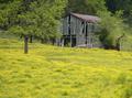
old barn and buttercupsby wkmenComment: Lovely colours. I'd push the green in the trees a bit more. I like how you brought in a feeling for pespective with that blurred plant in the lower-right corner foreground. The tilted horizon makes the picture really dynamic. I also like the contrast between nature's work and man's creation...or vice versa. |
| Photographer found comment helpful. |
| 01/05/2005 11:06:23 AM |
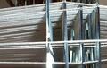
Gearby HalimComment: Jee, I expected your picture to to a lot better than this. I guess it's the border. Why did you add it? And I'm still interested to know how the colours were produced :) |
| Photographer found comment helpful. |
| 01/05/2005 11:03:35 AM |
Overshot - Whig Roseby outlandComment: I still don't know what this is, even with your comments. Could you pease PM me and tell me? Thanks! |
| Photographer found comment helpful. |
| 01/05/2005 11:02:33 AM |
Just Swingin' on My Hingesby ArtanComment: I see, your comments make the link to the mechanical theme much clearer. However, those things should be clear without descriptions. If the screws, hinges etc are what makes the picture fit the challenge, they should be easier to see. It's hard to see the hinges, and even harder to see the screws. It's perfectly okay to move in a challenge's grey area, but when you have a special approach to a challenge, make it clear to the voter. If I had understood your pint of view, I'd have given you a 6 instead of a four. I hope this helps. |
| Photographer found comment helpful. |
| 01/03/2005 04:38:23 PM |
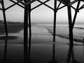
pier reflectionsby wkmenComment: I like the interesting point of view of this picture. It is not one of the typical beach shots. The composition is well done, the reflection and the horizon divide the image into three harmonic parts, so do the two bigger poles. I also like how the waves further split the central horizontal stripes into triangles.
I don't know what to think about the houeses. Have you considered cloning them out yet? I'd do the same with that piece of rope in the upper-right corner. |
| Photographer found comment helpful. |
Home -
Challenges -
Community -
League -
Photos -
Cameras -
Lenses -
Learn -
Help -
Terms of Use -
Privacy -
Top ^
DPChallenge, and website content and design, Copyright © 2001-2026 Challenging Technologies, LLC.
All digital photo copyrights belong to the photographers and may not be used without permission.
Current Server Time: 07/18/2026 09:08:04 AM EDT.