| Image |
Comment |
| 01/17/2005 04:26:34 PM |
On any Sundayby redmondson01Comment: Isn't it called 'On any given sunday?' Maybe both exist. I guess your hinting at the motorcross being every week on Sunday? Maybe you could have found a more fitting title, but that doesn't matter so much. I like the motion blur on the people in the background, but I think they are not blurry enough. The spectators are quite distracting from the main interest, the biker. Have a look at these:
//www.dpchallenge.com/image.php?IMAGE_ID=34000
//www.dpchallenge.com/image.php?IMAGE_ID=5817
Maybe a tighter crop would have been another way to guide the eye to the biker. 5. |
| 01/17/2005 04:21:25 PM |
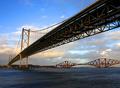
A Bridge Too Farby saggy9999Comment: Cool perspective, almost perfect vanishing point. I'd have preferred a b/w for this shot. It would have epmhasized the structure of the bridge and it's leading lines. 7. |
 Photographer found comment helpful. Photographer found comment helpful. |
| 01/17/2005 04:20:25 PM |
SPHEREby tazzaComment: I'd have cropped it about 25px tighter on each side. It looks a bit unsharp but I guess that's because of the bubbles. The composition isn't very interesting. Maybe you should have shown only a quarter of the sphere. 5. |
| 01/17/2005 04:19:06 PM |
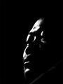
The Godfatherby quzailanComment: Putting the light a little more frontal would have shown some more details. Also, the negative space doesn't seem to do any good here. 4. |
| 01/17/2005 04:18:06 PM |
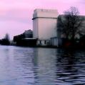
On The Waterfrontby ArtanComment: Looks strange. Very interesting perspective and a cool place (I hope that's no flood!). I may be wrong, but it looks to me as if you had made excessive use of NeatImage (mainly in the tree tops). I'd have liked to see some noise in here! 8. |
| Photographer found comment helpful. |
| 01/17/2005 04:16:09 PM |
Beachesby ZippyComment: 'The Beach' (with DiCaprio) would have been more fitting, as there is only one. This would have done better as b/w, as the colours aren't very interesting. Also, the foggy upper part doesn't add to the image, you could have cropped it. 3. |
| Photographer found comment helpful. |
| 01/17/2005 04:14:46 PM |
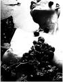
The grapes of wrathby whiteroomComment: Interesting use of contrast and noise. Is that a real woman? It's hard to tell beacuse od the (cool) destructive look. 8. |
| Photographer found comment helpful. |
| 01/17/2005 04:09:56 PM |
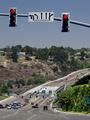
Life in the Big City.by BradComment: I hope I'll never have to drive there. I go nuts in Luxembourg City already! I like how confusing the image is without being a mess in tghe composition. Cool perspective too. But you weren't driving, were you? |
| Photographer found comment helpful. |
| 01/17/2005 04:03:53 PM |
|
| 01/17/2005 01:02:41 AM |
|
Home -
Challenges -
Community -
League -
Photos -
Cameras -
Lenses -
Learn -
Help -
Terms of Use -
Privacy -
Top ^
DPChallenge, and website content and design, Copyright © 2001-2026 Challenging Technologies, LLC.
All digital photo copyrights belong to the photographers and may not be used without permission.
Current Server Time: 07/21/2026 08:51:47 PM EDT.