| Image |
Comment |
| 09/01/2006 09:54:22 AM |
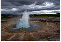
Blowingby GautiComment: Composition: 7 - This works well in focussing us on the important part of the photo while still leaving enough room for our eyes to wander :)
Technical: 5 - Seems a little soft and some parts are overexposed but the stopped motion is great and the contrast works well in the clouds. I'd have brightened the water slightly so that the attention isnt drawn away so much by the bright clouds.
Creativity: 7
Appeal: 6 - The lack of contrast in the foreground gives some parts of the shot a flat looking appearance.
Overall Calculated Average Score: 6 |
 Photographer found comment helpful. Photographer found comment helpful. |
| 09/01/2006 09:50:45 AM |
Beauty Becomes A Sunsetby LERtasticComment: Composition: 5 - Nice placement of the horizon and the negative space at the top works well.
Technical: 4 - A bit of overexposure in the sun and parts of the clouds.
Creativity: 5 - I've seen sunsets before and nothing in this one makes it really stand out.
Appeal: 5 - Interesting colours and forground silhouettes but it doesnt hold my interest all that long.
Overall Calculated Average Score: 5 |
| Photographer found comment helpful. |
| 09/01/2006 09:49:00 AM |
Pink and Greenby trainComment: Composition: 7 - Well composed, with just enough space around the flowers, with them creating interesting shapes in the frame.
Technical: 3 - Looks way too soft and too compressed. You had 200kb to work with in this challenge but you only used about 60. The black background is also a splotchy grey which looks to me like you've not calibrated your monitor properly. Lighting etc on the plants is good though.
Creativity: 4 - Nothing special about flowers on a black background.
Appeal: 4 - Nice vibrant colours but the border is too large and the compression/softness really spoils it imo.
Overall Calculated Average Score: 4 |
| Photographer found comment helpful. |
| 09/01/2006 09:45:44 AM |
A Day at the Racesby ShermyComment: Composition: 7 - Very nice, focuses attention well on the man. The large amount of black space on the bottom right is the only thing distracting.
Technical: 7 - Good DoF to separate him slightly from the background, but still leaving background detail to give him a context. The post processing effect is nice too
Creativity: 6 - More than just a normal portrait, shows more of his character, nice.
Appeal: 6 - Overall I like the "gritty" effect from the PP which suits the subject well :)
Overall Calculated Average Score: 6 |
| Photographer found comment helpful. |
| 09/01/2006 09:43:01 AM |
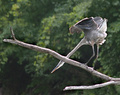
Poised Pursuitby rileyComment: Composition: 6 - The rule of thirds is followed quite well here, but I feel the sticks need a bit of extra space around them to stop it looking cramped.
Technical: 4 - There are some blown out parts, especially on the stock, and the photo appears soft overall.
Creativity: 5 - Its not just the usual bird pose, which is good,
Appeal: 4 - The colours all seem a bit flat, and the blacks arent black, so the appeal isnt really tehre for me. Also, the head going behind the stick is distracting to me.
Overall Calculated Average Score: 5 |
| Photographer found comment helpful. |
| 09/01/2006 09:40:12 AM |
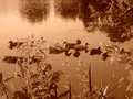
Saturday at the Lakeby emaynerComment: Composition: 3 - Seems very cluttered with the main focus centered, which doesnt work here imo
Technical: 3 - The jpeg compression is way too strong. You had 200kb to work with in this challenge, but you only used 22. This results in artifacting and also it looking very soft.
Creativity: 3 - A different angle to make this more unique would improve it
Appeal: 2 - With the artifacts, softness, crowdedness, and also the way too strong orange colour, the photo doesnt appeal to me at all, sorry.
Overall Calculated Average Score: 3 |
| 09/01/2006 09:37:40 AM |
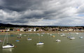
Stormy weatherby cerebisComment: Composition: 5 - Horizon too centered for my tastes
Technical: 5 - Exposure is good, but needs to be sharpened a bit in PP
Creativity: 5 - Not a very unique angle or composition.
Appeal: 4 - It seems overall a bit dull, with no real focal point.
Overall Calculated Average Score: 5 |
| Photographer found comment helpful. |
| 08/25/2006 09:19:05 AM |
|
| Photographer found comment helpful. |
| 08/25/2006 09:16:34 AM |
|
| 08/25/2006 09:14:51 AM |
|
| Photographer found comment helpful. |
Home -
Challenges -
Community -
League -
Photos -
Cameras -
Lenses -
Learn -
Help -
Terms of Use -
Privacy -
Top ^
DPChallenge, and website content and design, Copyright © 2001-2026 Challenging Technologies, LLC.
All digital photo copyrights belong to the photographers and may not be used without permission.
Current Server Time: 07/17/2026 02:43:43 PM EDT.