| Image |
Comment |
| 09/01/2006 12:01:04 PM |
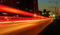
Chicago's Night Lightsby NerdJNerdBirdComment: Composition: 4 - The tilted effect could work if it was MORE tilted, but at the moment its not enough to really add drama, it just looks.... a bit wonkey.
Technical: 4 - Nice stars on the lights, but the sky and general overall colours look a bit drab
Creativity: 4 - The vanishing point is good, but there is no real subject matter to add any interest.
Appeal: 4
Overall Calculated Average Score: 4 |
 Photographer found comment helpful. Photographer found comment helpful. |
| 09/01/2006 11:59:21 AM |
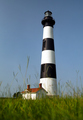
Inviting Solitudeby LtHousLadyComment: Composition: 3 - Its a bit uninteresting - Centered, obscured by grass, and maybe even slighly tilted (tho I can't tell for sure)
Technical: 6 - Nice saturation of the colours and the contrast is good which bright whites and dark blacks.
Creativity: 3 - A different angle and something else in the should could make this look more creative.
Appeal: 4 - It doesn't really hold my interest for very long.
Overall Calculated Average Score: 4 |
| 09/01/2006 11:48:13 AM |
Puppy Eyesby mauidudeComment: Composition: 5 - The centered composition works, but its distracting with the bottom of the nose touching the edge of the frame.
Technical: 9 - Great DoF and colour and lighting. I love it :)
Creativity: 5 - Not the most original of pet portraits, but cute all the same, and the lovely golden lighting gives it its own kind of feel.
Appeal: 7 - Really lovely cute photo :) Could have used the full 720 pixels though to let us see more detail.
Overall Calculated Average Score: 6 |
| Photographer found comment helpful. |
| 09/01/2006 11:46:18 AM |
outside inby phslugComment: Too small for me to comment on really. You had 720 pixels to work with in this challenge. 2 |
| Photographer found comment helpful. |
| 09/01/2006 11:45:26 AM |
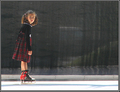
Sun Valley Skaterby EvaanComment: Composition: 6 - Nice composition but I think there's just slightly too much empty space on the right.
Technical: 5 - Could do with a small application of USM to sharpen it slightly, and a small levels adjustment to stop it looking quite so 'washed out' imo.
Creativity: 6 - I like how she's looking out of the frame, making us wonder what has caught her attention.
Appeal: 5
Overall Calculated Average Score: 5 |
| Photographer found comment helpful. |
| 09/01/2006 11:24:01 AM |
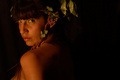
Nymphby BrielleComment: Composition: 6 - The negative space to the right works well but I don't like the crop at the top
Technical: 3 - It seems way too dark. There is almost no detail in the hair and the eyes especially need to be a lot brighter.
Creativity: 5 - The leaves in the hair etc are a good attempt to make it a unique portrait, but a more interesting angle and pose etc would add interest.
Appeal: 4
Overall Calculated Average Score: 4 |
| Photographer found comment helpful. |
| 09/01/2006 11:22:06 AM |
Pray for Surfby ShannonLeeComment: Composition: 7 - Nicely using the rule of thirds but I find the horizon cutting through the armpits a tad distracting
Technical: 3 - Nice exposure and the colours are suitably warm but the use of NeatImage is way in excess here, obliterating all texture.
Creativity: 5 - Nice shot, and the yellow cast adds some originality.
Appeal: 5
Overall Calculated Average Score: 5 |
| Photographer found comment helpful. |
| 09/01/2006 11:03:09 AM |
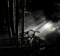
Wet Ride Aheadby RolandBComment: Composition: 7 - I like it, all areas of the photo have different points of interest.
Technical: 6 - A little dark overall, and not as sharp as it could be, but still a nice mood is evoked.
Creativity: 7 - The light really makes this unique
Appeal: 6 - I think a little more detail and sharpness would really improve this, but its definately an interesting shot.
Overall Calculated Average Score: 6 |
| Photographer found comment helpful. |
| 09/01/2006 11:01:35 AM |
Freestyleby BrinComment: Composition: 6 - Nothing wrong here, just not the most intersting composition :)
Technical: 6 - Seems a little soft, and bringing up the highlights a bit more wouldnt hurt, but overall nicely done.
Creativity: 8 - GREAT! It really shows a lot of personality! :)
Appeal: 9 - Really funny shot :)
Overall Calculated Average Score: 7 |
| Photographer found comment helpful. |
| 09/01/2006 10:59:55 AM |
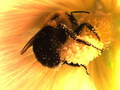
Pollen Catcherby geekssweetComment: Composition: 4 - Its too centred in my opinion.
Technical: 3 - It looks like you've cropped a lot to get this close, and the sharpness and image quality has suffered.
Creativity: 3 - I would have liked a further out crop so that we could see more of the surrounding flower, which would separate it from similar bee shots.
Appeal: 3
Overall Calculated Average Score: 3 |
| Photographer found comment helpful. |
Home -
Challenges -
Community -
League -
Photos -
Cameras -
Lenses -
Learn -
Help -
Terms of Use -
Privacy -
Top ^
DPChallenge, and website content and design, Copyright © 2001-2026 Challenging Technologies, LLC.
All digital photo copyrights belong to the photographers and may not be used without permission.
Current Server Time: 06/09/2026 08:11:47 PM EDT.