|
|
|
Showing 2721 - 2730 of ~4090 |
| Image |
Comment |
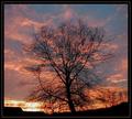
| 01/24/2004 11:46:57 AM | Tree in Silhouetteby lilnukeeComment: Critique Club
Wow, what great sunset colours. The colours along with the cloud formation really do look very nice. I like the centered composition and the tree looks great silhouetted. I think your main problem here is the jpeg compression. Your file is only 87kb, out of a 150k maximum. This means there are artifacts in the sky, and around the tree. I makes the pic look blurry and just generally not as appealing.
You say in your comments that you were experimenting with borders. I think the border looks okay but it could be better suited to the photo. At the moment you have 2 layers, with a line in the middle. I think you should only have 1 layer, so it looks thin, and put the thin white line in between the photo and the black border. This makes sure the black parts of the photo don't blend into the border.
I think some of the comments you got do bring up some good points. The colours could be even more eye-catching if you boosted the saturation a bit more in postprocessing. Also, a lot of people think 'after dark' means when the sun is completly gone. Voters are very literally minded here, so it's useful to take that into account.
Overall, this is a nice sunset photo, but slightly lacking in image quality. Play around with other compression levels to try and get something a little less artifacty. |  Photographer found comment helpful. Photographer found comment helpful. |
| 01/24/2004 11:39:16 AM | A Night at the Rialtoby dharmesonComment: Critique Club
Hi :)
This looked like quite a tricky shot to expose. While the bottom areas are dark and not much detail can me see, the white light is a bit over exposed. I'm not sure how you could have improved that under the restricted editing rules that were in effect for this challenge.
The bottom part is very interesting and I really like it. The blurred movement of the person really adds a lot, and the posters add a good amount of interest to the red brick wall. In my opinion, I think you should have got closer to the subject, and not bothered with anything above the wall with the posters on. I think the white area really spoils the photo, and the lights above that don't really add much. Just the person walking past the posters would have been an excellent photo on its own.
I think in post-processing you over-sharpened this a bit. I think this because on the curves of the 'R', jagged lines are visable, rather than keeping a nice smooth edge.
Overall I think this location has great potential, and through experimenting with different compositions could produce a top-notch photo. | | Photographer found comment helpful. |
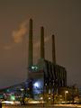
| 01/24/2004 11:32:57 AM | Winkin', Blinkin' and Nodby TooCoolComment: Critique Club
Hello :)
This is a nice pic. It's really smooth compared to a lot of the other shots in this challenge, and it's sharp as well. I think it would have done better if the actual sky was in fact darker. The colour of the sky at the moment is quite light, and similar to the building. I think a shorter shutter time would make it darker, and then the building would stand out more against it and have more impact. It would also stop the lights looking so blown out. Now, I wasn't there when you shot this so you might have tried that already and decided it wasn't as good, but I think having the sky darker to make the factory 'pop' more would look better.
The composition is pretty much centered. I don't know what was on either side of the building, but I would have liked to see the building more towards the right of the frame. I think this would look better because the smoke has more space to blow into, and it could possible enhance the sense of scale by having more space around it.
Overall a very nice pic, and it sounds like you went through a lot of pain to get it :P | | Photographer found comment helpful. |
| 01/24/2004 07:48:03 AM | | | Photographer found comment helpful. |
| 01/22/2004 11:30:35 AM | Ding Ding Ding!by kosmikkreeperComment: Originally posted by mrblobby:
Congratulations on 6th...should have been higher though. |
You wish is granted... 5th now :) |
| 01/21/2004 12:34:08 PM | |
| 01/21/2004 12:31:24 PM | | | Photographer found comment helpful. |
| 01/21/2004 12:30:58 PM | |
| 01/21/2004 11:56:04 AM | The Bird Manby KonadorComment: Thanks Jon, I dunno about his trousers, lol, I can't even see them. The bag is a tesco value loaf bag I think, you can see the stripes, hehe. And yeh, his hair is a bit of a mess :P |
| 01/19/2004 02:34:19 AM | | | Photographer found comment helpful. |
|
Showing 2721 - 2730 of ~4090 |
Home -
Challenges -
Community -
League -
Photos -
Cameras -
Lenses -
Learn -
Help -
Terms of Use -
Privacy -
Top ^
DPChallenge, and website content and design, Copyright © 2001-2026 Challenging Technologies, LLC.
All digital photo copyrights belong to the photographers and may not be used without permission.
Current Server Time: 07/26/2026 03:13:57 PM EDT.
|