| Image |
Comment |
| 07/26/2004 06:22:24 AM |
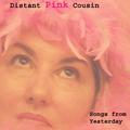
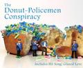
Distant Pink Cousinby GraciousComment: I dont think the OOF effect and flat contrast would work normally, but in the case of this album cover I think it looks pretty good. |
 Photographer found comment helpful. Photographer found comment helpful. |
| 07/26/2004 06:21:21 AM |
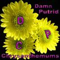
Damn Putrid Chrysanthemumsby banmornComment: This is a good shot, but the flowers are a bit too close to the edges of the frame I think. Cropping closer or further out would have made whatever choice you made more obvious, and made the photo more appealing, imo. |
| Photographer found comment helpful. |
| 07/26/2004 06:19:20 AM |
|
| 07/26/2004 06:18:43 AM |
|
| Photographer found comment helpful. |
| 07/26/2004 06:15:02 AM |
|
| Photographer found comment helpful. |
| 07/26/2004 06:02:45 AM |
|
| Photographer found comment helpful. |
| 07/26/2004 06:02:12 AM |
Dark Punk Colonyby RoosterComment: I would have boosted the contrast even more, just to make the blacks black, not just grey. At the moment it looks a little flat. |
| Photographer found comment helpful. |
| 07/26/2004 06:01:32 AM |
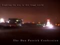
the Dan Patrick Confessionby fstopopenComment: No real point of interest here, but for an album cover challenge that's no problem. Abstracts can work really well. I like this shot a lot. |
| Photographer found comment helpful. |
| 07/26/2004 06:00:37 AM |
|
| Photographer found comment helpful. |
| 07/26/2004 05:59:21 AM |
Dancing Pathos Capersby rhipsterComment: I would have preferred a shallower DoF so that the background, which is a bit unattractive, was blurred out. |
| Photographer found comment helpful. |
Home -
Challenges -
Community -
League -
Photos -
Cameras -
Lenses -
Learn -
Help -
Terms of Use -
Privacy -
Top ^
DPChallenge, and website content and design, Copyright © 2001-2026 Challenging Technologies, LLC.
All digital photo copyrights belong to the photographers and may not be used without permission.
Current Server Time: 07/27/2026 02:04:10 PM EDT.