| Image |
Comment |
| 10/01/2004 07:45:51 AM |
forever and a dayby grigrigirlComment: I like the blown out sky and good exposure on all the whites, its a very romantic photo. The one thing I don't really like is the white fade around the edges. I think cropping with each edge half way through one of the pillars would be good too, letting us see more of the bride :) 7 |
 Photographer found comment helpful. Photographer found comment helpful. |
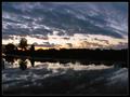
| 10/01/2004 07:44:22 AM |
All the Good Thingsby mbardeenComment: The white areas look a little over exposed to me. I think you should have underexposed this shot, and then dodged and burned it to a good exposure. This would make it more dramatic I think. Also, I would have liked to see some kind of subject in the right hand side of the frame as it looks a bit empty as it is. I know you can't change the landscape, but it's just what I feel :) 6. |
| Photographer found comment helpful. |
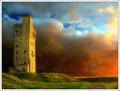
| 10/01/2004 07:42:46 AM |
Sunset at Castle Hill by BobsterLobsterComment: I love this shot. The mixture of red orange and blue in the sky is great and very powerful. The lighting on the castle and the grass is fantastic too. 10 |
| Photographer found comment helpful. |
| 10/01/2004 07:41:53 AM |
|
| Photographer found comment helpful. |
| 10/01/2004 07:41:21 AM |
|
| Photographer found comment helpful. |
| 10/01/2004 07:40:42 AM |
The Beaconby alanfreedComment: I think this shot is a bit too oversharpened. I notice it most between the trees and sky. I think this would look nice in black and white, as the colours look a bit muted and don't really add much to the shot. A nice nostalgic B&W would look a lot better in my opinion :) 6. |
| Photographer found comment helpful. |
| 10/01/2004 07:39:14 AM |
The Walkby L1Comment: The duotone works well here in my opinion, and the exposure is spot on. The only thing that bothers me is the soft focus effect. I'm not even sure if there is one applied, but some areas, specifically the trees around the man's hat, kinda blend in to other objects. 6 |
| Photographer found comment helpful. |
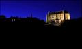
| 10/01/2004 07:37:26 AM |
Lancing Collegeby marboComment: I think there is too much black in the photo. The blue of the sky is really nice, and the college looks very impressive, but it's just a bit too far away to appreciate fully. I would have cropped in tighter on that. 6 |
| Photographer found comment helpful. |
| 10/01/2004 07:36:01 AM |
Naughty .... but niceby agwrightComment: Yum! That looks delicious. I think to finish this shot off nicely you sould dodge around the edges to make the background white rather than grey. Technically good, but nothing that makes the shot stand out amongst the crowd. 6 |
| Photographer found comment helpful. |
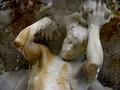
| 10/01/2004 07:34:47 AM |
Water Bearing Through Timeby labudsComment: This is a nice shot, but I think the water droplets look a little be strange just stopped in mid air. Since your title is 'through time' and it's a smooth statue, I think a long exposure creating water streams would look really good with the subject matter. At the moment there is nothing that really interests me in the photo. 5 |
Home -
Challenges -
Community -
League -
Photos -
Cameras -
Lenses -
Learn -
Help -
Terms of Use -
Privacy -
Top ^
DPChallenge, and website content and design, Copyright © 2001-2026 Challenging Technologies, LLC.
All digital photo copyrights belong to the photographers and may not be used without permission.
Current Server Time: 07/27/2026 11:29:09 PM EDT.