| Image |
Comment |
| 10/02/2004 05:38:51 AM |
Up and over... and in?by arnitComment: Very cool shot, which shows good action. The goalkeepers eyes are great and add a lot to the photo I think. 7 |
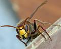
| 10/02/2004 05:37:33 AM |
The Hornetby rhipsterComment: The detail on the head is great, but I find the pastel colours in the background very dull and they dont suit the subject. I think this would look really good in B&W, because you'll still get the high contrast of the head to make it stand out, and you won't have the icky background colours. 6 |
 Photographer found comment helpful. Photographer found comment helpful. |
| 10/02/2004 05:30:24 AM |
Prowlin'by karmatComment: I always like tiger shots, they're great animals. I would have liked to see this shot cropped closer in on the head, cutting out that green pole in front of it, because I think that's distracting. 6 |
| Photographer found comment helpful. |
| 10/02/2004 05:25:30 AM |
Shadowboxerby scalvertComment: This is a really clever shot! The lighting is really good and the pose of your model matches the pose of the shadow very well. I think I would have preferred the model to be a bit higher in the frame though, so there wasn't as much blank space at the top. 7 |
| Photographer found comment helpful. |
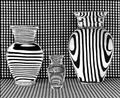
| 10/02/2004 05:24:10 AM |
Vases Filled With Waterby RefocusedComment: I've seen shots like this before but this one is confusing, cos there are no vertical lines on the left vase and no horizontal ones on the right... I have no idea how you did it :) It's a good shot but I think it lacks anything particularly special. The angle is just flat on and the composition is just centered, just like every other shot of this type. I would really like to see someone try this experimenting with the angle and visual appeal/impact of the photo. 5 |
| Photographer found comment helpful. |
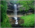
| 10/01/2004 11:14:01 AM |
Munising Fallsby pitsamanComment: I'm not really keen on the green in this photo, it takes too much attention away from the waterfall in my opinon. I would have liked to see this in B&W or a pale sepia, with either a closer crop, or a less centered composition. 6 |
| Photographer found comment helpful. |
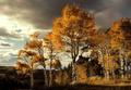
| 10/01/2004 11:12:58 AM |
Fallby ursulaComment: The colours here are nice and vibrant, and the photo has good clarity. The sky is a bit overexposed on the left but that's not too important. 7 |
| Photographer found comment helpful. |
| 10/01/2004 11:11:53 AM |
hole 12, par 4by willemComment: The is a great shot, infrared I guess? The toning is really efffective and the vignetting suits the photo wonderfully. My only gripe is that the horizon isn't straight, which makes the tree appear to not be straight either. Even if the horizon isn't straight in real life, I think straightening it in this photo would improve it. 9 |
| Photographer found comment helpful. |
| 10/01/2004 11:10:01 AM |
Mercyby hopperComment: Your model has great eyes, but I would have lightened the whites a little. The overexposure in the hair is a bit distracting, and in the background too, but other than that it's nice. I like the wind blowing the hair around. It adds a bit of dynamics to the shot. 6 |
| Photographer found comment helpful. |
| 10/01/2004 11:08:11 AM |
Split Bout....the inner struggleby graphicfunkComment: The creativity in taking this photo is amazing (I saw your photographer comments when you requested an admin note). To improve the shot I think cropping a bit further away from the man's shorts so they weren't up against the edge of the frame would be a good idea, and also the shadow from the right person is a little distracting. 7 |
| Photographer found comment helpful. |
Home -
Challenges -
Community -
League -
Photos -
Cameras -
Lenses -
Learn -
Help -
Terms of Use -
Privacy -
Top ^
DPChallenge, and website content and design, Copyright © 2001-2026 Challenging Technologies, LLC.
All digital photo copyrights belong to the photographers and may not be used without permission.
Current Server Time: 07/28/2026 10:56:52 AM EDT.