| Image |
Comment |
| 11/10/2004 08:11:06 AM |
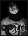
Severed Fishby DavidWegsComment: I like this shot, but its a bit small. Also, a slightly blue tint would have improved it I think. |
| 11/10/2004 08:10:03 AM |
Triangulationby soupComment: The detail is good but the out of focus dart is a bit distracting since it's the only unsharp thing in the photo |
 Photographer found comment helpful. Photographer found comment helpful. |
| 11/09/2004 12:55:22 PM |
Does size matter?by gudbjargarsonComment: Update: Woo I won the music challenge with the T1 (on the right) and came 23rd in this challenge with the 300D (on the left). So I reckon size certianly doesn't matter :) |
| Photographer found comment helpful. |
| 11/08/2004 02:22:34 AM |
|
| Photographer found comment helpful. |
| 11/03/2004 02:42:52 AM |
|
| Photographer found comment helpful. |
| 10/29/2004 09:35:50 AM |
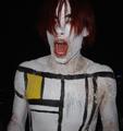
teenager @ highschool costume night (all in good fun!)by t_koreckiComment: B.O.T.P.A.C.
Bottom of the Pack Analytical Comments
Every challenge I am going to leave comments on some of the photos that finished at the bottom of the pack. I will try and explain why I think the photo did not do well in the challenge, which will hopefully result in increased rankings in your future photos.
-Ben
1) This photo does not immediately fit the challenge without an explaination. The photo should speak for itself and not rely on an explaination. It may fit the challenge if people think about it for long enough, but with 200 photos to vote on, most people will only look at your photo for a few seconds before deciding it doesnt meet the challenge and moving on.
2) Clarity. Your photo isn't sharp, which is what a lot of voters look for when scoring a photo.
3) Composition. It is very centered. A more interesting angle or perspective will normally increase scores.
4) Title. If people don't understand the photo, most will then look at the title to see of that helps. In this case the title is very long and looks rather unprofessional in many ways:
- No capitalization
- Use of the @ symbol
- Brackets
- Extra explaination that isn't needed within brackets
The title is part of the presentation of the photo and many voters will take it into account when scoring. |
| Photographer found comment helpful. |
| 10/29/2004 09:32:40 AM |
old school antiqueby clictacameraComment: B.O.T.P.A.C.
Bottom of the Pack Analytical Comments
Every challenge I am going to leave comments on some of the photos that finished at the bottom of the pack. I will try and explain why I think the photo did not do well in the challenge, which will hopefully result in increased rankings in your future photos.
-Ben
1) This photo does not immediately fit the challenge without an explaination. The photo should speak for itself and not rely on an explaination. It may fit the challenge if people think about it for long enough, but with 200 photos to vote on, most people will only look at your photo for a few seconds before deciding it doesnt meet the challenge and moving on.
2) Composition. It is very cluttered. Most voters prefer simply composed photos which draw attention to the focal point. This photo doesn't seem to have a focal point.
3) Post Processing. The photo has a n orange tint to it which isn't natural. A lot of voters like the photos to look as natural, and be as technically perfect, as possible. It looks like you used the wrong white balance, which is why a lot of people would have voted you down.
4) Size. You haven't used the full 640 pixels, so voters can't see as much detail in the photo as they would like. |
| Photographer found comment helpful. |
| 10/29/2004 09:29:44 AM |
papier et dpchallengeby DonaldComment: B.O.T.P.A.C.
Bottom of the Pack Analytical Comments
Every challenge I am going to leave comments on some of the photos that finished at the bottom of the pack. I will try and explain why I think the photo did not do well in the challenge, which will hopefully result in increased rankings in your future photos.
-Ben
1) Size. The photo doesn't use the full 640 pixels, so voters can't see as much detail as they would like.
2) Use of 'dpchallenge'. I've seen DPChallenge referenced in many photos on the site, and none of them seem to do very well. It may be that voters think using the name of the site is 'tacky' or 'amateur'.
3) Composition. It is very cluttered. Most voters prefer simply composed photos which draw attention to the focal point. This photo doesn't seem to have a focal point.
4) Title. If people don't understand the photo, most will then look at the title to see of that helps. In this case the title wouldn't be understood by a lot of non-French people. Message edited by author 2004-10-29 09:30:16. |
| Photographer found comment helpful. |
| 10/29/2004 09:26:52 AM |
Chupa - cabraby opelorcComment: B.O.T.P.A.C.
Bottom of the Pack Analytical Comments
Every challenge I am going to leave comments on some of the photos that finished at the bottom of the pack. I will try and explain why I think the photo did not do well in the challenge, which will hopefully result in increased rankings in your future photos.
-Ben
1) This photo does not immediately fit the challenge without an explaination. The photo should speak for itself and not rely on an explaination. It may fit the challenge if people think about it for long enough, but with 200 photos to vote on, most people will only look at your photo for a few seconds before deciding it doesnt meet the challenge and moving on.
2) Clarity. Your photo isn't sharp, which is what a lot of voters look for when scoring a photo.
3) Composition. It is very cluttered. Most voters prefer simply composed photos which draw attention to the focal point. This photo doesn't seem to have a focal point.
4) Title. If people don't understand the photo, most will then look at the title to see of that helps. In this case the title wouldn't be understood by most, if not all, voters.
5) Post Processing. The photo has a blue tint to it which isn't natural. A lot of voters like the photos to look as natural, and be as technically perfect, as possible. It looks like you used the wrong white balance, which is why a lot of people would have voted you down. Message edited by author 2004-10-29 09:30:43. |
| 10/29/2004 09:24:16 AM |
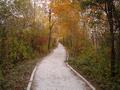
road of octoberby yomanComment: B.O.T.P.A.C.
Bottom of the Pack Analytical Comments
Every challenge I am going to leave comments on some of the photos that finished at the bottom of the pack. I will try and explain why I think the photo did not do well in the challenge, which will hopefully result in increased rankings in your future photos.
-Ben
1) This photo does not immediately fit the challenge without an explaination. The photo should speak for itself and not rely on an explaination. It may fit the challenge if people think about it for long enough, but with 200 photos to vote on, most people will only look at your photo for a few seconds before deciding it doesnt meet the challenge and moving on.
2) Clarity. Your photo isn't sharp, which is what a lot of voters look for when scoring a photo.
3) Composition. It is very centered. Many voters look for good use of the rule of thirds when voting, or at least a composition which adds interest to the perspective. Message edited by author 2004-10-29 09:30:59. |
| Photographer found comment helpful. |
Home -
Challenges -
Community -
League -
Photos -
Cameras -
Lenses -
Learn -
Help -
Terms of Use -
Privacy -
Top ^
DPChallenge, and website content and design, Copyright © 2001-2026 Challenging Technologies, LLC.
All digital photo copyrights belong to the photographers and may not be used without permission.
Current Server Time: 07/28/2026 07:03:17 AM EDT.