| Image |
Comment |
| 11/10/2004 03:11:10 PM |
Keyby SirBiggsALotComment: I like the shallow DoF, but it think it's slightly *too* shallow in this case. |
| 11/10/2004 03:09:53 PM |
No Photos Allowed!by dmscroComment: A polarizer would help cut down on the reflections I think, but the main problem here is ther photo is too small. Next time try using the full 640 pixel limit. |
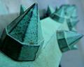
| 11/10/2004 03:09:10 PM |
Rail Detailby banmornComment: The perspective here is cool. I like how it repears and rotates into the background. |
 Photographer found comment helpful. Photographer found comment helpful. |
| 11/10/2004 03:07:42 PM |
Window to Her Soulby spydrComment: Good sharp focus on the eye, but the highlights on the skin are a bit blown out I think. |
| Photographer found comment helpful. |
| 11/10/2004 03:02:10 PM |
Circuit "City"by DrakeComment: I think this photo lacks a focal point, and it could also do with some additional contrast to make it stand out more. |
| Photographer found comment helpful. |
| 11/10/2004 02:54:58 PM |
Imperialism?by uctopukComment: This seems a bit over sharpened to me, but it may just be the texture in the photo. |
| Photographer found comment helpful. |
| 11/10/2004 02:53:48 PM |
Promiseby smiteaComment: Great photo. The lighting and colour and DoF is perfect. It's a shame you didnt use the full 640 pixel limit though. 9 |
| Photographer found comment helpful. |
| 11/10/2004 02:51:40 PM |
TIME PIECESby kiwinickComment: Good detailed macro but looks too over sharpened and compressed to me. |
| Photographer found comment helpful. |
| 11/10/2004 02:49:24 PM |
cotton budsby imagesloyolaComment: I'm not sure about the top heavy composition... I think with something like this a more centered composition would look better. |
| 11/10/2004 02:47:04 PM |
|
Home -
Challenges -
Community -
League -
Photos -
Cameras -
Lenses -
Learn -
Help -
Terms of Use -
Privacy -
Top ^
DPChallenge, and website content and design, Copyright © 2001-2026 Challenging Technologies, LLC.
All digital photo copyrights belong to the photographers and may not be used without permission.
Current Server Time: 04/15/2026 11:56:57 AM EDT.