| Image |
Comment |
| 01/19/2005 04:29:34 AM |
Into the Lightby artvetComment: Critique Club
This is a great photo and definately fits the Bokeh challenge. The colour and contrast are in my opinion spot on, but I see one major flaw which I think stopped you scoring higher.
Lens Flare.
Whilst it is true that the bright orange glow adds impact to the photo, the green and blue flares on the crisp silhouette of the branch do not. Under advanced editing rules it would be perfectly legal to use the clone tool to remove these and enhance the overall appeal of the photo. Also, the orange streaks on the branch should also be cloned out in my opinion. It is enough for the light to overcove the branch shapes in the bokeh, as that creates a good enough mood, without them obscuring the main focal point of the photo.
Composition-wise this is pretty good. I think maybe moving the branch up or down in the frame slightly would help, bringing it a bit more off centre, but it doesn't matter all that much in this case. |
 Photographer found comment helpful. Photographer found comment helpful. |
| 01/16/2005 10:17:39 AM |
|
| Photographer found comment helpful. |
| 01/16/2005 06:54:58 AM |
California Dreamin'by charmayneComment: Wow how weird! I have been humming this song for about 10 minutes and then I see this shot with the title. Bizarre :) |
| Photographer found comment helpful. |
| 01/16/2005 06:12:40 AM |
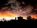
Haunting Sunsetby vtruanComment: I think this is a bit too oversharpened due to the halo and jaggies around the roof. The clouds are pretty cool tho :) |
| Photographer found comment helpful. |
| 01/14/2005 10:45:57 AM |
|
| 01/13/2005 06:18:34 AM |
HCMFby BobsterLobsterComment: Excellent shot, the angle you took it at makes it extra interesting and there's so much going on. |
| Photographer found comment helpful. |
| 01/09/2005 12:29:31 PM |
|
| Photographer found comment helpful. |
| 01/09/2005 12:19:42 PM |
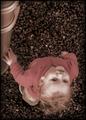
Tree spiritby RUEDISCHMUTZComment: Critique Club
To me this photo looks too dark overall. The black background is good but I feel the tree itself is too black. In post processing, using levels could fix this. Also it's quite soft. A quick application of Unsharp Mask could easily give it a little more definition.
I think the composition is a little dull, as the photo is very flat and doesn't appear to have any depth at all. Taking the photo during the day and getting a blurred background would help this, so would choosing a different angle that's not so front-on, but then of course the face wouldn't be visable.
It actually took me a long time to find the face, and I'm still not entirely sure that what I see is what you intended the face to be. I would encourage you to put info into the Photographer's Comments box in the future. Maybe a closer crop on the face would make it easier to spot, as some voters only spend a few seconds on each photo and may have voted you low when they couldnt find the face.
|
| Photographer found comment helpful. |
| 01/09/2005 12:13:28 PM |
Spend More Time With My Familyby Travis99Comment: Critique Club
Congrats on your top 10 placing Travis with this very nice photo.
The first thing that strikes me with this photo is the frame. Some people may like it but I really don't and think it detracts a LOT from the photo. I gave this photo an 8 in the challenge but it would be a 10 without the frame, as it is part of the presentation and should be judged as part of the photo in my opinion. Not only the frame, but the bevel on the actual photo makes it look quite 'tacky' in my eyes. As far as the other post processing goes, I think it is very well done, with nice sharpness, and the contrast not to strong, as to give a misty early morning feel. I think the crop may be a bit too narrow. It makes the photo look quite small and I would love to see more detail at the top of the frame, and perhaps a little less at the very left. This would improve the detail you'd be able to show.
All in all a very good photo fully deserving it's top 10 placing. Message edited by author 2005-01-09 12:28:59. |
| Photographer found comment helpful. |
| 01/09/2005 11:55:28 AM |
Walk Him Every Dayby KonadorComment: Thanks for the comments everyone. I recieved a few comments about finding the reflections in the eyes distracting. They are actually not reflections, but cataracts which are there permanently. I considered cloning them out but I think they are part of Charlie's personality and uniqueness so I left them in despite them being distracting. |
Home -
Challenges -
Community -
League -
Photos -
Cameras -
Lenses -
Learn -
Help -
Terms of Use -
Privacy -
Top ^
DPChallenge, and website content and design, Copyright © 2001-2026 Challenging Technologies, LLC.
All digital photo copyrights belong to the photographers and may not be used without permission.
Current Server Time: 07/26/2026 08:38:15 PM EDT.