| Image |
Comment |
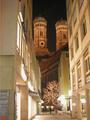
| 07/17/2005 08:14:35 PM |
Frauenkirche - Muenchenby wrampevoComment: I'm sure you'll get this comment a million times but this is too small :( Shame because apart from the over-exposure of the lights this could potentially have been a nice entry. I'm not sure how it meets the challenge though. |
| 07/17/2005 08:08:34 PM |
Winningby C_Steve_GComment: Looks like you've applied neatimage too heavily. I would have preferred grain. |
 Photographer found comment helpful. Photographer found comment helpful. |
| 07/17/2005 08:03:21 PM |
No License Requiredby CEJComment: I think it's sharpened too much, as shown by the jaggies on the wires, and the exposure was too long, since all ther highlights are blown out and the black shadows are actually grey. Is your monitor calibrated properly? I think it could be too dark. |
| Photographer found comment helpful. |
| 07/17/2005 08:01:16 PM |
Wherever...Wheneverby kevrobertsonComment: This could have been quite a nice shot but I think it was ruined by post processing. There is no dynamic range, all the brightness is too similar, with no real highlights and no real shadows, and a blue cast over eveything. I think it would look much better in B&W with the contrast much higher. |
| Photographer found comment helpful. |
| 07/17/2005 07:56:20 PM |
...is flexible hours?by XileboComment: Its a shame the background is so overexposed. It's a nice portrait but I think like lighting (from your flash?) is too flat and devoids the shot of some emotion. |
| Photographer found comment helpful. |
| 07/17/2005 07:54:05 PM |
Princess Audreyby Man_Called_HorseComment: The expression on the girl is very good for a portrait, but I think it looks a bit too soft, like neatimage has been too heavily applied or something. |
| Photographer found comment helpful. |
| 07/17/2005 07:53:09 PM |
leave me aloneby speaseComment: I think this would look better in B&W since the colours are all a bit bland and add nothing to the photo. B&W would give more impact to the emotion of the cat and the textures. |
| 07/17/2005 07:51:40 PM |
I am on my ownby michaelgrasserComment: This is a really nice portrait. The skin seems a bit green though, and there is too much space on the left in my opinion. |
| Photographer found comment helpful. |
| 07/17/2005 07:50:32 PM |
Freedom from the Balloonby jrtoddComment: This is an excellent capture, but other than the initial "Wow" factor, this has nothing in the way of composition, emotion, contrast, or meaning. |
| Photographer found comment helpful. |
| 07/17/2005 07:47:18 PM |
|
| Photographer found comment helpful. |
Home -
Challenges -
Community -
League -
Photos -
Cameras -
Lenses -
Learn -
Help -
Terms of Use -
Privacy -
Top ^
DPChallenge, and website content and design, Copyright © 2001-2026 Challenging Technologies, LLC.
All digital photo copyrights belong to the photographers and may not be used without permission.
Current Server Time: 07/26/2026 11:00:48 PM EDT.