|
|
|
Showing 2121 - 2130 of ~2515 |
| Image |
Comment |
| 01/16/2003 10:57:56 PM | Megan at the Train Stationby lisaeComment: Hello from the Critique club- Here is my (FAR from expert) opinion on your travel picture.
I am at a loss how to "critique" a perfect picture. Critique implies being critical or offering suggestions for improvement. So I will just blab a bit on why I like this photo so much. Don't expect this to be too organized.
First, this is a compositional masterpiece. There are three conflicting parts and each is distinctly diferent visually also. First is the Goth Girl, very very modern and very very out of place. She is all black, the darkest and most "contrasty" thing in the image. Nicely placed on the rules of thirds line. Second there is the modern boring industrial world represented by the squared containers in the background. These are all oriented the other way, laying down , in opposition to the upright girl. They are all a monotone monotonous lower contrast grey tone. Third is the old fashioned train station represented nicely by the filligree above the columns.
Now look at the lines - Perfect. You have the diagonals leading off into the distance, That's where the viewers eye finally travels off too. But the contrary girl looks defiantly in the other direction. The lines of the boxes are all horisontal. The girl is slouchy and bent, the only not straight line in the picture. The negative shapes that are formed by the columns and the roof and the platform are lovley as the diminish in size to the distance. The front post which so nicely divides the picture emphasizes the sense of division as a whole, those three elements of time which do not fi together.
Techincally I can't add anything. the focus and exposure are perfect and both were clearly difficult to achieve. This is an indoor/outdoor exposure, both. The staion is dark but not to dark, the backgroud is bright but not too bright. The foreground (post) midground (girl and station) and the background (containers and even some rural looking scenary) and all in perfect focus. It is sharp without a hard edge, soft without any blur. Black and white was a good choice. Who needs color when the message is so simple.
Emothionally the picture is STUNNING. The alienation of youth, no where to fit in this mundane world. The containerised goods represent the conforming society, row housing, packaged breakfast cereals, bland TV shows, it's all there in those grey boxes. Ms. Goth is too out of place even to protest. She just looks bored and disgusted and trapped. Here she is on an old fashioned train platform, itself a symbol of another age that doesn't fit. Trains? who even thinks about trains in this world of planes and cars? Certainly no one has remodeled that train station in 75 years. Hey are there even any trains running that could take her out? Doesn't look like it. maybe she is waiting for nothing. Nothing here either but hills and more hills. The dilemna of the youth "I don't want to stay here, I don't want to go back and I don't want to move forward". It's amazing that we, any of us, grow up.
Ummmm...maybe, before you hang this in a gallery you could edit out that bright spot behind the front pillar. and send me an invitation to the show! Message edited by author 2003-01-17 10:46:23. |  Photographer found comment helpful. Photographer found comment helpful. |
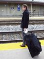
| 01/14/2003 12:59:55 PM | "Take the A Train"by RefocusedComment: Hello from the Critique Club -
This photo didn't do very well in the ratings did it? I gave it a six because it met the challenge and was a little better than average. Technically it is pretty well done. The focus is good, the suitcase and the guy being sharp and the back wall almost sharp. The lighting is good being a greyish day. I think the colors look a bit washed out. I would have fiddled with it a bit in post processing.
However the composition leaves a lot to be desired. I think this picture would have benefitted from the rule of thirds. If the guy had been over to the right, looking down the tracks, more of the tracks showing might have improves the idea of the endless wait for the train to come. The central focus of the shot, the place where the viewers eye ends up is that big black blob of a suitcase. While it adds to the story (big bag, stuffed, probably long trip, maybe somewhere interesting) it is not very interesting visually. The bag is too black and too big, it unbalances the scene.
The composituional lines here are pretty basic, maybe too baix to be interesting. The figure is right in the middle making a strong upright, The train tracks are straight across (well, a little bit diagonal) and also centered. The exact center of the picture is the mans hand holding his suitcase with a handerchief, why the handkerchief? it is distracting. There is nothing in three of the rule of thirds points and the suitcase in the fourth. With all those straight lines, the barrel distortion from the lens bothers me. I do like the repeat of the yellow stripe top and bottom. The signs on the wall, the lamp post and the strair railing all seem to be cluttter. Also the way the railing grows out of his back emphasizes his poor posture.
Wait - It's not a total loss. The main elements here are striking and worth noting. The station, the packed bag, the intent look on the mans face, the way he looks down the tracks and the tracks themselves are all worthy parts of the picture. What to do? Hmmm.... get the empahais on the guy. Move him off center. Move the bag. Lose the hankie. Maybe try a landscape view so there are more tracks to look down? Pay more attention to the junk in the background, like move so the stairs are in a different place. And jazz up the color in post processing. You've got the yellow lines, they work. You've fgot the blue signs, maybe they could be balanced by a blue luggage tag, or even a red one. Leave the guy grey, like the day and the stones and the station. He works well like that, any color on him would be a distraction.
Please remember that this is just one opinion, mine, and I am far from an expert. | | Photographer found comment helpful. |
| 01/13/2003 11:38:47 AM | The Nuclear Familyby GekkerComment: Yikes - My rott knocked over the dryer the first time she saw the family cat and thing never got any better. |
| 01/13/2003 11:23:29 AM | |
| 01/13/2003 11:18:40 AM | |
| 01/13/2003 11:05:39 AM | | | Photographer found comment helpful. |
| 01/13/2003 11:02:10 AM | The Burnoutby alanfreedComment: Aawk - what went wrong? I meant to return and change my nine to a ten but I got busy. Maybe everyoone else forgot too. I thought this was a real winner. | | Photographer found comment helpful. |
| 01/13/2003 10:57:21 AM | | | Photographer found comment helpful. |
| 01/09/2003 02:29:38 PM | terminalby ramoneComment: This is a stunning image.
If I were a photography teacher I would make an overlay of the compositional lines for my students. On the left, all the diagonal lines lead directly to the vanishing point. On the right are vertical lines diminishing in size towards the same point. ANd the brackets of the roof beams in red tie the two sides together with a contrasting diagonal. If it were drawn out it would be a textbook lesson.
Also perfectly composed are the colors - red on the left, monochrome on the right, tied with the red roof beams. Yellow in the center; the warning line on the pavement mirrors the line of ovehead lights. ANd the third left right tie is the beautiful blue sky and the large blue A.
Another contrast that is effective is the conflict between motion and stillness. The sweep of diagonal lines into the distance implies activity and speed while the flat red front (or is it back) of the train with the tranquil sky implies rest and quiet. I suppose this is a universal human conflict - I want to go but I want to stay, I don't want to go but I don't want to stay. Which is more inviting, the peaceful blue sky here or the draw of that distant point?
Technically everything is perfect. The exposure probably wasn't east to get. It is an inside/outside photo. Likewise the focus, both background and foreground needed to be in focus. I can't decide if I agree or disagree that the focus of the background should have been crisp also. I think the slight blur contributes to the sense of restless motion back there.
Overall this is a wonderful picture. Very full of emotion. Visually perfect. A great demonstration of how to break the rule of thirds. Sorry but I have nothing to add in the way of improvement except maybe: make a print and frame it. |
| 01/06/2003 12:56:29 PM | | | Photographer found comment helpful. |
|
Showing 2121 - 2130 of ~2515 |
Home -
Challenges -
Community -
League -
Photos -
Cameras -
Lenses -
Learn -
Help -
Terms of Use -
Privacy -
Top ^
DPChallenge, and website content and design, Copyright © 2001-2026 Challenging Technologies, LLC.
All digital photo copyrights belong to the photographers and may not be used without permission.
Current Server Time: 07/17/2026 08:02:17 PM EDT.
|