DPChallenge: A Digital Photography Contest You are not logged in. (log in or register
 
Browse Settings
Currently viewing:
Registered Useremorgan49

Show comments:

Per page:

Order:

Comments:


Comments Made by emorgan49
Pages:   ... [209] [210] [211] [212] [213] [214] [215] ... [252]
Showing 2111 - 2120 of ~2516
Image Comment
The Obvious!
01/20/2003 01:58:57 PM
The Obvious!
by Gracious

Comment:
Why didn't you put this in Humor...oh wait, wrong week.
Photographer found comment helpful.
Milestone
01/20/2003 10:41:24 AM
Milestone
by Manic

Comment:
Straighten it please - tilted pictures are my pet peeve - even if the marker was tilted.
Drink Milk?
01/20/2003 10:02:00 AM
Drink Milk?
by rj324

Comment:
Exquisite!!! Best of Show!!!!
Photographer found comment helpful.
Got Milk?
01/20/2003 10:00:02 AM
Got Milk?
by arnit

Comment:
Great!
Photographer found comment helpful.
I've Got Milk :-)
01/20/2003 09:59:11 AM
I've Got Milk :-)
by teachme53

Comment:
Ooooh dear- I just sent my pig to the auction last week.
Got Cookies
01/20/2003 09:56:08 AM
Got Cookies
by daysez

Comment:
Oooh this is the best of the milk and cookies crowd. This is realyy really nice - could be my favorite of them all.
Photographer found comment helpful.
tired of sex
01/20/2003 09:32:05 AM
tired of sex
by andres

Comment:
Hello from the Critique Club. Sorry I am a bit slow. I don't know how to take this photo. I'm not sure what you were thinking when you submitted it since it is your first and only submission. There are several ways I can take it so I am going to write three different reviews.

Review #1 - You are a jerk!
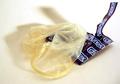
What is THIS? I am a little old lady. Do I really need to look at this? There are kids as well as oldies who submit to and vote on these challenges. There was a discussion of that was appropriate and inappropriate. Several images have been disqualified for blatant sexuality. Is this submitted for it's shock value? If so, go look for attention somewhere else.

Review #2 - This is a joke!
And a pretty funny one too. I find that photographers are a pretty up tight bunch. I think they are always trying to prove to the world that photgraphy is art, that it takes talent. and is not just a cheaters way to paint or draw. On this site people get really worked up about their score and the rules. It is refreshing to see a tongue-in-cheek submission.

Review #3 - This is a serious submission!
Believe it or not, I gave this picture a seven. I don't know the song but I've heard of the band. Didn't they do that Buddy Holly song? I'm tired So tired I'm tired of having sex (so tired) . I imagine loud rock, lots of drums, screaming lyrics and some feedback.. Am I close?

The composition of this photo is very nice. the package and the condom make a strong diagonal and the shadows make a weaker diagonal in the othe direction. nice. I like the upright torn part of the package and it's corresponding shadow. they seem to represent....ummm...you know...uprigtness. The condom is is certainly tired looking. The colors are nice, the three colors balance eachother. The lighting is very good.

Techinically I agree with the commenter who thought that the white balance was off. I also think that the dark values are off. If the contrast was increased slightly do you think the browns and blues would look richer and less washed out? The lighting is very good, as is the focus.

How sad to be tired of sex. And how sad that the condom has become the symbol of sex. Back when I was young and wild and the dinosaurs roamed the earth and HIV didnt, a condom was just the least preferred method of birth control. This picture, with it's title, packs an emotional punch. It represents the ultimate in youth alienation. Yep, this picture looks bored (but not boing).
I'm tired of having sex (so tired)
i'm spread
So thin
I don't know who I am (who I am)

Now for the disclaimer- remember that this review is just the opinion of one (far from expert) person. And sorry for the duplicate review. Just shows how opinions can differ.


Message edited by author 2003-01-20 11:58:18.
Photographer found comment helpful.
what good is one glove, without the other.
01/20/2003 08:44:31 AM
what good is one glove, without the other.
by timskirven

Comment:
LAST PLACE? Hey wait a minute! How could I be so wrong? I gave it an 8. I thought the guy was drumming on the table in time to the music. But actually the sense of tesion made me think more of someone in a court house or even a police interogation drumming nervously on that official looking table. There is soooo much tension here it makes me nervous just looking at it. I thought it was a great photo.
Look, I Can Use a Spoon
01/20/2003 08:35:28 AM
Look, I Can Use a Spoon
by karmat

Comment:
Hello - Greetings from the critique club. Funny thing, I usually draw a few pictures at a time so I can mull them over for a day or so. One week I got all train station pictures and this week I have all baby pictures. Good thing I like babies more than I like trains.

First, I have to ask. What is that stuff??? It really doesn't look edible to me!!

Usually, as I look at a picture over and over again, I like it better and better, Unfortunately this is one I like less. It just doesn't have any spark to it. I know your work and I know you can do much better with lighting and composition. This is the same fellow with the sparkle in his eye in the "Spoon Fed" picture so I know that he is much cuter than this.

What's wrong? Okay it's funny...and it's messy..and it's cute. So why isn't it wonderful? Maybe because no one looks happy? A happy baby is absolutely contagious and I don't get that feeling here. I wonder if you added a tiny highlight to his eye if it might make all the difference in the world? Everything seems sort of flat. His expression is flat. The colors are sort of dull. The soft focus, though very well done adds to the dullness.

Your composition is nice at first glance. The hand on the left, balances the kid on the right and the spoon connects the two weighted areas. The hand is great and in it's "thirds" position but the complimentary spot should be the eye, that lack-luster eye. So instead my viewers eye travels down to the ear which is the second most interesting thing in the picture but seems irrrelevent to the story.

Technically (this is my weak point) it is lovely, The soft focus is lovely but seems unsuited for the occasion, it would be nice if he were sleeping or cuddling. I like that the kid is soft and the goo is sharp. Is it too sharp? around his mouth it looks like cement. The use of the uncluttered background in nice. And the choice to leave out any distractions, like tray or bowl or Mom is nice. Would it have looked better in black and white? Maybe the white balance is wrong, maybe that;s why the colors seem so uninteresting.

I'm so sorry to be so harsh because I'm hitting below the belt twice, critisizing your photography AND your baby. Yikes! I should be banned from the site. The problem is that I think you can do much better.

Message edited by author 2003-01-21 11:59:14.
Photographer found comment helpful.
Love Potion #9
01/18/2003 05:37:30 PM
Love Potion #9
by CreativeFlyPhoto

Comment:
oh he was correct - It was black! I just remembered the words - Oh but red is sooo much better. Red for love, right?

lalalalla and looked like India Ink
I held my nose
I closed my eyes
I took a drink
Photographer found comment helpful.
Pages:   ... [209] [210] [211] [212] [213] [214] [215] ... [252]
Showing 2111 - 2120 of ~2516


Home - Challenges - Community - League - Photos - Cameras - Lenses - Learn - Help - Terms of Use - Privacy - Top ^
DPChallenge, and website content and design, Copyright © 2001-2025 Challenging Technologies, LLC.
All digital photo copyrights belong to the photographers and may not be used without permission.
Current Server Time: 09/14/2025 02:41:17 PM EDT.