| Image |
Comment |
| 06/30/2004 07:07:14 PM |
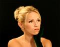
Pleasant thoughtsby awpollardComment: I think in a portrait the eyes should be a center of focus. Her eyes are nice and bright with good catch light but they are they same brightness as her finger tips, Well, it is a nice french manicure but unless she was the manicurist or particularly values her hands, I think the fingernails command too much importance. The best light falls on her hand also and the jewelry is ver interesting, That leaves her face with a secondary importance. What about cropping just below her knuckles, that looks more balanced to me and makes her lovely face stand out. I do like the way you have left more space on the left, leaving room for her gaze to be part of the picture. Maybe the white balance is too pink? |
 Photographer found comment helpful. Photographer found comment helpful. |
| 06/30/2004 03:59:55 PM |
|
| Photographer found comment helpful. |
| 06/30/2004 03:58:36 PM |
GEBby maraComment: odd - somehow I think this would have been for effective with a deep depth of field instead of shallow. |
| 06/30/2004 03:56:47 PM |
Double Spiresby BeeGeeComment: Perfect lighting, perfect composition, extraordinary duplication of design. |
| Photographer found comment helpful. |
| 06/30/2004 02:00:53 PM |
A Rainbow's Endby readmeComment: The rainbow is nice but there's not much else here to make it interesting. |
| Photographer found comment helpful. |
| 06/30/2004 01:59:41 PM |
Big Mouthby boomerComment: There are some stunning leading lines in this photo. It reads easily from left to right, high to low/ The top pelican points to the greedy one (love his shirt collar). the pattern of scallops on the roof repeats in the sape of the wings. the building lines contrast with the organic forms and feathers. the mouth is perfectly positioned to be the central focus. I think I would have increased the contrast and saturated the inside of the mouth. |
| Photographer found comment helpful. |
| 06/30/2004 01:46:26 PM |
My Love...by toddheadComment: I think I would move her to the lft a little and leave an uneven amount of black. whatever she is staring at or thinking about is also part of the image and he needs some room too. The extra negative space on the right implys that there is another part to her life, but the extra negative space on the left is just extra space and doesn't contribute. try it |
| Photographer found comment helpful. |
| 06/30/2004 01:43:33 PM |
Captain George Highlighted.by graphicfunkComment: Great face! great triangluar composition! Lots of wonderful leading lines, cheeks, arms, shirt folds, makes a nice flow for the viewers eyes. lighting is a bit harsh and I find the cloth under his elbows distracting. also that dip in his next commands too much attention, soften it out? |
| Photographer found comment helpful. |
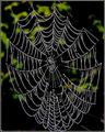
| 06/30/2004 12:47:30 PM |
The extraordinary skill of the spiderby trainComment: Happy Halloween. The contrast between the sharply focused web and the completly out of focus background is very nice/ The over processed look works well here, even the grainy background. It is a sylized image of a spider web, you can than the spider for the wonderful repeating patterns in the lines. You can thiank yourself for mimicking the radiating pattern in the leaves of the background. I like the way the image reads from top left to lower right and the center of the web draws the eye back into the scene. |
| Photographer found comment helpful. |
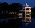
| 06/30/2004 12:42:47 PM |
Natural Symmetryby ellamayComment: oh my. this is lovely. What a perfect scene. the contrast between the straight lines (square) and the curved is wonderful. the pink side of the square repeats the pink flowers, the yellow in the center anchors each halp in the middle. The muted colors work well to enhance the Zen ness of the image. So very nice. Not quite sharp enough for a ribbon, you'll have to settle for a top ten. |
| Photographer found comment helpful. |
Home -
Challenges -
Community -
League -
Photos -
Cameras -
Lenses -
Learn -
Help -
Terms of Use -
Privacy -
Top ^
DPChallenge, and website content and design, Copyright © 2001-2026 Challenging Technologies, LLC.
All digital photo copyrights belong to the photographers and may not be used without permission.
Current Server Time: 07/24/2026 06:41:44 PM EDT.