| Image |
Comment |
| 02/28/2008 12:02:01 PM |
Darkmanby LeeDComment: I love this shot, very clever idea and a unique way to go for this challenge. I like the lighting, its just enough to see him and whats going on, yet its little enough to keep some mystery. |
 Photographer found comment helpful. Photographer found comment helpful. |
| 02/28/2008 12:00:59 PM |
|
| Photographer found comment helpful. |
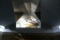
| 02/28/2008 11:59:33 AM |
Under The Bridgeby LandzEncaComment: I dont find this host very interesting, perhapse if it was centered and cropped a bit to remove the lower inch of the shot where noting is going on wit would have improved the image more. |
| Photographer found comment helpful. |
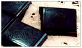
| 02/28/2008 11:58:33 AM |
65% Dark, 35% Lightby incubusComment: I am not a big fan of this the bar that is seperated is too dark and hard to read the hersheys logo on it. I dont like that I can see the wood table through the white cloth perhapse a solid sheet or cloth wuld work better. The lighing is also off the piece up front is lit but the rest are not. |
| Photographer found comment helpful. |
| 02/28/2008 11:56:55 AM |
|
| Photographer found comment helpful. |
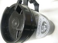
| 02/28/2008 11:56:16 AM |
Untitledby emerygirl25Comment: This is very uninteresting to me. The cup is fading into the background, the focus is very soft, and the lighting is washing it out. |
| 02/28/2008 11:55:26 AM |
Lost in the gray cityby kiskatComment: I didnt really see this fitting in this challenge, the composition is a bit off for me. The pole seems to be as much a focus as the 2 people. The idea is sound but I think the exicution needs work. Definatly worth trying again though. |
| Photographer found comment helpful. |
| 02/28/2008 11:31:56 AM |
Old Black and Whiteby Phoenix-5Comment: I felt this challenge was to recreate a b&w photo, that aside I dont find this shot very interesting to look at. If you were going to include color, I would like them to be very string, everything has this muted feeling to it. the composition needs work as well, I would like to see it tighter and not see the floor and white object behind the chair on the left. |
| 02/28/2008 11:30:03 AM |
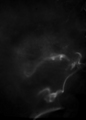
"Caesar's Profile"by martinkulikComment: This was a good idea with a lot of potential, but I dont think the contrast between the smoke and the background is strong enough. It seems more like an incidental snapshot that a planned styalized photograph. |
| Photographer found comment helpful. |
| 02/28/2008 11:28:34 AM |
"There is no gray."by johst582Comment: I feel the spirit of this challenge was to recreate a b&w image, that being said im not a big fan of this shot, I find it difficult to look at, the composition is not doing anything for me either. |
| Photographer found comment helpful. |
Home -
Challenges -
Community -
League -
Photos -
Cameras -
Lenses -
Learn -
Help -
Terms of Use -
Privacy -
Top ^
DPChallenge, and website content and design, Copyright © 2001-2026 Challenging Technologies, LLC.
All digital photo copyrights belong to the photographers and may not be used without permission.
Current Server Time: 07/21/2026 01:08:20 PM EDT.