| Image |
Comment |
| 03/04/2007 04:36:10 AM |
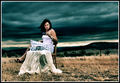
Is it Love or Lustby DirtypainterComment: Hi, Greetings from the Critique Club:
Composition: Oh yeah....now this is my kind of image. I love this job...lol!! Okies....lets behave and get down to business. This image is great. It has a strong diagonal with activity in both sides of that diagonal. The males head I feel is a little too close to the top....it gives a very cramped feeling....entrapment...which, yeah, he is experiencing a feeling of being trapped...but one of enjoyment. So the close crop at the top is contradicting of the images feeling. I would've liked to have seen that visible part of 'his' right leg removed, but I am aware that this is a basic editing, so maybe that is something you can watch for in future shoots. Also her orange tongue bar is distracting and cumbersome. Maybe a silver one or remove it for this angle shot would have been better.
Technical: ) The lighting over the models is superb. Nothing to be said there. However the indifference in the lighting on the backdrop is messy. It shows the creases on the right side behind the male. This keeps drawing the viewers eye out of the scene.
Overall: Okay...taking into account the backdrop lighting and the small details in the composition, I feel this image was hammered due to what I call the 'nudie police'. I feel for you as I experience just as much as anyone on this site. It is a shame...but please do not let that deter you from experimenting with this line of work more. I would love to see your future shoots. If you have any questions or I can help you in any way please do not hesitate to PM me. Good luck...oh and I hope you don't mind...but I am adding this to my faves. |
 Photographer found comment helpful. Photographer found comment helpful. |
| 03/04/2007 04:18:13 AM |
out of waterby jooudComment: Hi, Greetings from the Critique Club:
Composition: I feel this image has a great story but it is hidden by the clutter. We can see there are two firemen and a fire. The rest of the image doesn't tell us much...so it doesn't need to be there. I have taken the liberty to work on your image as you can see below. As you can see I have cropped in fairly heavily. Can you see why though? Look at the expressions on their faces. That is great. You have to realise that this site only allows a 640pixel size. That isn't going to show much to the viewer, so you need to show the most obvious. That expression would just nail this image. The fire behind links them to the location. That is all you need.
Technical: The lighting is right, especially considering the heat of the moment. The timing of the capture is right. The focus was right. I did, however find that a nudge of Shadow/Highlight, Contrast and Saturation worked for this image. Gave it that bit more punch.
Overall: A great image with loads of potential given the right treatment. Don't give up and keep looking for those magical moments.
 |
| 03/03/2007 09:57:01 PM |
Love in the Sunby bennettjamieComment: Hi, Greetings from the Critique Club:
Composition: I have taken the liberty to work with your image as y ou can see below. I have cropped a tad off the top as my eyes kept wandering out of the page. Aside from that I would possible have had a little more room around the main subject so they don't feel so confined. Love is meant to have no confinements...it is a free feeling, therefore you need to use your photo to convey that to the viewer. Make it so it isn't a feeling of entrapment. I know that it wasn't possible at the time, but in future watch for details such as the water bottle...very distracting to the eye.
Technical: I felt the image had flat lighting and worked it by increasing the saturation and then separately the greens. (All valid in Basic Editing)
Overall: I feel this had much potential. A little more experimenting with angles and lighting issues and this would have done much better.
 |
| Photographer found comment helpful. |
| 03/03/2007 09:47:10 PM |
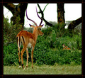
-Here Lies My Love-by AlexgioComment: Hi, Greetings from the Critique Club:
Composition: You have followed a general rule of thirds and I can, after studying the image for a bit, see the diagonal from the top left antler/horn down to the other deer, but due to the heavy contrast of the background trees and heavy saturation of the grasses, I found the second deer had escaped me at first. I feel most people would be put off by the back region of the deer being presented first...and I am the first one that would say, ' you can't tell an animal to turn around for a photo' but I wonder if there might have been a more presentable image in this series. Possibly not, which would explain your choice with this image...but it might be something to watch for in the future.
Technical: Your choice of settings was suitable (although I would have gone for a narrower aperture and slower shutter to compensate) but I feel that this was taken at full zoom...hence the deterioration in quality. Your colourings are a little too saturated and whilst I am aware of the limitations of Basic, I feel a little Shadow/Highlight would have helped in the separation of the foreground deer from the rest of the image.
Overall: In summary, I do really like your image, but feel due to circumstances both out of your control (the animals) and in your control (technicalities) this image has let you down in its final result. |
| Photographer found comment helpful. |
| 03/03/2007 09:33:51 PM |
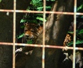
I HATE humans, let me out!!by charlievComment: Hi, Greetings from the Critique Club:
Composition: I understand the circumstances of which you took this image but I feel the composition could be better. The out of focus tree and the wire really diminish the photo. The wire needs to be there but if you had cropped in more the photo would have had more impact.
Technical: Again the focusing has let you down. You chose an F4 but that has made the wire more noticeable then it needs to be. You might not have been able to use flash but a bit of Shadow/Highlight should have helped in this area.
Overall: In summary, the image tells a sad story...but the composition and technicalities keeps the viewer at bay from studying the image more. |
| 03/03/2007 07:39:47 PM |
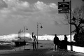
Anger for the stormby Rino63Comment: Hi, Greetings from the Critique Club:
Composition: I can understand why you have kept so much sky (because of the sign) but I feel there is so much that has been lost. The vacant area really takes the viewer out of the image. You basically want to keep the viewer trained on your image for as long as you can. The activity in the foreground is great but due to the technicals, it is lost. Therefore, the viewer starts looking for other areas in the image. The waves are great...and I feel the image could really take on a whole new perspective if you cropped to the man in white and his surrounds as per the thumbnail below. Can you now see the lights have given the image a strong diagonal and the man directs the viewer up to the activity of the wave. There is no lost information or areas in the image.
Technical: Whilst I am not one to stick to the rules of the histogram curve, I do feel there is way to much dark in this image for the subject. I can't even read the sign properly and I definitely can't see the expression on the peoples faces. I can see some expression through their movement but it doesn't tell me much of the story. There are too many blanks in the storyline. If your tonage was a bit lighter it would lend better but I feel you were concerned about blowing out the water and that is why you went in this direction.
Overall: I think this image has a lot to offer but has been let down in some general areas. Your tonage and composition range was huge and you had a lot think about at the time of the capture. You handled it well but I feel there is a lot of room for improvement.
 |
| Photographer found comment helpful. |
| 03/03/2007 07:28:19 PM |
Sunday Marketby DudskiComment: Hi, Greetings from the Critique Club:
Composition: I like how the rule of thirds play well here. The ladies cheek line sits on the third and with the change in light...it lends well to this overall placement. The way the lady is looking into the image works well as does her facial expression. The vivid colour is very pleasing to the eye.
Technical: Whilst there is some blowout in the image, the colour definitely overpowers that, so that is definitely not a concern. The delicate touch of bokeh keeps the eye directed at the main subject which is obviously the lady. I know that the sun was high during this shot which lends me to another area, that was not in your control at the time of the shoot. I would normally like to see the face lighter than the surrounding subjects. This keeps the attention on the main subject for longer. If you look at the image you can see that you first notice the lady (which is quite dark) but then you are drawn quite quickly to the rest of the image. If you can imagine it being the opposite (where the lady is lighter than the rest of the image) then you can understand how this would hold the viewers attention more.
Overall: I feel you have a wonderful image that would grace a cafe wall anywhere. Good luck with your future imagery. |
| Photographer found comment helpful. |
| 03/03/2007 07:22:00 PM |
Fabulous Flying Machineby JonathanJComment: Hi, Greetings from the Critique Club:
Composition: Generally most images can break the rule of thirds without causing to much imbalance but I feel this one has too much sky and tends to drage the viewers eye up into the vacant area. The fence diagonal is good as it takes the viewer up along the fence to the people, then to the glider and then....nothing. Can you see where you get a little bit lost in the sky?
Technical: I hope you don't mind but I worked on this image to help you understand what I am talking about. For starters, this image needed some contrast. So I increased the Brightness/Contrast followed by a shift in the Hue & Saturation. A touch of levels and you will see the result below. I would like to note that I was pleased to see the control of tones wihtout any blowouts in the image.
Overall: I think this image has promise but needed a little more thought to the composition and processing.
 |
| Photographer found comment helpful. |
| 03/03/2007 06:18:41 PM |
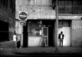
Payphone - Cell phoneby jblaylockraynerComment: Hi, Greetings from the Critique Club:
Composition: The composition is great. Whilst the image can almost be broken into a rule of thirds...by being slightly off you have still balanced the image but given it a unique feel, leading into a story of its own.
Technicals: There is a large tonal range in this image and you have handled all those areas well. I am pleased to see no blown out areas. The perspective is correct as is the depth of field. Choosing to use F10 instead of a wider aperture has kept as much detail within your story as you could.
Summary: Overall...I think this image has a lot to offer. The way the Tshirt man is looking at the other man as if he is talking to him but in a split screen is excellent. The signage lends to this same mood. Job well done. I can definitely see why this image scored so well.
P.S. I have to admit that I didn't look at the author until I finished typing this and was very pleased to see who this image belonged to. I have admired your work for some time and hope that my critique is pleasing to you. Should you have any questions please do not hesitate to contact me. |
| Photographer found comment helpful. |
| 03/03/2007 05:50:15 AM |
|
| Photographer found comment helpful. |
Home -
Challenges -
Community -
League -
Photos -
Cameras -
Lenses -
Learn -
Help -
Terms of Use -
Privacy -
Top ^
DPChallenge, and website content and design, Copyright © 2001-2026 Challenging Technologies, LLC.
All digital photo copyrights belong to the photographers and may not be used without permission.
Current Server Time: 05/10/2026 05:49:14 AM EDT.