| Image |
Comment |
| 03/08/2007 01:19:58 AM |
|
 Photographer found comment helpful. Photographer found comment helpful. |
| 03/08/2007 01:05:33 AM |
|
| Photographer found comment helpful. |
| 03/07/2007 12:20:48 AM |
|
| Photographer found comment helpful. |
| 03/06/2007 05:16:43 AM |
|
| 03/05/2007 12:51:21 AM |
DNA by yankoComment: Fantastic....one of my higher scorers.....congrats Richard. |
| Photographer found comment helpful. |
| 03/05/2007 12:50:00 AM |
|
| Photographer found comment helpful. |
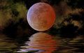
| 03/04/2007 06:35:09 AM |
Eclipse Risingby marboComment: Yada yada...just clearing the horizon...aren't you clever!! And pigs fly too...hahahahaha....cute!! |
| Photographer found comment helpful. |
| 03/04/2007 06:33:27 AM |
|
| Photographer found comment helpful. |
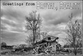
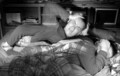
| 03/04/2007 04:53:47 AM |
Insomniaby Sting11165Comment: Hi, Greetings from the Critique Club:
Composition: Okay...I like the idea. And yes, insomnia generally takes place in the bedroom...but again, this image is cluttered. Try and keep the image with as little details as possible. Ask yourself......does this item or that item need to be there. Also, I feel those shelves really cut the image up....they enclose the story and the majority of the image into the bottom two thirds...and that can hurt the score.
Technical: I understand why you chose BW tonings...to make the viewer work out the story without the colours doing all the work. But you need to work on the tonings themself. A dramatic and draining scene such as this really needs heavy tones...to express the mood straight up to the viewer.
Overall: I feel you were on the right track...and you knew what you wanted, but you became frustrated at not being able to put it into one story. Keep trying and watch details. Ask yourself if that needs to be in the image and work it from there. Draw the image on paper and build it from there. You will find that half the clutter wouldn't have made it to the piece of paper...so why should it make it to the final photo. Good luck and keep experimenting. |
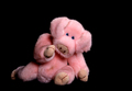
| 03/04/2007 04:47:30 AM |
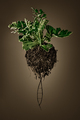
You n me babeby David1411Comment: Hi, Greetings from the Critique Club:
Composition: Oh now this is just plain cute. The bright pink against the black works well and how the pig seems to be reaching for the viewer really draws the viewer in more. Well done on that little aspect. I do feel however if you cropped a portion off the right hand side of the image it would have a more even balance. Also maybe another human touch would have helped your score...maybe a small single rose lying in front of the pig...sort of like an offering.
Technical: There isn't much I can say here except to watch in future shoots for marks on the pig...like on his belly. I know, being a Basic Editing you couldn't do anything about that...but do watch small details like that as it does have an effect on your score. Also maybe a small reflector on the pigs right hand side to lift some of those shadows on his leg would also have helped the image.
Overall: Now, after reading this, you might think I am being picky, but I wouldn't be doing my job if I wasn't. It wouldn't help you by saying this image is perfect and yet it came in at 144th place. So I am telling you the good and bad of the image to help you with future scores. I think you have done a great job and with a few details considered, your work will do well in future shoots. |
| Photographer found comment helpful. |
Home -
Challenges -
Community -
League -
Photos -
Cameras -
Lenses -
Learn -
Help -
Terms of Use -
Privacy -
Top ^
DPChallenge, and website content and design, Copyright © 2001-2026 Challenging Technologies, LLC.
All digital photo copyrights belong to the photographers and may not be used without permission.
Current Server Time: 05/10/2026 04:34:09 AM EDT.