| Image |
Comment |
| 03/18/2007 12:44:18 AM |
|
 Photographer found comment helpful. Photographer found comment helpful. |
| 03/18/2007 12:43:01 AM |
Used Kitchen Furniture And Fittings For Sale Cheapby GreetmirComment: Hi, Greetings from the Critique Club:
Composition:Okay Greetmir, I don't want you to get upset with what I am going to say to you. But I am going to be honest and hopefully help you with your photo. I looked at this image and groaned, shaking my head. No image is without hope but when you are photographing for a client you need to fulfill their requiements. DPC is no different. Look at the winners. They are generally in your face, simple compositions. Made to look easy when in fact they aren't. There is always a main focal point. Everything is easy for the viewer...it is all laid out. Now with that in mind...look again at your image. Does it fit any one of those things. No! I am not saying give up your style. But by photographing for a client you are forced to try something different and in turn you learn new techniques and see things from different angles and that strengthens your ability and your own style.
Now with regards to your image...it is cluttered. There is no 'one' item that jumps out first up. My eyes wander everywhere and yet see nothing. That is not good.
Technical:Your score was low...you didn't get anything above a 7...and that is unusual. But not when you look at your image. That tells me that it isn't just my opinion but many...and that is there to help you. Not to belittle you. Learn from it my friend. That is why you upload here...to learn. And I hope you are willing to listen to what everyone might offer you in advice.
Now...your image. It has a lot of blowouts...you have lost information. I assume you handheld this. If you don't have a tripod...then put the camera on a sturdy post of some sort and try a different setting. Looking at your settings I am guessing you shot Automatic. That is okay...but the camera doesn't know what you are photographing and has made some serious mistakes. So you need to start taking control of your equipment. Learn the settings and play with them.
Overall: I think you need to try simplifying your images and take it one step at a time. You have a lot of enthusiasm and happiness...now let it come out in your photos. This one does not show any of that. |
| Photographer found comment helpful. |
| 03/18/2007 12:25:32 AM |
A Chair for a Bearby CitadelComment: Hi, Greetings from the Critique Club:
Composition:Now this is cute. It has so much potential. At the moment it looks very much like a stock photo. You need to break away from that for this subject. Maybe put a little flower pot with flowers and a bow on the floor next to the chair. An additional mini photo in a frame hanging in the background would look great. It would complete the story. And not be a 'stick the subject on a white background and take a picture' style shot!
Technical:This is the main area that has let you down. I have uploaded my version to show you what I mean with the backdrop. I can see what you were aiming for but it has actually let the image down. Go for a clean image....with as little detail as possible. This image needs to be clean, bright, cute and colourful. Hence the addtion of the photo frame in the background and the flowers. The greyed floor is NOT suitable for this image. Also, rid yourself of those shadows. A general rule is to have the subject a minimum of the same distance from the backdrop as it is in height. Example - 6 foot tall person should be a minimum of 6 foot from the backdrop. Now you are also photographing a still life. So why use a flash. Use a light and bounce it off some small foil covered boards if need be. Use a tripod and low ISO with a long shutterspeed. Use a narrow aperture also. Your subject is NOT going to run away...so why take a quick shot?
Overall: I think this gorgeous bear and chair needs to make another appearance...but I think the bear needs to befriend the photographer and together they work as a team. Keep up the great effort and ideas in your work...and please....don't give up.
 |
| Photographer found comment helpful. |
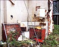
| 03/17/2007 05:23:28 PM |
UnUseDby TheStickComment: Hi, Greetings from the Critique Club:
Composition: I can see what you were trying to achieve, but there is just no life...no focal point in the image. If you had placed one ornament on that shelf...a bit of colour...it would have given this image some life.
Technical: Technically you are on the right track. The focus is good as is the lighting. But there are some areas that need cleaning. If you were after the old look...then make it look really old and worn. This item just looks dirty. So I would suggest cleaning up the marks and brightening it up.
Overall: I know this critique sounds harsh but I am only saying this to help you with your future entries. You need to treat DPC as a client...and this is generally what they look for. You have 4 seconds to make an impact with the viewer and hold them there. So look at your image...and see if there is anything of major factor that would hold them. If not....look at improving it in whatever way you can.
Good luck and please keep trying. |
| Photographer found comment helpful. |
| 03/17/2007 05:18:23 PM |
Rising Water Tableby robaComment: Hi, Greetings from the Critique Club:
Composition: I think the composition is right on for this particular image. Personally I wouldn't change any part of that.
Technical: Here is where I feel the image has been let down. The improvements needed are only minor but are enough to have kept your score down. The shadow around the table is natural, but distracting. Try lightening that area. The hill on the left shore is dark and takes up too much of the image without giving anything to the story. I have taken the liberty of working on your image in the way I have described here to show you what I mean. I added a Shadow/Highlight to your image and found the details in both the shadow and the hill appeared. I also cloned out the post at the top of the chair.
Overall: Overall, I feel you have a great image with good lighting, composition and colour. But the minor areas were enough to keep your score down. Keep up the great work and I look forward to seeing more of your work in the future.
 |
| Photographer found comment helpful. |
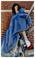
| 03/16/2007 03:20:57 AM |
Am I a Model Yet?by MissyKayComment: Okay this is a much better size. I like the patterning on his shirt and the combination of textures displayed around the image. The tone and clarity of the bricks and glass are great but can you see how the focus is lost by the time you get to his right hand. His skin is also blown out with is a shame. Also, never, crop off a hand. There are certain rulings that help balance out an image...and you will learn them with time. |
| Photographer found comment helpful. |
| 03/16/2007 03:19:23 AM |
Contagious Smileby MissyKayComment: This has potential. Unfortunately the whites on the fur are blown...there are no longer any details there. Most portraits are better in vertical crops than landscape...and this is no exception. Her smile is captivating but my eyes are drawn to other areas of the image. Try to eliminate that from happening by concentrating the focus and crop on the main subject. |
| Photographer found comment helpful. |
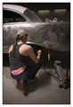
| 03/16/2007 03:18:05 AM |
Essentials of Lifeby MissyKayComment: The foreground subject takes up quite a percentage of the overall photo. And due to its range of tones it is quite distracting. The background is very busy with not good lighting. Try and simplify your shots and get rid of anything that is not necessary. If you want to keep the subjects in focus then zoom out...take the shot then crop in. Also always try to keep the size of the image at 640 pixels. |
| Photographer found comment helpful. |
| 03/15/2007 12:53:17 AM |
|
| Photographer found comment helpful. |
| 03/15/2007 12:53:14 AM |
|
| Photographer found comment helpful. |
Home -
Challenges -
Community -
League -
Photos -
Cameras -
Lenses -
Learn -
Help -
Terms of Use -
Privacy -
Top ^
DPChallenge, and website content and design, Copyright © 2001-2026 Challenging Technologies, LLC.
All digital photo copyrights belong to the photographers and may not be used without permission.
Current Server Time: 05/10/2026 01:11:01 AM EDT.