| Image |
Comment |
| 02/27/2004 04:12:10 PM |
Barbed Wireby heidaComment: Love it. Choice of color is somehow appropriate. Composition and lighting beautiful. 10 |
 Photographer found comment helpful. Photographer found comment helpful. |
| 02/27/2004 04:11:23 PM |
|
| Photographer found comment helpful. |
| 02/27/2004 04:10:44 PM |
a roadby jmritzComment: Nothing mundane about this photo. Beautiful shot. I'm not sure if you've used some kind of PS effect or what, but the photo seems somewhat "posterized" on my monitor. No matter, I really like the shot, and gave it a 10. |
| Photographer found comment helpful. |
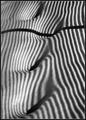
| 02/27/2004 08:09:11 AM |
Pin-Stripped Suit by ellamayComment: I didn't get a chance to vote on (or even look at!) the texture challenge and I am so sorry! This photo is wonderful, and I am so glad that you got a ribbon with it and it ended up on the home page where I could snap it up into my favorites folder! Really lovely work, congratulations. |
| Photographer found comment helpful. |
| 02/26/2004 04:33:18 AM |
Patriotic Bear by Ian Hollemanby TooCoolComment: WOW Ian! Your lighting is better than my attempts at it! I like the composition, and the theme. I can see just enough of the background to find it the tiniest bit distracting - would prefer that it be solid black. At first, I thought the border was somewhat distracting, but it works with the theme, and I agree with Justine-it would make a great Independence Day poster/print/postcard.
Keep on shooting - you're doing great! |
| Photographer found comment helpful. |
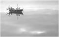
| 02/23/2004 07:20:53 AM |
Miredby OlyuziComment: I am sorry that I didn't have time to comment during the challenge, but will happily do so now:
I gave you a 5, and this is why:
1. I like the composition. I also like the choice of black and white, but the image lacks impact.
2. Though I "know" that the boat is the subject, it seems to be diminished by it's surroundings. There is just too much else competing for attention. I think a much tighter crop on the boat would have helped significantly.
3. The dark area on the top left, as well as the branches hanging down into the view are very distracting and keep drawing my eyes away from the boat.
4. It looks very oversharpened, to the point of all the little bits of white drawing my eye to them.
|
| Photographer found comment helpful. |
| 02/23/2004 07:04:47 AM |
Sea of tranquillity by geewhyComment: Congratulations on winning with this stunning photo! Hope you plan to make it available for prints - I want one! |
| Photographer found comment helpful. |
| 02/22/2004 07:52:20 AM |
Sea of tranquillityby geewhyComment: I'm speechless. Can't wait to make it a favorite, and to see how it was done. A breathtaking piece of work. I love the composition. 10 |
| Photographer found comment helpful. |
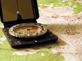
| 02/16/2004 05:34:59 PM |
An In Depth View of Pecos Wildernessby brett2004Comment: I did rate this fairly low for several reasons:
1. The compass is not in focus (I thought it was included as an intended subject), has a distracting cast shadow, and is partially cropped with the very dark area of the compass case leading the eye right out of the frame.
2. A topographical map means nothing to me, other than that I know what one is, and the way I "read" your photograph was that the compass was the subject and you were using the map as sort of background reference material to show that you would use a compass to find your way through the Pecos Wilderness.
3. The extremely shallow dof at the foreground made my eyes feel like they were going blurry!
I really do like your concept, but would like to have seen it shot at a slightly different angle perhaps.
|
| Photographer found comment helpful. |
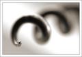
| 02/14/2004 07:06:15 PM |
Cork Screwby JackoComment: Oddly simple and interesting. Love the choice of coloration, and the dof is perfect for this shot and subject. The composition is unexpectedly appealing to me - Definitely a wall hanger here. Not so impactful as to knock me out, but definitely worth a 9. |
| Photographer found comment helpful. |
Home -
Challenges -
Community -
League -
Photos -
Cameras -
Lenses -
Learn -
Help -
Terms of Use -
Privacy -
Top ^
DPChallenge, and website content and design, Copyright © 2001-2026 Challenging Technologies, LLC.
All digital photo copyrights belong to the photographers and may not be used without permission.
Current Server Time: 07/23/2026 12:17:12 PM EDT.