| Image |
Comment |
| 02/04/2003 11:30:31 AM |
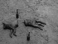
Gotcha!by ebrantiesComment: This is probably my lowest rated picture. I'm really not into sick humor. I don't like the composition much - there is just too much space around your subject, and the shot overall is very dark, and lacking in contrast. I don't find the photo to be shocking, just sad and sick. Oh, and the only emotion it stirs in me is to wonder if you seriously need help. |
| 02/04/2003 11:25:21 AM |
No more keyboards ... or else!by PaulMdxComment: Good crisp clear shot of the hammer, and the composition is OK. I'm not sure about the cliche part, but hey, everyone has their own idea of that. |
 Photographer found comment helpful. Photographer found comment helpful. |
| 02/04/2003 11:20:27 AM |
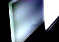
dirty lightby BeckyComment: Sorry, but even as an abstract, this doesn't really do anything for me. The little reflection looks kind of like a wine glass, but that doesn't make sense to me. the grain doesn't really do anything to enhance the shot for me. |
| 02/04/2003 11:18:33 AM |
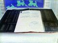
The Bookby kellieComment: I don't "get" this shot, I guess. I wish I could gain some understanding of it, but the more I look at it, the more confused I am. The grain is very distracting, as is the train thing in the back, and the bricks. |
| 02/02/2003 08:33:09 PM |
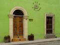
Cafe Iguanaby jenaromComment: Love the color especially! Great lighting and composition. That is a wonderful door. |
| Photographer found comment helpful. |
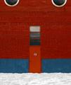
| 02/02/2003 08:32:02 PM |
Door #13by zadoreComment: Simple, but very engaging. I love the way the colors come together and kind of play off of one another. Good balance in your composition, and terrific lighting. |
| Photographer found comment helpful. |
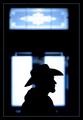
| 02/02/2003 08:30:19 PM |
Stetson Silhouetteby GordonComment: Love the border, the colors, and the composition a lot. Looks like he has a brillo pad on his chin though! |
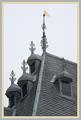
| 02/02/2003 08:29:11 PM |
Craftsmanshipby AzrifelComment: Not crazy about the border, I would have definitely switched the gray one and the tan one. The architecture on this building is awesome, and you have showcased it beautifully. I like the composition that you chose, I think it works well. |
| Photographer found comment helpful. |
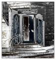
| 02/02/2003 08:26:15 PM |
.........Wilson Legionby undieyatchComment: Love the composition of this shot. Also love what you did to it, though I'm not entirely sure what that is! Anyway, this shot really jumped out at me, so good work. |
| 02/02/2003 08:22:18 PM |
Church Doorsby inspzilComment: What amazing architecture. Love the black and white. A little dark on the right side on my monitor, but otherwise love it. |
| Photographer found comment helpful. |
Home -
Challenges -
Community -
League -
Photos -
Cameras -
Lenses -
Learn -
Help -
Terms of Use -
Privacy -
Top ^
DPChallenge, and website content and design, Copyright © 2001-2026 Challenging Technologies, LLC.
All digital photo copyrights belong to the photographers and may not be used without permission.
Current Server Time: 07/25/2026 06:32:21 AM EDT.