| Image |
Comment |
| 11/15/2003 06:42:30 PM |
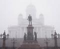
A sacred place in the mistby AlexysComment: I'm sorry, but I just have to say it: what I wouldn't give to see that amazing building without all the distractions in front of it!! The architecture looks just breathtaking. As it is...well, I like the composition, and the lighting, and especially the way you've captured the very foggy scene so well. The muted colors work well for the shot. |
| 11/15/2003 06:38:10 PM |
my sacred placeby agwrightComment: I like the warm glow, the nice reflections, and the backlight. At first glance, I thought that I would like to see some of the bottom cropped off, but after coming back to it, I like the feeling of depth that the large dark area at the bottom gives it. I would rather see both sides cropped in so that your subject fills more of the frame, and doesn't look so lonely there. I also don't care for the white border, it does not seem to complement the shot - (I don't usually lower my vote for borders). |
 Photographer found comment helpful. Photographer found comment helpful. |
| 11/15/2003 06:23:23 AM |
Sacred Place..to meby kavamamaComment: I can almost hear the quiet! This is quite beautiful. Love all the clouds and mists, and your choice of composition is very engaging. You must live in a wonderful place. |
| Photographer found comment helpful. |
| 11/15/2003 06:21:04 AM |
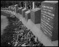
Titanic Cemeteryby BeagleboyComment: How very sad this feels. Black and white is perfect for this, and I like the perspective of your shot. |
| Photographer found comment helpful. |
| 11/15/2003 06:18:42 AM |
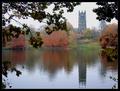
Reflecting Upon Religionby michael_pComment: Beautiful shot with gorgeous color. Your composition, using the foreground trees to "frame" the church, works well for this shot. |
| Photographer found comment helpful. |
| 11/15/2003 06:16:18 AM |
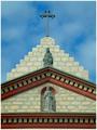
Missionby JPRComment: A lovely and interesting architectural shot, your composition is perfect for the lines and angles, and I just love the colors. The only "nitpick" I have is that I would like to have seen a little more lighting on the dentil molding to give the shot a little more depth. |
| 11/15/2003 06:12:09 AM |
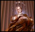
Madonnaby thelselComment: I am not crazy about most photos of statues or statuettes, but I find this somewhat appealing. The color is beautiful, and your lighting is great. I kind of like the repetitive shadows behind the figure, though in some ways, they distract from the main subject since they are so strong. |
| Photographer found comment helpful. |
| 11/15/2003 06:09:01 AM |
steamy sanctuaryby darcyComment: The lower portion of the shot has a soft, relaxed feel, while the top portion seems very "busy". I find my eyes jumping around, searching for something to rest on, but am continuously distracted by all the things going on in the upper area of the photo. |
| Photographer found comment helpful. |
| 11/15/2003 06:05:33 AM |
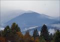
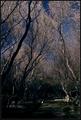
Sacred Groundsby heidaComment: The light on the trees is beautiful, and I like the way the composition shows them all curving inwardly from the bottom to the top. The bottom portion of the photo is so dark though, that I really cannot make much out. I see the little piece of light , but not much else. I would like to have been able to make out more interesting details. |
| Photographer found comment helpful. |
| 11/15/2003 05:55:33 AM |
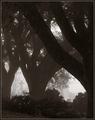
Bowby sherComment: At first glance, I thought I was looking through the arches of a building! Very interesting composition on this that conveys a very quiet, solemn feeling. I'm not sure if this is black and white, or if it just comes across that way due to the way and time of day that it was shot, but the coloring is perfect for the shot. |
| Photographer found comment helpful. |
Home -
Challenges -
Community -
League -
Photos -
Cameras -
Lenses -
Learn -
Help -
Terms of Use -
Privacy -
Top ^
DPChallenge, and website content and design, Copyright © 2001-2026 Challenging Technologies, LLC.
All digital photo copyrights belong to the photographers and may not be used without permission.
Current Server Time: 07/24/2026 01:55:38 PM EDT.