| Image |
Comment |
| 08/06/2002 12:58:00 PM |
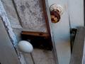
Door Knobsby BambooChicaComment: oooh, i see something new... just kidding! ;) i really like the lines and composition of this picture--very rustic looking. good job, 8--amitchell |
| 08/06/2002 12:56:00 PM |
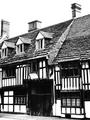
Wattle and Daub.by UberFishComment: wonderful! love the excellent composition and stark contrast. very european house, i think. 9--amitchell |
| 08/05/2002 03:11:00 PM |
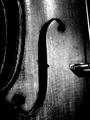
Portrait of an Old Violinby paganiniComment: wow, as an ex-violin player, i love this--i would have given a copy to my grandfather (he used to play in a symphony.) the lighting and contrast is just perfect. the only thing i might have done differently is pull out just a bit to get a hint more of the strings on the right. anyway, my favorite shot so far! 9--amitchell |
| 08/05/2002 03:30:00 PM |
Violinby cq107Comment: i like the framing and the clarity/color of this photo--it really shows the age of this beautiful old violin. the only nit-pic i have are the bright lighing on the neck (perhaps a diffuser or different placement of the light?) otherwise, very nice job! 8--amitchell |
| 08/06/2002 12:49:00 PM |
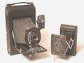
My Friendsby daysezComment: ok, i'm having a tough time with this one. first--i love the picture--very nicely set up and also nice subject/composition. I'm just trying to figure out if it has the soft overexposed look on purpose? I can only assume so, to make it look older? it looks like you jacked the output levels way up to give it that oldtimey portrait look?I took the liberty of putting this in photoshop and messing with the levels--darkening the cameras and taking that whitish contrast off really makes the camera and shadows stand out really nicely. but like i said, that is just me--i still like what you have here! BTW, i've never left such a long comment so i'll stop! email me if i'm way off base because now i'm curious and would like to know your intent here! :-) 8--amitchell |
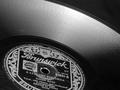
| 08/06/2002 12:50:00 PM |
78 rpmby floydComment: i used to love danny kaye as a kid! very cool lighting and composition. 9--amitchell |
 Photographer found comment helpful. Photographer found comment helpful. |
| 08/01/2002 01:03:00 AM |
Company Slaveby KimblyComment: very creative. like the simple use of color and the light background. --9--amitchell |
| 08/01/2002 01:07:00 AM |
|
| 08/01/2002 12:54:00 AM |
Customer Dissatisfactionby mciComment: best of the bunch! great composition, lighting and contrast--and great mood. Looks like she is depressed --why not about money?!! I'd hang this on my wall. 10--amitchell |
| 08/01/2002 12:57:00 AM |
Back to Basics by dequinixComment: awesome. like the framing and the bland color scheme seems to add to the depressive atmosphere of the picture. Can't decide if I'd crop the column on the right out or not...anyway you get a nine from me! 9--amitchell |
Home -
Challenges -
Community -
League -
Photos -
Cameras -
Lenses -
Learn -
Help -
Terms of Use -
Privacy -
Top ^
DPChallenge, and website content and design, Copyright © 2001-2026 Challenging Technologies, LLC.
All digital photo copyrights belong to the photographers and may not be used without permission.
Current Server Time: 07/16/2026 07:39:52 PM EDT.