| Image |
Comment |
| 10/09/2016 07:41:23 AM |
Early Fall Stormby DrakeComment: Hello from the critique club
An interesting image that contributes to the challenge
A great action shot with good timing to capture such a wave against the lighthouse. With regard to the lighthouse, I think this is one of those examples where true rendition can actually be a hindrance, the crookedness is the first thing I spotted and probably lots more voters and in terms of the image itself it is perceived somewhat negatively. I think a little poetic licence was called for. to rotate to a point where neither the sea or lighthouse was perfect would have made both much less obvious. Thanks for a great entry Drake |
 Photographer found comment helpful. Photographer found comment helpful. |
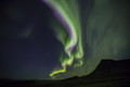
| 10/09/2016 07:36:19 AM |
Splitting the skyby BennihComment: Hello from the critique club
An interesting image that contributes to the challenge
A wise decision Benedikt to move away from the light trails of the traffic, you now have a lovely silhouetted landscape against which to view this magnificent natural spectacle. What an amazing colourful aurora you have captured, I like the way its shape lends itself to the shape of the landscape too. In terms of composition I find it rather too central, I would have preferred less of the right side of the landscape in favour of a more rule of thirds placement of the aurora. A very worthy entry Benedikt, thanks |
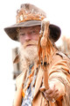
| 10/09/2016 07:31:24 AM |
Moon Cougar, shamanby snafflesComment: Hello from the critique club
An interesting image that contributes to the challenge
What an amazing character! I like the portrait itself, a really interesting looking character whose pose also adds to the impact. The snake is rather macabre but adds another layer of interest telling us some more about his roots together with your title it reveals all. I can see you must have deliberately gone for a high-key effect, I'm not really sure why, to be honest the blown out background and important elements such as the bend of the snake ruins the overall effect for me. I would rather the whole image was toned down and the skin tones made to look more natural. Thanks for an interesting entry Susan |
| 10/07/2016 07:09:03 AM |
Eagle #1by bobnospumComment: Hello from the critique club
An appealing image that meets the challenge
A great action shot that conveys a feeling of speed and determined concentration to get the ball in that goal. The timing is good with both her feet and the ball off the ground, its all very dynamic. The DOF is good showing good detail in the players at the back of the field and isolating Eagles 1 from the other players. Thanks for a well-captured action shot Bob. |
| Photographer found comment helpful. |
| 10/07/2016 07:01:09 AM |
Take-Offby clickodakComment: Hello from the critique club
An appealing image that meets the challenge
Although there is not much evidence of speed it is implied through the obvious fact that the plane has taken off. Looking at your data it would have been difficult to show speed through motion blur even with a smaller aperture the shutter speed would probably have still been too high but a shot in lower light, dusk perhaps, and a much slower shutter speed to show some motion blur would, for me, have been more effective. I like the distortion of the background from the engines turbulence. Thanks for a generally a pleasing image Marcel |
| Photographer found comment helpful. |
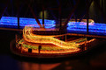
| 10/07/2016 06:54:13 AM |
Light, Speedby riotComment: Hello from the critique club
An appealing image that meets the challenge
Nice one Eugene! What a great opportunity for an original image that fits the challenge brief perfectly. I like your composition avoiding any distractions it enables us to home in on the action which is intriguing in itself especially trying to figure out how the runners created the separation they did. I like the soft illumination from the lighting both on the water and the bridge. This is a great image Eugene, well done |
| Photographer found comment helpful. |
| 10/05/2016 07:21:29 AM |
Archesby GeneralEComment: Hello from the critique club
An unusual image that meets the challenge through implication
Its all about the title! Clever use of title to imply ‘fallen’ without it the image alone would be quite ineffective. I think it would have worked better without socks especially those socks whose lettering dominates. You could argue that the foreground shapes help emphasise the message but to be honest I’m not convinced. I see from your comments that this was your intention but I think the link is a little too tenuous. Anyway, thanks for your interesting interpretation Paul |
| Photographer found comment helpful. |
| 10/05/2016 07:13:24 AM |
Fallen Applesby clickodakComment: Hello from the critique club
An interesting image that meets the challenge well
A very appropriate choice of subject that appears to have been very naturally captured in its natural environment. The composition is good, the apples dominate as indeed they should but the surrounding vegetation fits in nicely too. The back-lighting is good, lighting the grass and leaves very effectively, it helps balance the dominance of the apples in an appealing sort of way. Thanks for your entry Marcel
|
| Photographer found comment helpful. |
| 10/05/2016 07:07:48 AM |
tired from the battleby OK-PhotographyComment: Hello from the critique club
An interesting image that meets the challenge in an implied way
Your title helps convey the message that the ‘warrior’ is resting though not necessarily ‘fallen’ as in the challenge brief. Your character’s appearance is interesting in itself with the historical costume and rifle and the black lipstick adds intrigue. The choice of scene doesn’t really add to the story here with the plain wall and the rail tracks they feel more of a distraction rather than adding to the story the image could have conveyed but I think the tongue-in-cheek atmosphere was more important to you here. Thanks for your entry K.
|
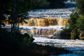
| 10/05/2016 06:52:31 AM |
Water Falls..by DrakeComment: Hello from the critique club
An appealing image that meets the challenge
The falling of the water adequately fulfils the challenge brief. As you say, the appeal of this is in the colour of the ‘tanned’ water also enhanced by the direct sunlight. Whilst I am a keen fan of motion blur I am pleased to see you have not gone down the somewhat overdone route of excessive shutter speed to produce a smooth image without detail, though perhaps a slightly longer speed could have been used to bring a hint of motion into it. Perhaps a shallower DOF focused on the waterfall itself could have helped isolate the main feature from the rest of the image in a more effective way. |
Home -
Challenges -
Community -
League -
Photos -
Cameras -
Lenses -
Learn -
Help -
Terms of Use -
Privacy -
Top ^
DPChallenge, and website content and design, Copyright © 2001-2026 Challenging Technologies, LLC.
All digital photo copyrights belong to the photographers and may not be used without permission.
Current Server Time: 05/06/2026 05:10:39 PM EDT.