| Image |
Comment |
| 11/29/2016 04:56:44 PM |
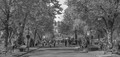
This is our storyby snafflesComment: Hello from the critique club
An interesting image that contributes well to the challenge
A dynamic action shot from a great viewpoint to create something more unique and interesting. Getting up close like this really helps the viewer feel more involved and a part of the action you can sense the atmosphere of the event. The angle of the horse also adds a further dynamic to the image with its strong diagonal, it couldn’t be better compositionally leading into the arena with the background spaces filled with the audience and others involved. Personally, I like to see some motion blur from a slower shutter speed but still a great shot, well done.
I would just like to add belated best birthday wishes to you Susan, hope you had a wonderful day... |
 Photographer found comment helpful. Photographer found comment helpful. |
| 11/25/2016 03:46:42 PM |
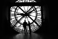
3:59 by Ja-9Comment: Hello from the critique club
An appealing image that contributes well to the challenge
I hate to disagree with you all but in my books its 2:49! Anyway, that aside, what a wonderful photographic opportunity this is, an absolutely adorable and unique situation for great silhouettes. Yes, its a shame it is a little crooked and you weren’t able to correct it post and given your normal attention to detail I’m surprised it occurred but we’re all human, well done for crucially including the couple. Given the strong subject matter I think a great opportunity was lost here to take a ground level portrait orientation shot making the most of the lovely wooden floor and soft shadows without the need to include the whole, (or most) of the clock face, you could have excluded the girder supports. Still a good image Janine, well done. |
| Photographer found comment helpful. |
| 11/25/2016 03:32:17 PM |
Vexedby riotComment: Hello from the critique club
An appealing image that contributes well to the challenge
I actually like her expression, it probably is a little more annoyed than quizzical but it is very appealing and adds a sense of mystery to the shot which has to be good. The bokeh whilst interesting is also very dominant particularly with the bright orange and bright yellow colouring, I think I would have preferred to see a good mono conversion of this to tone down the dominance of the bokeh. Given the expression and the bokeh Eugene I think you actually missed a good opportunity here through composition to combine the two much more effectively as though she were actually seeing it for herself and reacting to it. |
| Photographer found comment helpful. |
| 11/25/2016 03:23:19 PM |
Duck Lakeby clickodakComment: Hello from the critique club
An image that contributes to the challenge
Well Marcel, I don’t think this is one of your better efforts which is disappointing given your recent good form. I concur with the considered and helpful comments you have received, I don’t really have a lot more to add except to say that this feels like a rushed snapshot that had little or no thought applied you could and should have done so much more with it. Better luck next time. |
| Photographer found comment helpful. |
| 11/25/2016 03:16:34 PM |
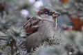
The Plebby RulerZigzagComment: Hello from the critique club
An appealing image that contributes well to the challenge
This is a lovely bird portrait with great focus and DOF in an interesting natural situation. The feather detail is lovely. It’s a little unfortunate that the background is not more uniform the highlights and brown patches are a little distracting but there’s probably not much you could have done about that. I do find it a little too central I think it could have made it more dynamic to have framed it further to the left. These are all really minor criticisms for an excellent nature study, well done Anton.
P.S.
Sorry, I forgot to congratulate you on your high score and excellent result, well done. Message edited by author 2016-11-25 15:56:35. |
| Photographer found comment helpful. |
| 11/23/2016 04:59:11 PM |
meow kampfby HoghemaruComment: Hello from the critique club
An appealing image that meets the challenge
A nice high key portrait of ‘the cutest cat on earth’! I think generally you’ve done quite a good job here Fabio but unfortunately you’ve bordered a little too close to overexposure there are significant areas of the whites where you have lost the detail in the fur which is crucial for the image for obvious reasons. I do like your reflection in her eyes it adds a little surrealism to it. Thanks for your entry |
| Photographer found comment helpful. |
| 11/23/2016 04:53:29 PM |
Birch bark and groundcherriesby snafflesComment: Hello from the critique club
An appealing image that meets the challenge
A lovely high key, low contrast image Susan. Your choice of background was a very wise choice it makes the end result far more interesting and appealing. I feel your exposure was just a hint too much in that you have specks of blown highlight that just cannot be controlled in the same way as the rest of the image. And the other is that corner of unnatural background detail in the top left hand corner, naughty! Overall, a lovely image deserving of the score and placement, well done Susan. |
| Photographer found comment helpful. |
| 11/23/2016 04:48:01 PM |
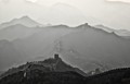
Great Wall, China (Badaling 八达岭by quindeComment: Hello from the critique club
An appealing image that meets the challenge
I like your image Carlos, very appealing. I would say for this challenge brief the top half of your lovely landscape works very well to the extent that although the foreground wall is well composed it adds too much contrast to the final image without this the image works very well. Alternatively, and a better proposition, you could have dodged the foreground to reduce the contrast of the wall so that it blends more subtly with the rest of the scene. |
| Photographer found comment helpful. |
| 11/23/2016 04:38:20 PM |
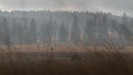
High Fensby OK-PhotographyComment: Hello from the critique club
An appealing image that meets the challenge
Your image is low contrast and fulfils the challenge brief but it lacks a strong focal point, I think you would have probably fared better if you could have given us perhaps a distant person, something to add interest. Your exposure was good in that there are no blown highlights which would have defeated any attempts at low contrast so well done for that. The soft focus foreground grasses are a bit distracting particularly in the sky area. Thanks for your entry K, its generally pleasing and fulfils the brief so well done. Message edited by author 2016-11-23 16:42:14. |
| 11/23/2016 04:31:30 PM |
Walk to schoolby clickodakComment: Hello from the critique club
An appealing image that nearly meets the challenge
I can see where you’re going with this Marcel but it doesn’t quite get there for a couple of reasons. Your subject has a full tonal range which is what you want for a ‘normal’ image, however, for the challenge brief you would have been better to specifically choose a subject with a narrower tonal range. Your exposure is not helping you either, if you had underexposed it you would have had data in all areas that you could have manipulated further to reduce the contrast, as it is your sky and various small areas of the image are overexposed and completely lacking any information that could be manipulated. Even a recomposition excluding the sky and less exposure could have got you nearer to a lower contrast result but thanks for your brave attempt. |
| Photographer found comment helpful. |
Home -
Challenges -
Community -
League -
Photos -
Cameras -
Lenses -
Learn -
Help -
Terms of Use -
Privacy -
Top ^
DPChallenge, and website content and design, Copyright © 2001-2026 Challenging Technologies, LLC.
All digital photo copyrights belong to the photographers and may not be used without permission.
Current Server Time: 05/06/2026 03:17:24 PM EDT.