| Image |
Comment |
| 02/13/2017 08:05:03 AM |
Ice Fishingby clickodakComment: Hello from the critique club
An appealing image that contributes well to the challenge
Brr.., it looks very cold there! I like your composition including the nicely curved tracks in the foreground, what I don’t like is everything going on in the background. I’m viewing this on my screen with the top cropped where the shadows start and I’m liking the image much more, it has a much more isolated feel to it which is entirely appropriate for the scene. Your commenter is right it would be impossible to tell what they are doing without the title which proves the value of the right title. Thanks for sharing Marcel |
 Photographer found comment helpful. Photographer found comment helpful. |
| 02/13/2017 07:56:55 AM |
Impending Storm by Ja-9Comment: Hello from the critique club
An appealing image that contributes well to the challenge
Congratulations Janine, a great result for a great image, very deserving. Thats a very complimentary remark from bmartuch but he’s right it does have a feel of the master about it. The mono conversion and exposure are the hallmarks of his work and whilst this doesn’t have the full range of tones you expect to see in his work it is a very good effort. My only minor criticism would be to crop off the bottom darker foreground, I think the whiter base of snow would be better. |
| Photographer found comment helpful. |
| 02/10/2017 05:35:56 PM |
Rainbowby jjstudiosphiladelphiaComment: Hello from the critique club
An appealing image that contributes well to the challenge
Welcome to DPC! What a great way to start, I like your approach in your attempt to create an unusual and unique entry, the prism lighting works quite well in adding the ‘burst of colour’ the challenge is asking for. Inevitably the lighting is quite difficult and causing you some problem which on the whole you have handled well. The pose is unusual and quite effective with the emphasis clearly on her lovely face but the bright highlights on her forehead and temple would benefit from a little dodging to reduce their impact. The white light arrow is a little unfortunate in that it is pointing directly to her nose. The other lighting problem is the bright area above her in the background which together with the circle on the left are both a little distracting. The focus and DOF is good with nice separation from the foreground and background.
I’m sure I speak for many here, welcome John, we look forward to more from you soon... |
| Photographer found comment helpful. |
| 02/10/2017 05:22:21 PM |
Papa Cardinal In The Snowby DrakeComment: Hello from the critique club
An interesting image that contributes to the challenge
It’s a funny old world isn’t it! Obviously, congratulations for your high score and HM for another lovely cardinal shot but I actually much prefer your other recent entry ‘winter squall’. I prefer the frontal pose of the other but more importantly there is some loss of detail in the intense reds here. These are minor criticisms in another excellent entry, well done Drake |
| Photographer found comment helpful. |
| 02/10/2017 05:15:49 PM |
Thawby riotComment: Hello from the critique club
An interesting image that contributes to the challenge
Aah, the lovely ice queen! Whatever the light she will always make an impact, though I have to say my initial reaction on first seeing this was not so positive. Whilst the lighting certainly makes for a unique image, the image noise and shadows are not doing her any favours, its leaving her looking bruised above and below the eye and on the nose. To counter those negatives your focus with this lovely shallow depth of field is spot on, ‘the eyes have it’, together with the nose and lips. Your cropping is necessarily tight to minimise the effect of the strongly coloured red light in the background but its not a huge issue in an obviously brightly coloured setting. |
| Photographer found comment helpful. |
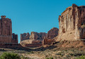
| 02/08/2017 03:49:14 PM |
Sky Scrapersby Dr.ConfuserComment: Hello from the critique club
An interesting image that contributes to the challenge
It’s often difficult to capture the grandeur of the scene before you in a 2D medium such as photography, I can imagine how awe-inspiring the scene was to you at the time. Whilst the lighting is picking up some of the irregular detail in the rock face it just feels a little too harsh and flat, I think an earlier or later time of day may have helped you to achieve your goal better. The vivid blue of the sky is also too dominant it is taking away interest from the landscape itself. This is a tough challenge to do well in but thanks for your contribution. |
| Photographer found comment helpful. |
| 02/08/2017 03:39:23 PM |
• c a l m •by Ja-9Comment: Hello from the critique club
An appealing image that contributes well to the challenge
A lovely landscape Janine. I like your composition with the emphasis on the water and its reflections and the pebbly bottom of the foreground. It’s a good exposure throughout with lovely sharp detail from the large DOF you have used. The composition gives a true feeling of depth and the immenseness of the scene. Nicely done. |
| Photographer found comment helpful. |
| 02/08/2017 03:32:40 PM |
Fiery Sunsetby gintayComment: Hello from the critique club
An appealing image that contributes well to the challenge
Well Gin Tay, what a start to a promising DPC career! Your first submission, and an honourable mention in one of the biggest challenges of the year, all I can say is, I’m really looking forward to seeing more from you soon…! Your high score and placing is thoroughly well deserved this is a magic sky against an equally appealing and interesting foreground. Your patience has been well rewarded with timing that has captured the very essence of a magnificent sunset. The long shutter speed has softened the water to contrast nicely with the soft greens of moss covered rocks whose lovely sinuous shapes add real impact to the scene. The exposure is perfect with excellent detail throughout including the highlights. A great image Gin Tay well done. |
| Photographer found comment helpful. |
| 02/08/2017 03:20:58 PM |
Checking the pricesby clickodakComment: Hello from the critique club
An interesting image that contributes to the challenge
Well Marcel, your commenters and voters are all of one voice and in terms of the challenge brief taken in its literal sense they are right. However, you could argue that you have captured the stillness of life as it stops to ponder the price of the goods on display! To be honest, that’s not a very convincing argument in respect of his distant perspective and the way he is merging into the hustle and bustle of the background. To make that work in a convincing way he would have needed to be larger and more isolated and his stillness a significant factor in the composition. Never mind, better luck next time... |
| Photographer found comment helpful. |
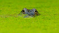
| 02/08/2017 03:11:25 PM |
Carefulby PhocalComment: Hello from the critique club
An interesting image that contributes to the challenge
Up to your usual high standard Ronnie another nicely captured alligator in its green mossy environment. Your title sums it up too, careful is the order of the day, its malevolent presence is a warning in itself, careful! |
| Photographer found comment helpful. |
Home -
Challenges -
Community -
League -
Photos -
Cameras -
Lenses -
Learn -
Help -
Terms of Use -
Privacy -
Top ^
DPChallenge, and website content and design, Copyright © 2001-2026 Challenging Technologies, LLC.
All digital photo copyrights belong to the photographers and may not be used without permission.
Current Server Time: 05/04/2026 02:25:11 AM EDT.