|
|
|
Showing 1561 - 1570 of ~3781 |
| Image |
Comment |
| 07/15/2015 01:43:03 PM | Do you remember...5,4,3,2,1...Thunderbird are Go !!!!by clickodakComment: *Hello from Sid and the Critique Club*
A generally well constructed shot that meets the challenge well.
I'm afraid I can only vaguely recall the show, I like the viewpoint you have used and from memory I think you have used a commonly seen composition for your shot, you certainly seem to have convinced your two commenters, so well done for that. The lighting and exposure are good too.
Initially I thought it was a plain blue background but I see there are some subtle clouds there, unfortunately there is also a vapour trail to the lower left which once observed becomes a slight distraction. You have generally done a good job with your editing apart from the red nose cone which has a halo around it and again, once seen becomes more obvious.
I think you've done a good job of it, to be honest there's not a lot more I can add so 5,4,3,2,1… Sid
|  Photographer found comment helpful. Photographer found comment helpful. |
| 07/15/2015 12:52:24 PM | Homage to Three Worldsby VBWComment: *Hello from Sid and the Critique Club*
I must admit, whilst obviously, I've heard of MC Escher I had not heard of his three worlds so I had to google it, delightful. A competent image that meets the challenge and should have scored better, It certainly doesn’t deserve all those sub fours.
I really don't think you have a problem with the focus, you have to accept that you are shooting through water which inevitably is not going to give you the same sharpness as air. At least you have managed to avoid the common problem in this situation of focussing on the waters surface which certainly would have rendered the fish soft. If you manage to come up with the magic formula in post-processing that will render unsharp images sharp then I will be delighted to hear from you.
As you rightly point out the 'pollen' on the waters surface is distracting and would benefit from removal and it may be this alone that has resulted in its lower than deserved score. I know its removal would have been tedious but I think it would have been worthwhile. Perhaps a quicker approach would have been to select these with colour range and simply subdue them thus making them much less conspicuous.
I like the dynamic shape and the dorsal fin just breaking the surface, I like its vivid colouring, I like the distorted reflections from the ripples, the reflections themselves are not too bad either, shame there weren't the leaves to complete your homage but a very good attempt I would say.
Happy fishing… Sid |
| 07/15/2015 09:25:36 AM | sunsetby sidpixelComment: *Hello from Sid and the Critique Club*
Oh cor blimey, I've drawn my own image for critique! I didn't realise that could happen, ah well...
Well, I've certainly learnt a hard lesson from this to make sure I thoroughly check ALL the detail. Not only was this a rushed entry but I had thoroughly cleaned the sensor before going out so I didn't even bother to check for sensor dust, I should have done because I changed lenses several times. No excuses, lesson learnt. |
| 07/14/2015 04:53:51 PM | The Dark Worldby GudjonottoComment: *Hello from Sid and the Critique Club*
Congratulations on your 7th place finish with your high impact image that meets the challenge well.
I assume this is some sort of catherine wheel type firework? Anyway, you have chosen a very suitable subject and handled it very well with your sufficeintly long exposure to display it in a very interesting way. You have also wisely decided to include its reflection in the water thus making it more than doubly interesting because of the ripples on the waters surface, it works very well indeed.
Unfortunately I find myself inexorably drawn to the centre of the bright oval trying to work out the detail therein instead of admiring the rest of the image as fully as I want. I think there's an argument for cloning out this part of the image to avoid the distraction, funnliy enough the reflected part is nowhere near as distracting but for conformity you would probably need to remove that too.
I'm not sure I agree with one of your commenters about the photographers on the right, they are discrete enough not to interfere with the main interest and indeed you would expect something like this to be enjoyed by others as well and so it adds a human element to the story, so I like it.
The light from the firework adds a nice touch of light to the surrounding areas and against that rich blackness of the water and the navy of the sky with its specks of starlight works really well. You made an excellent job which has been justifiably rewarded by your voters, well done. Sid |
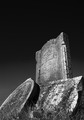
| 07/14/2015 03:53:40 PM | Gravestonesby mklarenbeekComment: *Hello from Sid and the Critique Club*
Welcome to DPC Michiel with a strong maiden entry that fulfils the challenge brief.
I like that you have converted it to mono and made good use of the tones available to you, I particularly like the sky with its lovely rich gradation though there do appear to be some problems in the lower left. I'm not sure if your commenter means this to be the banding problem but I don't see the sort of banding problems I would normally expect. This patch looks too abrupt and regular for that as though it is the remnants from some cloning or repair of some sort?
Given your exif it looks as though it was a very bright day which might explain why you've gone for such a small aperture, I would have thought you could probably have got everything as you wanted it with about f8, especially as you are using the wide angle end of your zoom. That's just an observation and makes no difference to your final image.
I do like the low viewpoint and composition, this is what gives your image its impact, well done. The shadows are a little dense, I would have liked to see just a bit of detail, I think the highlights are just about ok.
The one thing that mars the image is the lighting. If you had shot this at a different time of day when you had some oblique lighting on it, it would have really picked out all the lettering on the headstones and increased its appeal and impact enormously.
This is a very commendable start Michiel, we look forward to seeing lots more from you, Sid |
| 07/14/2015 03:30:09 PM | You Will Not Be Forgottenby Ja-9Comment: *Hello from Sid and the Critique Club*
I'm sorry to see that you didn't receive any comments, hopefully this will make up for it. In terms of the challenge brief, being a monument it obviously fulfils that.
You've chosen a pretty impressive monument for your subject and I like that you have converted it to mono with the most important parts of it standing out from the background. There are however, one or two things I am not keen on and might have done differently.
I am not happy with the overexposed sky but perhaps you gave it some +EC to get more detail into the faces? I'm not sure how close you were and what focal length you were using but looking at your exif there would have been some scope to use a larger aperture to reduce the detail in the background.
As it stands this is pretty much a record shot of a monument in other words it simply records it straight on without a lot of creative input, from this viewpoint I find the reflections in the base distracting. Given the nature of the subject I don't think you even need to include the base and I would have tried it from a position further to your left and closer in to frame them from the guns up using the flag itself as the main background. This position would also have overcome your sky problem and allowed you to get a better exposure of the faces and it would have stamped your own creative input to it.
I hope this helps, Sid | | Photographer found comment helpful. |
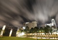
| 07/14/2015 12:42:40 PM | OKC: Remembering When Time Stood Stillby postoakinversionComment: *Hello from Sid and the Critique Club*
First of all, congratulations on your 8th place result. The long exposure has enabled you to create an image with impact that has clearly been appreciated.
For me the sky with its motion blur from the clouds is what gives this image its impact, I also like the startbursts of the lights from the small aperture you have used. I'm not too keen on the wide angle effect on the buildings but I think if you had used perspective control you would have altered the whole image to its detriment. Equally, the more exaggerated an effect is the more acceptable it becomes.
The biggest problem I have here is the amount of overexposure from the illuminated areas. I tend to agree with your commenter that combining separate exposures may have been a better choice or perhaps a reversed graduated filter to reduce the exposure of the lower half may have worked better.
As a stranger, I need your description to confirm that this is indeed a monument, and the time, I assume is not a clock as I thought, but a permanent reminder of the time when the deed was done? So, given all that it obviously fits the challenge well.
All of this is rather academic given your result, well done. | | Photographer found comment helpful. |
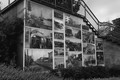
| 07/14/2015 12:10:23 PM | Picture Wall has to be Moved Citizens really Mad at the Mayorby PaulG13Comment: *Hello from Sid and the Critique Club*
What an amazing location, the world needs more of 'em!
The images on the wall all look fascinating and they're presumably telling something of the local character and history of the place. I like that you have shot from an angle as opposed to a straight on front shot. I wonder if you could have shot from the right hand side with the receding space being filled with the larger side of the picture wall thereby replacing the railing/sky combination with more of the images themselves. Maybe you couldn't get into that position anyway?
The lighting looks flat and overcast thus avoiding overly bright contrasts which suits your subject well, I don't know if you have enhanced the image wall but it is standing out from the rest of the image nicely. I do see this on the front page of the local paper with the headline amendments as suggested by your commenter so yes, it fills the challenge brief well.
I don't know if the original images are mono too but they have reproduced well here, all in all a very respectable entry, well done.
Happy shooting, Sid |
| 07/13/2015 03:56:49 PM | a metaphor for fallingby posthumousComment: *Hello from Sid and the Critique Club*
Sadly, an undervalued image worthy of a much higher score than it received. It displays good creative vision and your title adds another dimension.
I am unfamiliar with your post-processing technique but I always prefer to do my mono conversion in PS. Whatever your technique is it has made, what I suspect was probably a mediocre mono image from the camera into a much stronger image.
The problem with the in-camera mono option is that it throws all of your valuable colour data away thus severely limiting your options, in particular colour filters, which is where all of your tonal possibilities are held.
The foreground leaf grabs your attention and lets you explore the other underwater debris nearby, your eye is then naturally led up the boulder to those absolutely gorgeous ripples after feasting on those slowly drifting up and out of the top of the image. You have a lovely, near full, range of tones, with detail in all areas from the darkest shadows to the bright highlight of the ripple.
Its sad that it scored so low but how on earth anyone can possibly justify the sub fours is way beyond my comprehension, they have managed to completely distort the end result, you have my sympathy.
More of the same please, Sid | | Photographer found comment helpful. |
| 07/13/2015 12:59:02 PM | Aaaahhh by texdonComment: *Hello from Sid and the Critique Club*
Let me begin by congratulating you on your yellow ribbon, very well done. What's his name, Rip Van Winkle?
It's such a hard life, having to be so cute 24/7/365! You've done a marvellous job of capturing his or her character here so well, the end result an image that is well deserving of the title and the ribbon.
As has been commented already the way you have got nice sharp focus on the nose and your chosen aperture for sufficeint DOF on the head has all worked really well. Although we can't even see the eyes I think the way the light highlights the nose this more than makes up for such absence.
The colours and tones in the fur are all absolutely gorgeously reproduced. You can't help but wonder what dreams your lovely dog is experiencing, makes you wish we could communicate better with them doesn't it.
Well done, woof… Sid | | Photographer found comment helpful. |
|
Showing 1561 - 1570 of ~3781 |
Home -
Challenges -
Community -
League -
Photos -
Cameras -
Lenses -
Learn -
Help -
Terms of Use -
Privacy -
Top ^
DPChallenge, and website content and design, Copyright © 2001-2026 Challenging Technologies, LLC.
All digital photo copyrights belong to the photographers and may not be used without permission.
Current Server Time: 05/08/2026 04:36:44 AM EDT.
|